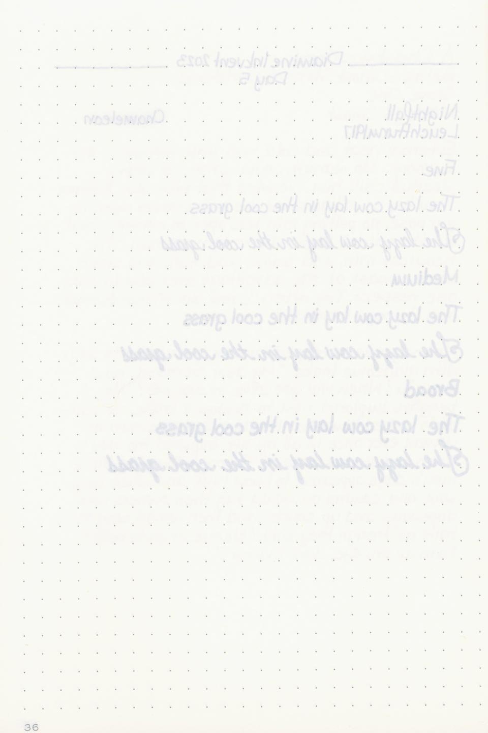
Diamine Inkvent 2023: Day 5 — Nightfall


*Please note that the scan is the accurate representation of this color.
Day 5!
Hello everyone! For day five of Diamine Inkvent, we have Nightfall.
The Color and Properties
Nightfall is a “chameleon ink” — an ink that contains particulates that change color depending on the angle and lighting that it’s viewed in. The base color is a muted midnight blue with subtle shading that appears near black where the ink pools. It’s incredibly dark — in low lighting, it may be difficult to tell that it’s a blue at all. There’s a slight red sheen that might appear at the edges where the ink pools, but because the base color is so dark, it can be difficult to see. Moreover, because of the shimmer, it makes the sheen even harder to see beneath it.
As far as the shimmer is concerned, it’s okay. It’s far easier to see the particulates in this ink compared to the previous chameleon Inkvent ink, Fortunes Gold. The color you see is still highly dependent on the viewing angle and the lighting, though. I mostly noticed color shifts between green and blue no matter how or what lighting I viewed it in. That doesn’t hinder this ink at all though. If it’s trying to capture a starry night sky, I don’t think it needs more iridescence to accomplish that.
Ink splat
Ink droplets
Performance | Cleaning


Rhodia

Leuchtturm
The performance was good. I didn’t experience any clogs or hard starts. Nightfall’s flow was notably wet, and it was a well-lubricated and comfortable writing experience the whole way through. The particulates agitated easily, and there was a pleasingly even distribution of shimmer throughout the writing.
The cleaning process was easy. The color, as well as the particulates, washed out with a basic flush and soak. There weren’t any particulates left behind in the pen or any of the nib units. It was a relatively painless experience for a shimmering ink. Well done!
Writing Samples
My personal thoughts…
When I swatched this ink, I wasn’t really sure what to think. I couldn’t decide if I liked the color or not. I think it’s too dark to distinguish itself from a black ink in writing, and overall, it’s lacking in some of the traits that I normally look for in an Inkvent ink. I don’t think it's particularly festive or wintry — it would be a fine shimmering blue-black for just about any season. I’ll admit, it’s grown on me since I initially opened it, but I still look at it and wonder whether or not it’s because I tried too hard to like it, or I actually do.
Written in a Leuchtturm1917 notebook
More Images/Info:
Tools and materials used in the writing samples:
A TWSBI Diamond 580 AL with 3 nib units including a Fine, Medium, and Broad. All nibs are tuned to perform at the same wetness.
A Rhodia No16 A5 DotPad
A Leuchtturm1917 A5 Notebook


Scan of the writing sample