Diamine Inkvent 2025: Day 17 — Gala
Disclosure: This post contains affiliate links. If you click and make a purchase, I may earn a small commission.
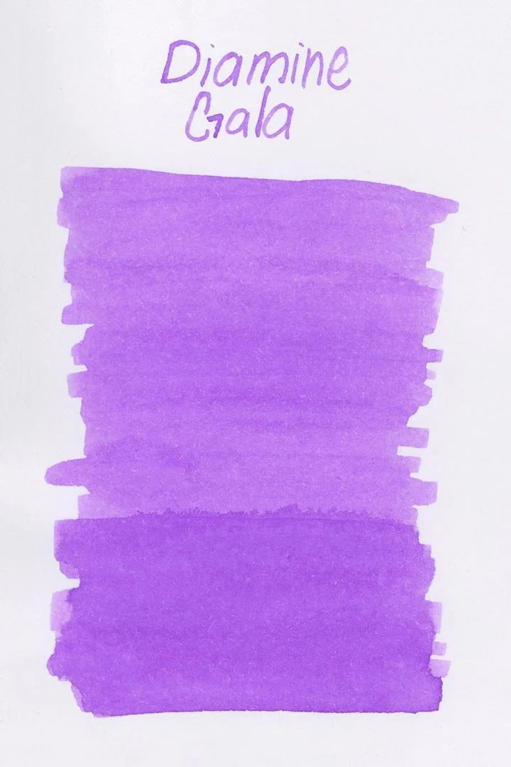
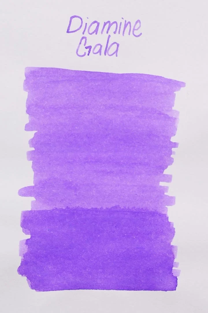
*Please note that the scan is the accurate representation of this color.
Day 17!
Welcome to day 17! Today, we’re looking at Gala
The Color and Properties
Diamine Gala is a pastel purple ink that shades lightly to a stronger, but still light purple where the ink pools at the bottom of the letters. In both cursive and print writing, the ink shades with a crisp cut and even darker purple edges around where the ink pools at the bottom of letters or where letters cross each other. The color is on the pale side, and in general, you can expect it to be much lighter in writing than in large concentrations (such as swatches or splats). That can make the ink difficult to make out, especially on white paper, or if a darker ink is used on the opposite side of the page.
Ink splat
Ink droplets
Performance | Cleaning
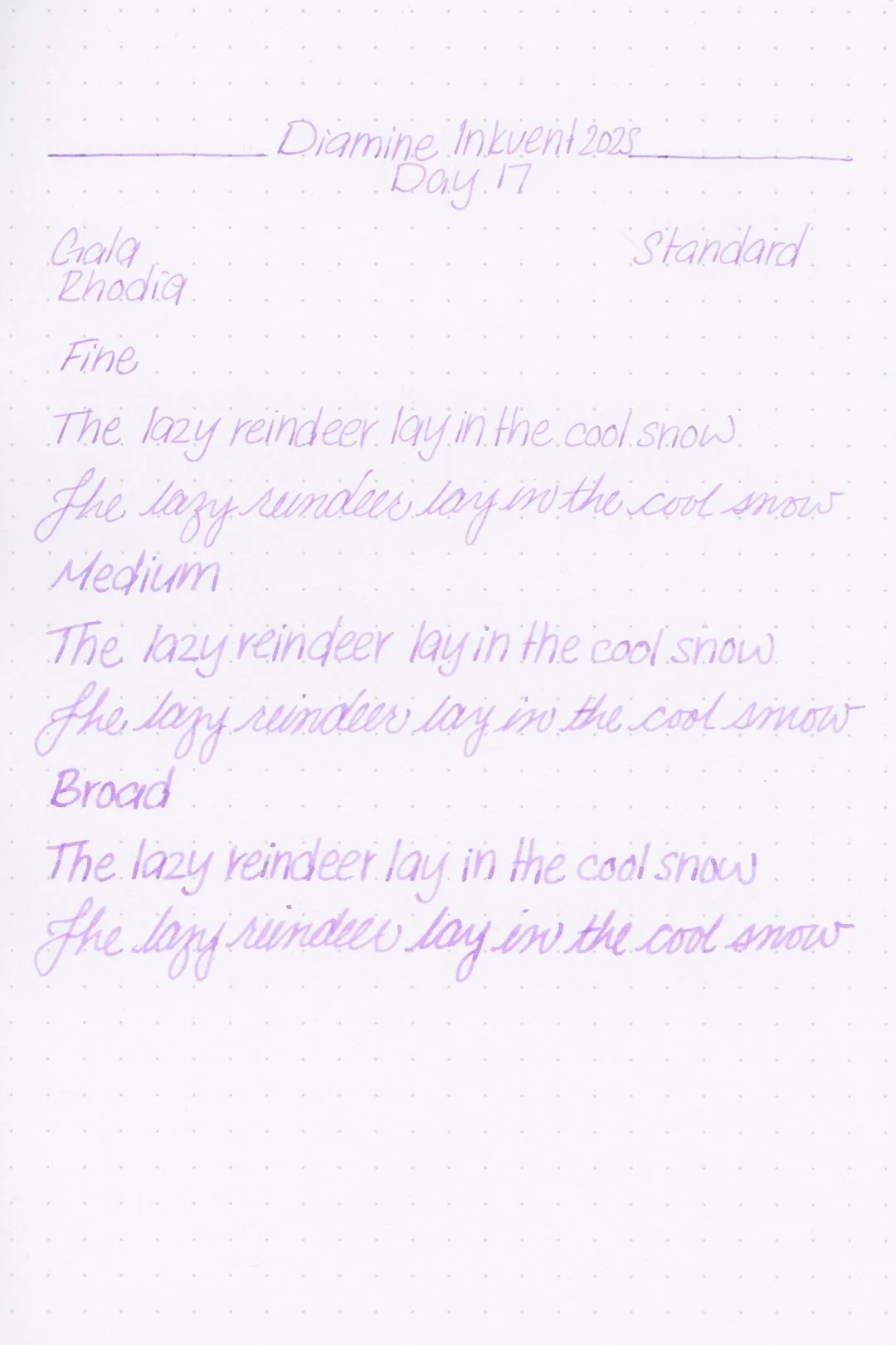
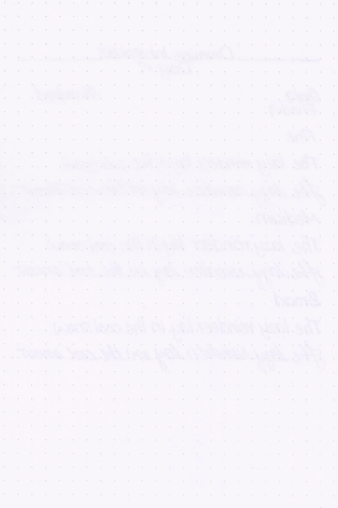
Rhodia
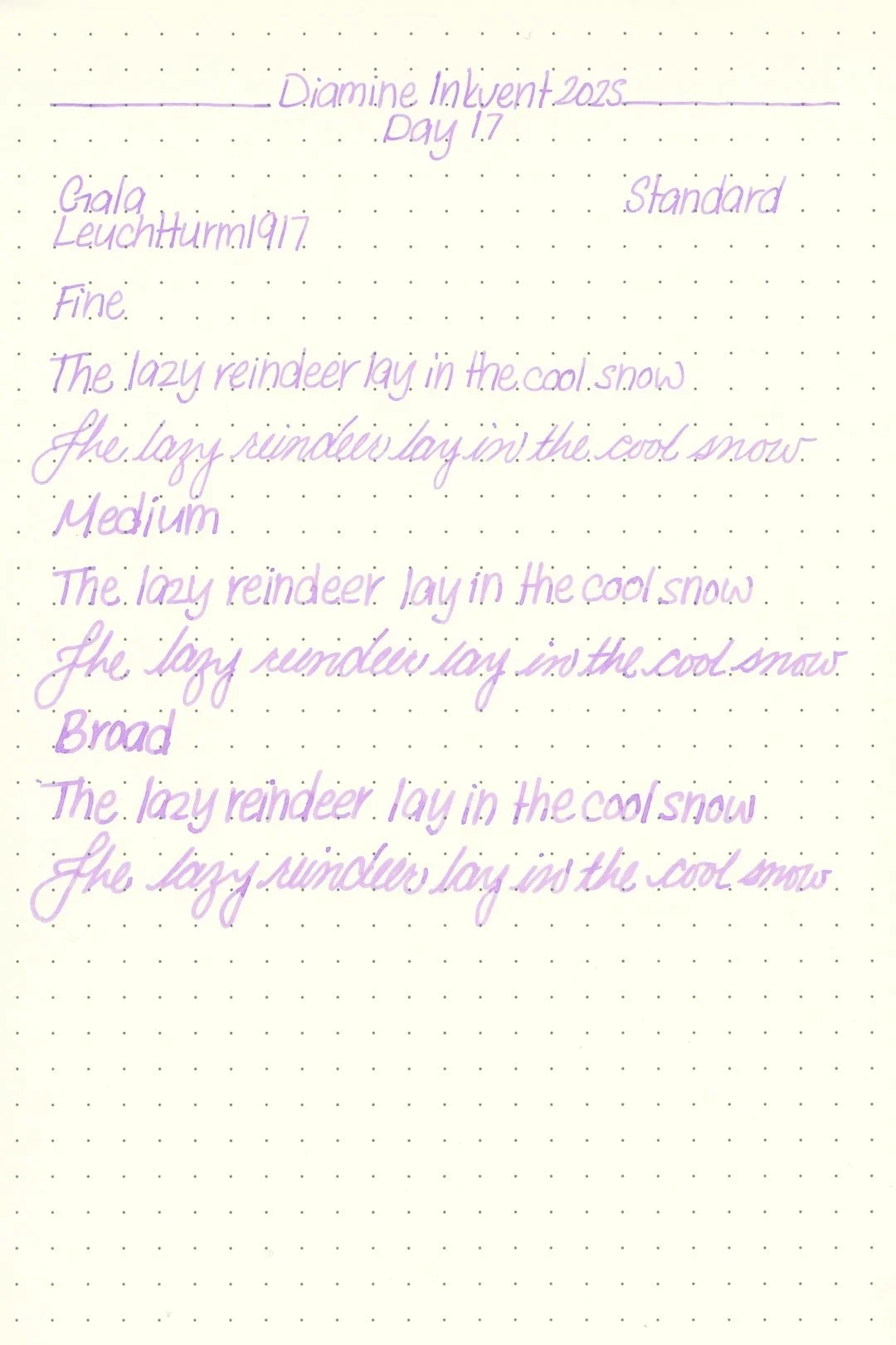
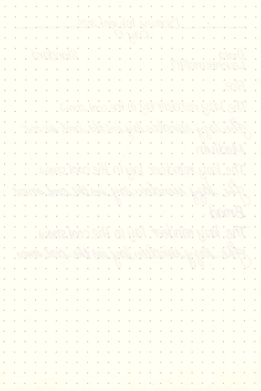
Leuchtturm
Gala has a dry flow and less-than-average lubrication, and while it’s not the absolute worst writing experience, it’s not great either. The writing experience can feel…honestly, it almost feels like dry writing, like the ink isn’t even there, especially with smooth papers and large nib sizes. Despite this, there weren’t any performance issues in terms of hard starting or drops in flow during extended writing. The ink was well-behaved on all the papers I tried it with, and I didn’t see any traces of bleeding or feathering.
The base color cleaned out of the pen incredibly quickly, and there weren’t any traces of color or residue left over in the pen or nib units after a single soak and flush with a bulb syringe.
Writing Samples
Written on 52 gsm Tomoe River paper (white, 7mm ruling) with a medium nib.
Written on Midori MD paper (cream, 7mm ruling), with a medium nib.
My personal thoughts…
Gala was in the handful of inks in this calendar that I was the least excited to get to because the color wasn’t doing anything for me. It reminded me of a more purple Lullaby or a less interesting Jacaranda from the previous calendars. I’ll admit that once I started writing, the look grew on me. It’s a little pale, but written out on the page it looks a lot cooler-toned than expected. Unfortunately, the performance was still underwhelming, and the ink was overall an unenjoyable experience to write with. Still, I can see how a lot of people might still like it, but for me, it’s just not enough to force myself through the dry writing experience.
Written on 52 gsm Tomoe River paper with a medium nib.
More Images/Info:
Featured in the photography and writing samples:
Diamine Gala
TWSBI Diamond 580, medium nib
Traveler’s Company “Have a Nice Trip” brass clip — Endless Pens | Amazon
Nanami Paper Tomoe River Cafe Note B6 Slim - Ruled
Midori MD A6 lined notebook — Amazon
Current text: A Christmas Carol by Charles Dickens — Amazon
Enjoying this content? Consider donating or joining our Patreon! It goes a long way to allow me to put more content like this together (and hopefully, make it even better!), and every little bit is an immense help.
Tools and materials used in the writing samples:
A TWSBI Diamond 580 AL with 3 nib units including a Fine, Medium, and Broad. All nibs are tuned to perform at the same wetness.
A Rhodia No16 A5 DotPad
A Leuchtturm1917 A5 Notebook