Diamine Prussian Blue
Ink Review #149


*Please note that the scan is the accurate representation of this color.
Disclosure: This post contains affiliate links. If you click and make a purchase, I may earn a small commission.
Overview
The Color and Properties
Diamine Prussian Blue is a faded, dusky grey-blue. The ink shades with a crisp cut and dark outer edges around pooled areas in both print and cursive writing. There’s not necessarily a lot of tonal variation in the shading, but the cut makes it easily visible. The ink can also have a slight (although very dull) red sheen to it, but it’s mostly around the edges of letters, and I don’t find it to be that common in normal writing applications.
There’s also a slight smell to this ink that I’ve noticed in a few other Diamine inks (especially blues). It’s not generally a pleasant scent, but it’s not nearly as strong in this ink. I noticed it a few times while making this review, but it wasn’t necessarily bothersome.
Ink splat
Ink droplets
Chromatography
Performance on Paper | Dry Times | Water Resistance
There weren’t any visible traces of bleeding or feathering on any of my test sheets. Prussian Blue is very well behaved and should be safe with most fountain pen-friendly papers, even with larger and wetter nibs.

Rhodia
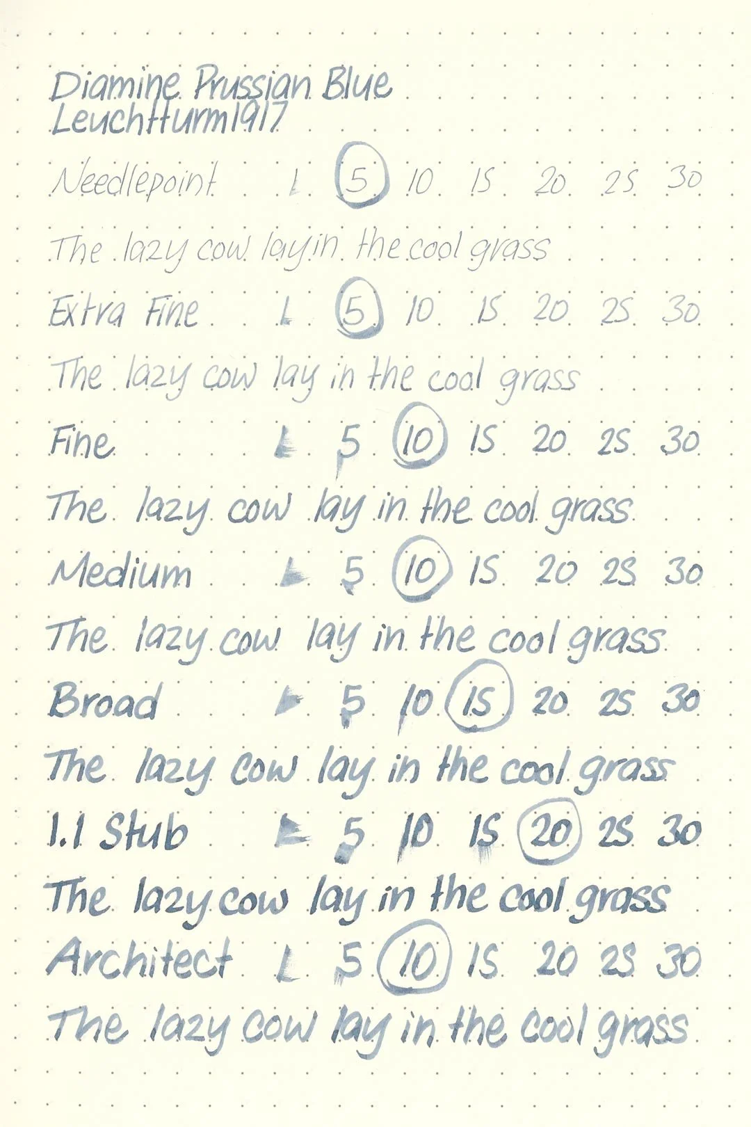

Leuchtturm1917
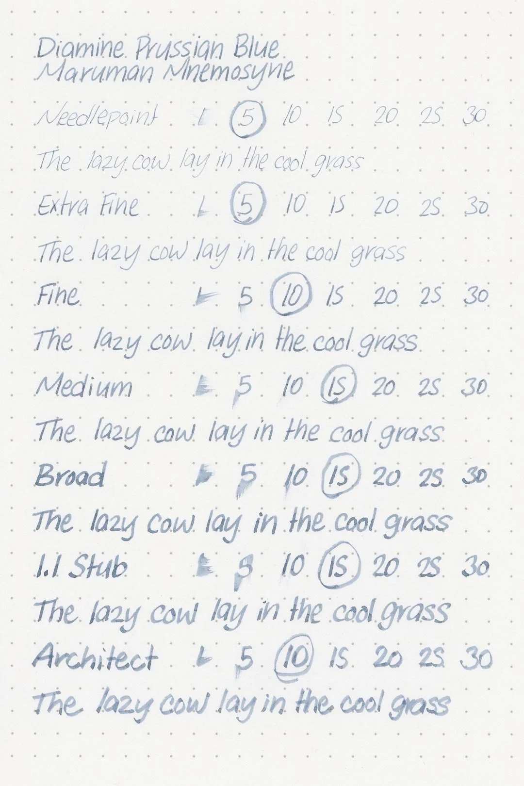
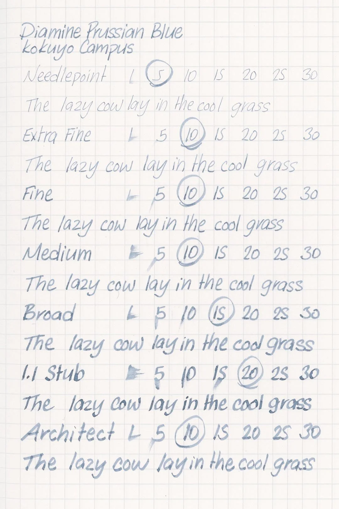
The dry times are also excellent. The needlepoint to medium nibs mostly dried within 10 seconds, while the larger nib sizes trailed only slightly behind, with dry times in the 10-20 second range.
When exposed to water, Prussian Blue clouds over slightly, but while the color mostly washes away, there are strong purple-grey impressions left over of whatever was written that are easily legible.
More Pages


Performance in the Pen | Cleaning
Prussian Blue has a dry flow and below-average lubrication. The ink still works, and I was able to keep up surprisingly well during my extended writing tests without any noticeable drops in flow; however, I don’t think it’s very comfortable to write with. I didn’t experience any hard starting or skipping during my tests, but I did notice the tendency for letters to thin out slightly. While I think this ink would be okay in pens with broader nibs and high-flowing feeds to counteract the dryness, I don’t think it’s a great choice with finer or more feedback-y nibs.
Prussian Blue flushed out of my test pen and nib units extremely quickly (in the first flush) and didn’t leave any traces of color or residue in the barrel of the pen or nib units.
Writing Samples
Written on 52 gsm Tomoe River paper (white, 6mm ruling) with a broad nib.
Written on Midori MD paper (cream, 7mm ruling), with a broad nib.
Written on 52 gsm Tomoe River paper (white) with an architect nib.
Written on Midori MD paper (cream, 7mm ruling) with an architect nib.
Performance in a pen: 7.5/10
Performance on paper: 10/10
Color saturation: 5.5/10
Sheening: 1/10
Shading: 6/10
Dry time: 9/10
Water resistance: 4/10
Ease of cleaning: 10/10
Shimmer: None
My Personal Thoughts…
What is Prussian Blue?
Simply put, it’s the result of a chemical reaction between ferric salts (iron) and cyanide ions. A fantastic example of Prussian Blue would be old cyanotype blueprints! Blueprints are essentially copies before copiers were a thing: Ammonium iron citrate and potassium ferricyanide are mixed into a highly photosensitive solution that is then applied to paper and exposed to ultraviolet light, permanently coloring the paper what we call Prussian Blue (as well as leaving a negative image of whatever was in front of the paper).
The reason all of this information is important is that it means that Prussian Blue is a very distinct color; while there might be some slight variation in the color you get, it’s still going to be easily identifiable as Prussian Blue. Thankfully, I used to work in the field, and I had some old cyanotype blueprints to compare (visible in the images below), and if you ask me, Diamine’s iteration simply isn’t cutting it (and honestly, neither is TWSBI’s).
Does that mean this is a bad color? No, not really. I think it’s a beautiful color. Especially in a large nib that can show off its great shading characteristics. I’m a fan of the color, and early on in my fountain pen days, I loved the ink. Revisiting it, however, has been bittersweet, and I’m sad to say it. I had a hard time finding it enjoyable to write with. I would consider myself pretty tolerant of dry inks, especially when the color is worth it, but Prussian Blue, to me, is just too dry and too unlubricated. If there’s even the slightest imperfection in your nib, you’ll feel it — I sure did. Usually, doing the writing samples for these reviews is the most enjoyable part. Not this time. I don’t love Prussian Blue anymore. But when I go back and look at the photos, it’s not hard to understand why someone would either.
Written on 52 gsm Tomoe River paper with a TWSBI Diamond 580 ALR in “Prussian Blue” (broad nib).
More images/info:
Featured in the photography and writing samples:
Diamine Prussian Blue
TWSBI Diamond 580 ALR “Prussian Blue”, broad nib, architect nib custom grind
52 gsm B6 Tomoe River notebook by Sterling Ink
Midori MD B6 Slim lined notebook (Amazon)
Midori MD A6 lined notebook (Amazon)
Jenika’s Journals pocket notebook covers
Tim Holtz mini bulldog clips (Amazon)
Karas Pen Co. Bolt
Pentel Graphgear 1000 mechanical pencil
Current text: The Picture of Dorian Gray by Oscar Wilde (Amazon)
Tools and materials used in the writing samples:
A TWSBI Diamond 580 AL with 7 nib units, including a Needlepoint grind, EF, F, M, B, 1.1mm stub, and an Architect grind. All nibs are tuned to perform at the same medium wetness.
A Rhodia No16 A5 DotPad
A Leuchtturm1917 A5 Notebook
A Midori MD A5 Notebook
A 52 gsm A5 Tomoe River Notebook
A Maruman Mnemosyne A5 Spiral Notebook
A Kokuyo Campus A5 Notebook