Ferris Wheel Press The Fluttering Heart
Ink Review #55


*Please note that the scan is the accurate representation of this color.
This is Ferris Wheel Press’ 2023 Limited Edition Ink
Overview
The Color and Properties
The Fluttering Heart is a shimmering ink. The base color is a pale pink with what Ferris Wheel Press calls a “champagne sparkle,” and from the looks of it, that’s not a bad way to describe it. When I first swatched this ink, I initially thought the particulates were silver, but in some lighting, it gives off a hint of pale gold. There’s some basic light shading with this ink, with a crisp cut between light and dark tones.
The Fluttering Heart may be too faint to be easily visible on most papers, especially on graph paper, where the printed grid easily overpowers the ink’s color. It may also be difficult to see if a darker ink is used on an adjacent page.
Ink splat
Ink droplets
Chromatography
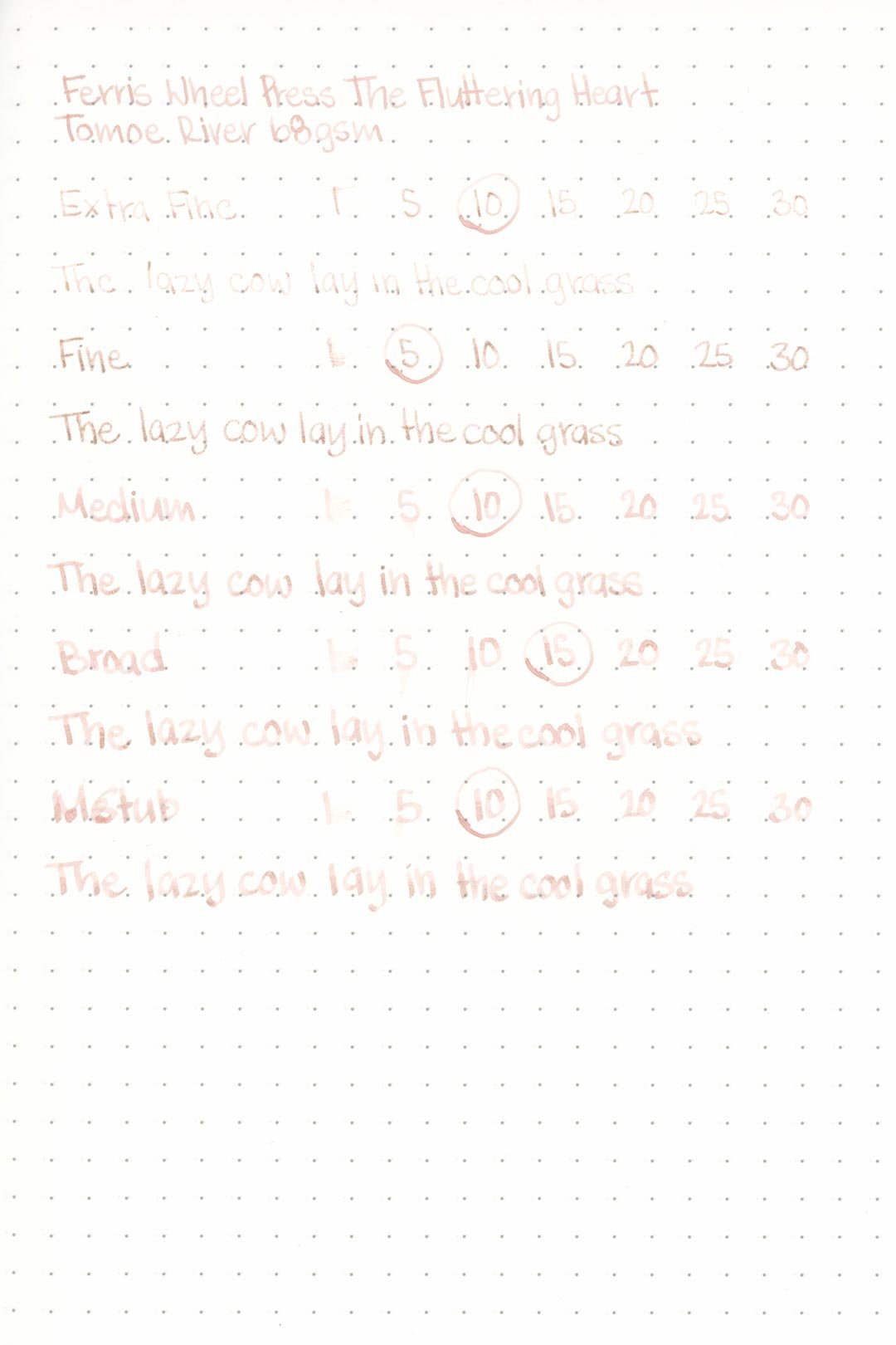
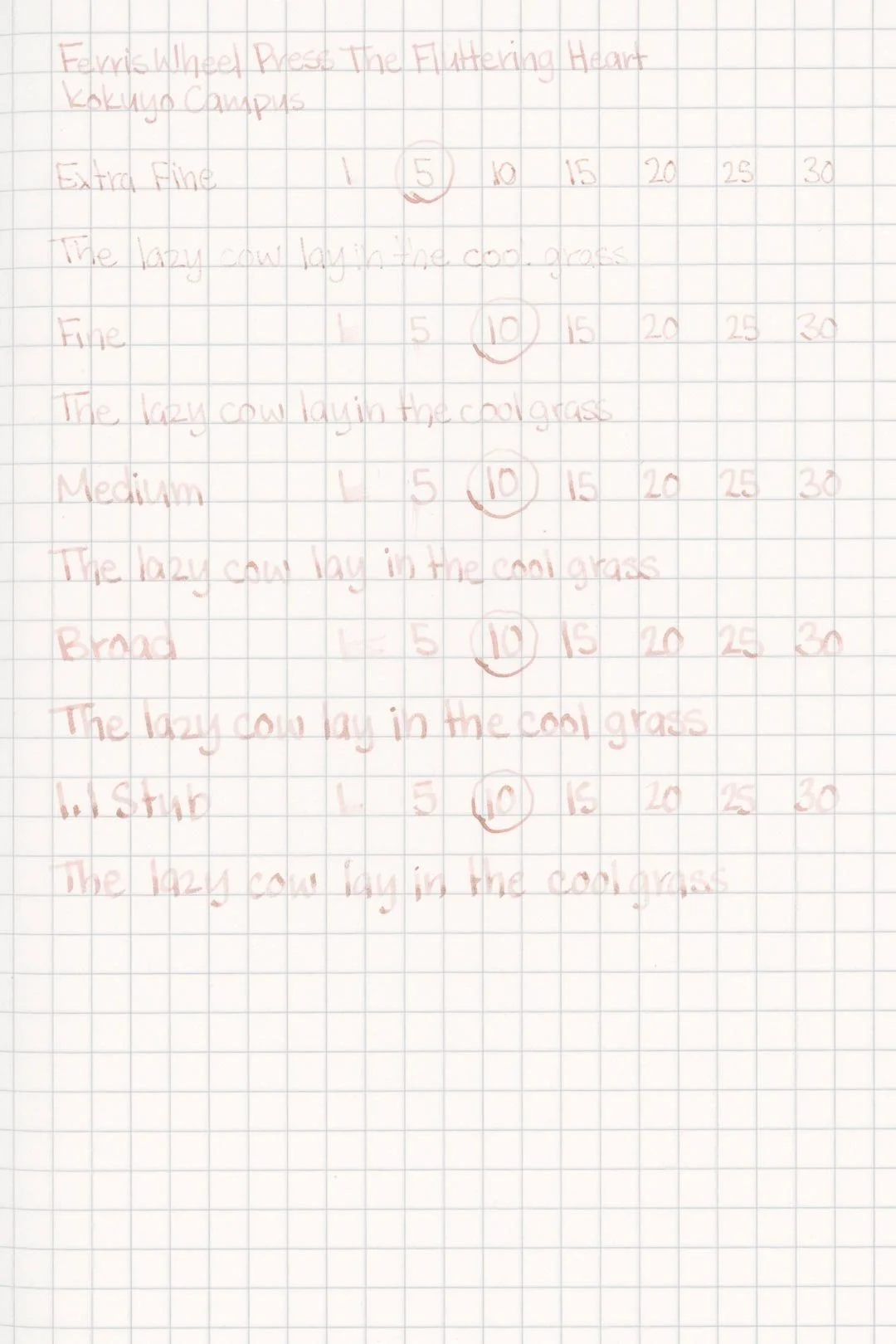
Performance on Paper | Dry Times | Water Resistance
The Fluttering Heart is well-behaved: I didn’t experience any visible feathering or bleed-through on any of the test papers. This ink should work well in most fountain pen-friendly papers.


The dry times were above average, with the large nibs often being dry within 15 seconds, and in some cases, they were even dry by the 10-second mark.
The water resistance was poor, and exposure to water washed most of the color away leaving behind faint shadows that are mostly illegible, especially in less than optimal lighting conditions.
More Pages


Performance in the Pen | Cleaning
Performance in the pen was unfortunately poor. The Fluttering Heart has an exceptionally dry flow — so much so that I had difficulties getting this ink to even flow into the test nibs when I was making the test pages. I also had difficulties writing with this ink without the constant distraction and discomfort of poor lubrication. I didn’t have any hard starts or stops with the larger nibs, but unsurprisingly, I ran into numerous clogs with the extra fine and fine nibs. I would say this ink would gain from being used in a wetter nib, but because the flow is so poor, you may still encounter mixed results. With that said, the shimmer distribution is at least good, and I didn’t have any issues getting a clean even coat of shimmer throughout all of my writing.
When cleaning the color washed out of the nib units easily, but there was a reflective haze left behind inside the pen, as well as around the piston crown. This is easily scrubbed out, but it does require the disassembly of the pen, or at least a way to reach the inside of the barrel so this can be removed.
Writing Samples
Performance in a pen: 5.5/10
Performance on paper: 10/10
Color saturation: 2.5/10
Sheening: 0/10
Shading: 5/10
Dry time: 8.5/10
Water resistance: 1/10
Ease of cleaning: 5/10
Shimmer: Champagne, Medium
My personal thoughts…
The Fluttering Heart was great in concept — a pale, romantic pink with a bright and elegant shimmer. It seemed great! I swatched it, and the color was certainly pale, but I didn’t mind it, and I loved the shimmer. My initial impressions had me excited to do this review. Unfortunately, my enthusiasm quickly fizzled out when I started writing with it. I’m fairly tolerant of inks with a dry flow, but not only was this ink dreadfully uncomfortable to write with, but it was borderline unusable. It didn't matter what nib I used or tried either. I even used it with a flex nib, but the flow was so poor that there was railroading at even the slightest flex. I really wanted to love this ink, but it turned out to be a major disappointment. I had a difficult time getting my hands on this ink when it initially came out, but I can confidently say that I wish I hadn’t gone through the trouble.
Written in a Leuchtturm1917 notebook with a Pelikan M205 (fine)
More images/info:
Tools and materials used in the writing samples:
A TWSBI Diamond 580 with 5 nib units, including an EF, F, M, B, and 1.1mm stub. All nibs are tuned to perform at the same wetness.
A Rhodia No16 A5 DotPad
A Leuchtturm1917 A5 Notebook
A Midori MD A5 Notebook
A 68 gsm A5 Tomoe River Notebook
A Maruman Mnemosyne A5 Spiral Notebook
A Kokuyo Campus A5 Notebook