Ferris Wheel Press Three Steamboats
Ink Review #38


*Please note that the scan is the accurate representation of this color.
Overview
The Color and Properties
With finer nibs, Three Steamboats shades with a soft gradient between light and medium shades of blue. As the nib size goes up (and depending on the flow) you may notice less of a gradient and more of a crisp cut between the two tones. If you have a wetter pen you might notice some darker blue edges around the letters, and you may even start to see some grey come through.
Ink splat
Ink droplets
Chromatography
Performance on Paper | Dry Times | Water Resistance
Three Steamboat’s performance was generally okay. I experienced some bleed-through on Kokuyo, which was surprising because the ink is pretty dry (but we’ll get to that later). I did notice with the larger nibs that you can see the paper breaking down as the ink dries (though I imagine that’s because the ink is light enough to be able to see it happening). It wasn’t just the Kokuyo either: I noticed it on the Rhodia too — especially looking at the swatch and ink splat. It never feathered, and I didn’t get bleed-through on any of the papers other than Kokuyo, but I honestly wonder if that’s just because the flow is so dry.


Rhodia
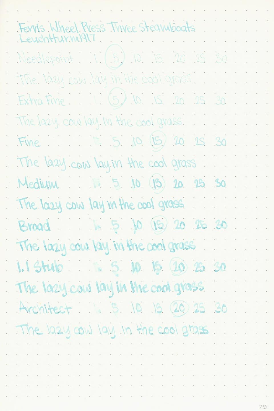

Leuchtturm1917
Speaking of which, that’s probably why the dry times were also good. Outside of Tomoe River and Leuchtturm, I didn’t experience any dry times that took more than 15 seconds at most.
From looking at the chromatography, I expected to see better water resistance. There is some slight but inconsistent color retention, and it leaves grey shadows behind where it didn’t wash away, but they’re almost too pale to read.
More Pages


Performance in the Pen | Cleaning
I didn’t experience any issues with the ink flowing out of the pen — no hard starts or stops, but the flow is just so dry and unlubricated. I don’t generally have anything against dry inks but this one can be unpleasant. The flow out of the architect nib was so poor that it was nearly as unreadable as the needlepoint.
Cleaning wasn’t difficult, but for such a light color I expected it to clean out faster. Still, it washes out with relative ease.
Writing Samples
Performance in a pen: 7.5/10
Performance on paper: 8/10
Color saturation: 3/10
Sheening: 0/10
Shading: 6/10
Dry time: 9/10
Water resistance: 2/10
Ease of cleaning: 9/10
Shimmer: None
My personal thoughts…
I really wanted this ink to be great. It’s a pleasant color, I’ll give it that. It’s a refreshing bright blue that pairs well with the nautical themes the artwork and name suggest. I think that it would fit in nicely as a spring or summer ink. Unfortunately, it’s already a light color that has a hard time contrasting against the paper, and that’s before the dry flow makes it appear even lighter. I’ve tried it in a few pens with varying levels of success. Wetter nibs will go a long way, but I’d suggest simply staying away from using any specialty nibs that might already be temperamental. I’d also suggest against using this ink on any of the cream papers: the contrast is even worse and it kills the brightness and vibrance that makes it such a cool, refreshing blue.
So what’s with the name? I did a lot of research in an attempt to find out what I could. I came up with nothing. I have no earthly idea why it’s called Three Steamboats. But I’ll have some fun with this.
What’s interesting is that in French, it doesn’t even say Three Steamboats — it says Le Bayou Bleu, which means The Blue Bayou. That makes some sense. Bayous are shallow, swampy water channels, and steamboats were an ideal choice for traversing them. Great, we have a connection. But why Blue Bayou? I’m not entirely sure, but, there’s a song called “Blue Bayou”. It’s a languid and wistful tune about wanting to return to a (better) place called Blue Bayou. Assuming there’s a connection here, the color now makes some sense. The light blue color certainly evokes a certain tranquility that also romanticizes something that isn’t generally known for being light blue: a bayou. Is that what Ferris Wheel Press was going for, though? Probably not, but until I get my hands on the actual lore, that’s going to be my interpretation.
Written on 52 gsm Tomoe River Paper with a medium (21k) Sailor Pro Gear Standard “Blue Cobra”
More images/info:
Tools and materials used in the writing samples:
A TWSBI Diamond 580 AL with 7 nib units, including a Needlepoint grind, EF, F, M, B, 1.1mm stub, and an Architect grind. All nibs are tuned to perform at the same medium wetness.
A Rhodia No16 A5 DotPad
A Leuchtturm1917 A5 Notebook
A Midori MD A5 Notebook
A 68 gsm A5 Tomoe River Notebook
A Maruman Mnemosyne A5 Spiral Notebook
A Kokuyo Campus A5 Notebook