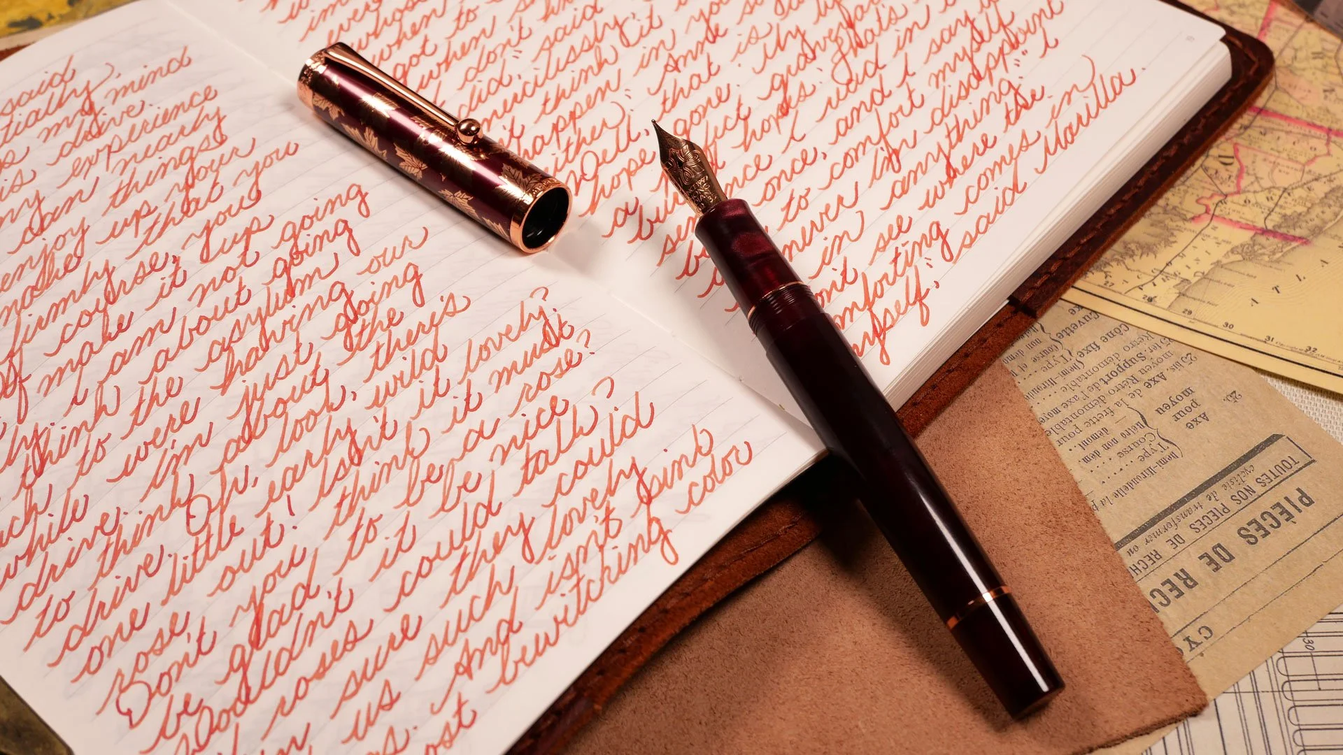
A Quick Look At The Hongdian N8S (And A Comparison With The Old N8)
Disclosure: This post contains Amazon affiliate links. If you click and make a purchase, I may earn a small commission.
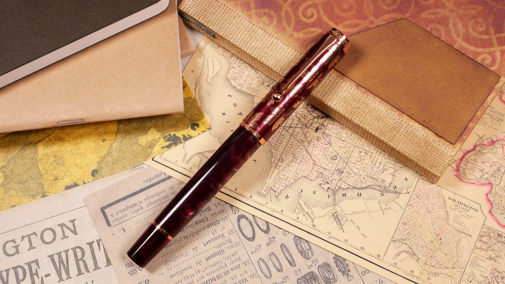
Today we’re taking a look at the new N8S fountain pen by Hongdian. It’s an update to the old N8 model with a few interesting changes. There are a lot of things I like about the new design, and since I have the old model on hand, we can take a direct look at both and compare them!
First Look | Comparisons
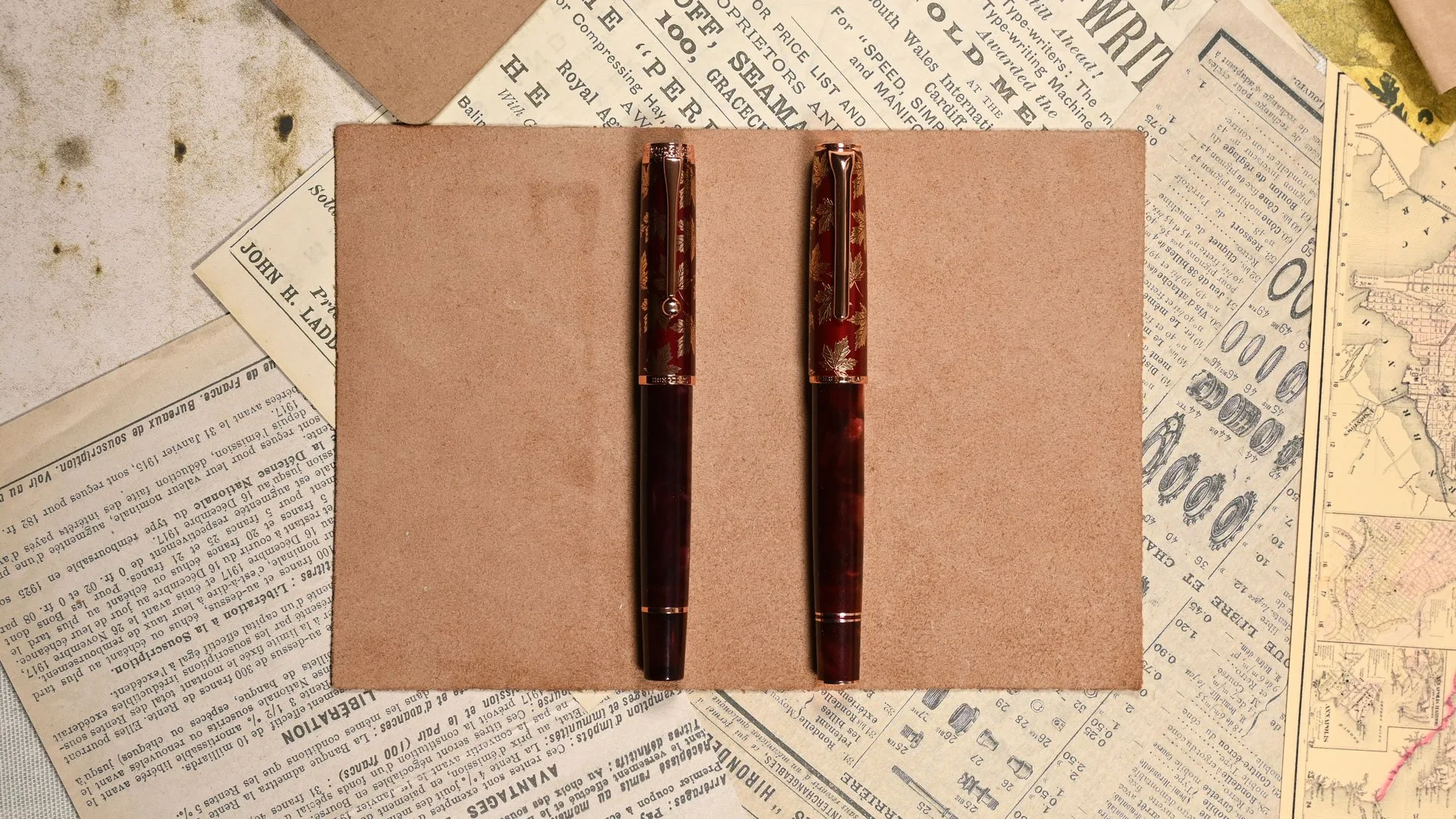
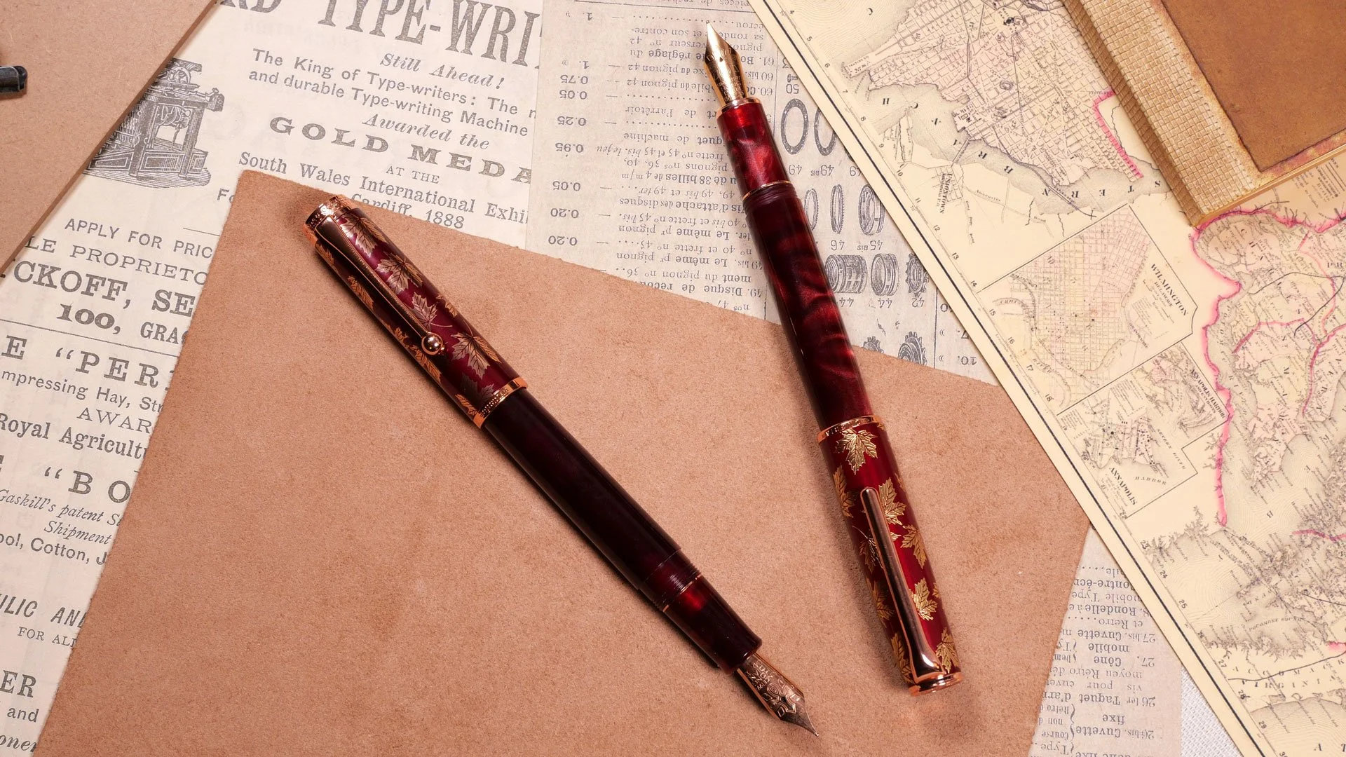
On the left, we have the new N8S and on the right, we have the old N8 model
Above, I have the two pens in the Maple Red color. Right away, you can see the pens are more or less the same size, but the color difference surprised me. When I opened the box, I assumed that the body of the pen was the same material as the old one, but when they’re side by side, it’s easy to see that the new N8S is darker overall. In some lighting, it even looks like it’s leaning towards purple. It’s also possible that it is the same material, and this is just variation between batches, but I think I prefer the brighter red of the old pen. Then again, the darker material matches the new cap better.
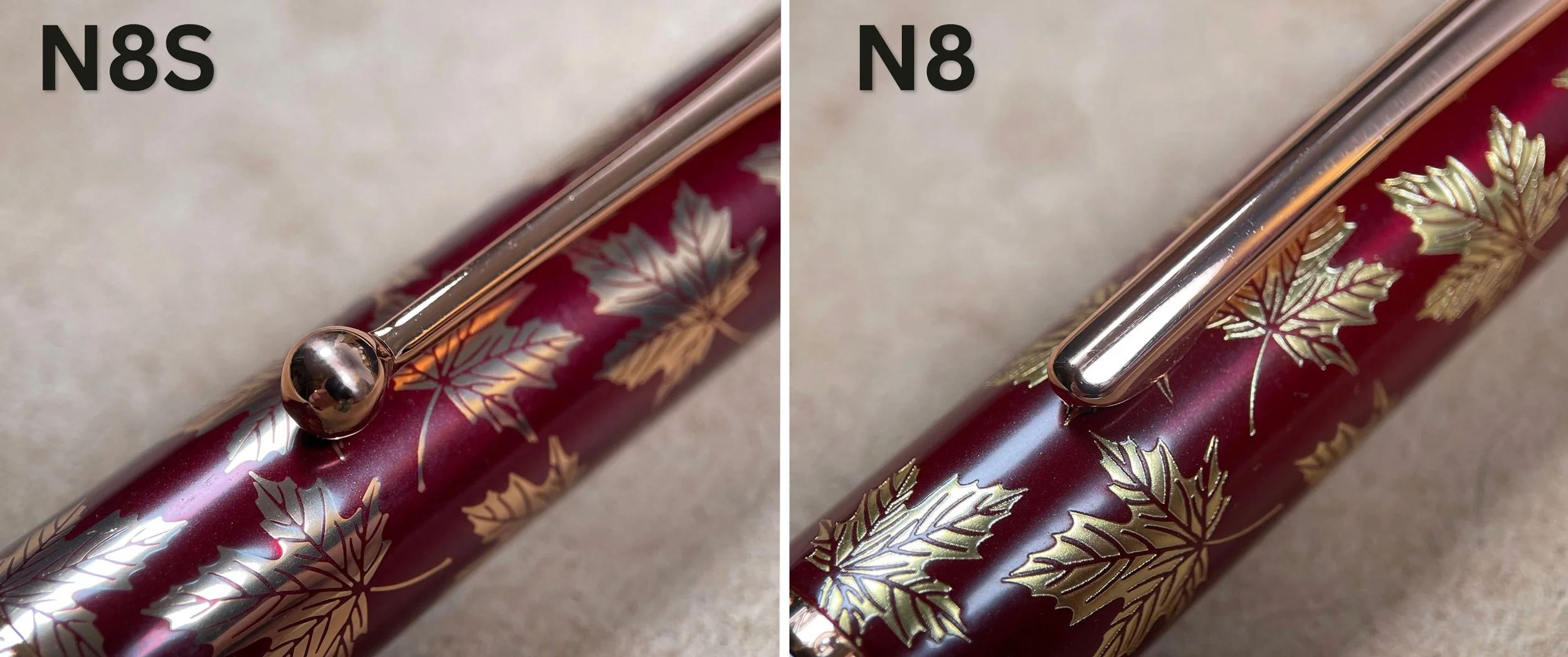
The most noticeable difference between the two pens is the new cap and clip. The cap is still painted metal, and the leaf design is exactly the same; however, it’s textured and 3-dimensional on the old N8. The design on the N8S is flush with the cap and also more reflective. Which one looks nicer will be down to personal preference, and I think both of them look nice, but I think the old one stands out more when you compare them side by side.
The clip on the new N8S is now a ball-end design compared to the flat one on the old N8, and I would consider this an improvement both functionally and aesthetically. The ball clip holds the pen securely, but it slides into the pocket more easily than the flat one. I also think the ball clip suits the design of the pen better overall.
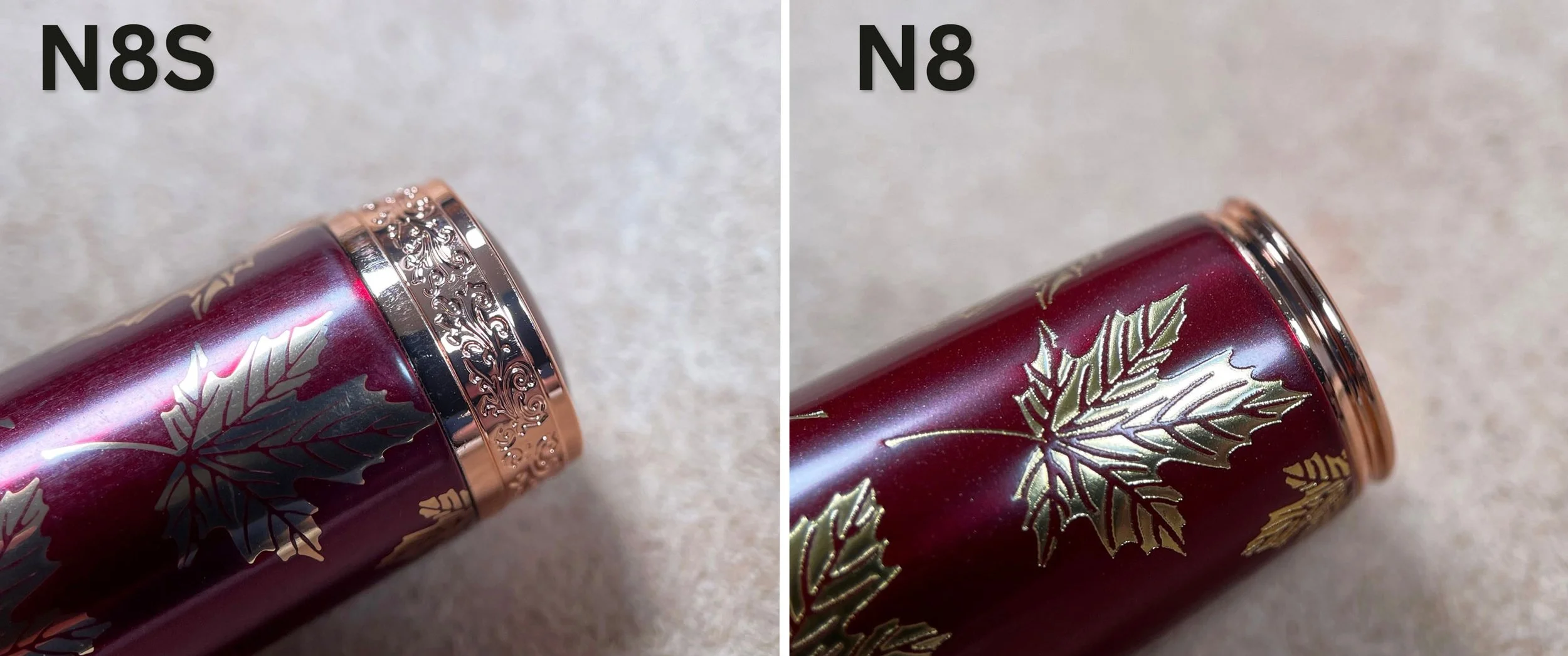
Another big improvement is the more substantial band around the finial. Compared to the small lip around the old pen, the N8S has a thicker etched band around it that makes a much bigger statement than the old one. While I don’t think it’s the biggest aesthetic upgrade on the new pen, It’s my favorite element of the new design, and to me, it completes the look.
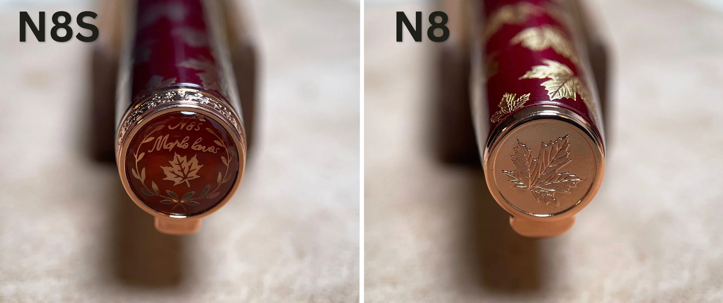
The biggest upgrade for me is the design on the finial. The original pen had the maple leaf design embossed at the end of the finial, and it looked nice enough, but it always bothered me that it wasn’t straight and turned what was supposed to be one of my favorite elements of the pen into something I never wanted to look at. On the new pen, the design is more substantial. Now it’s printed and recessed in the finial beneath a clear material (acrylic, I would assume). The new design seems to be perfectly aligned, and like the band around it, seems more well thought out than the original. With that said, the design says “N85 Maple leaves” on it; on closer inspection, it looks like it says N85 “Maplo Laves.” Somehow, this doesn’t bother me. At least, not nearly as much as the misaligned leaf on the old finial. If you ask me, it’s still a massive improvement, and kind of charming.
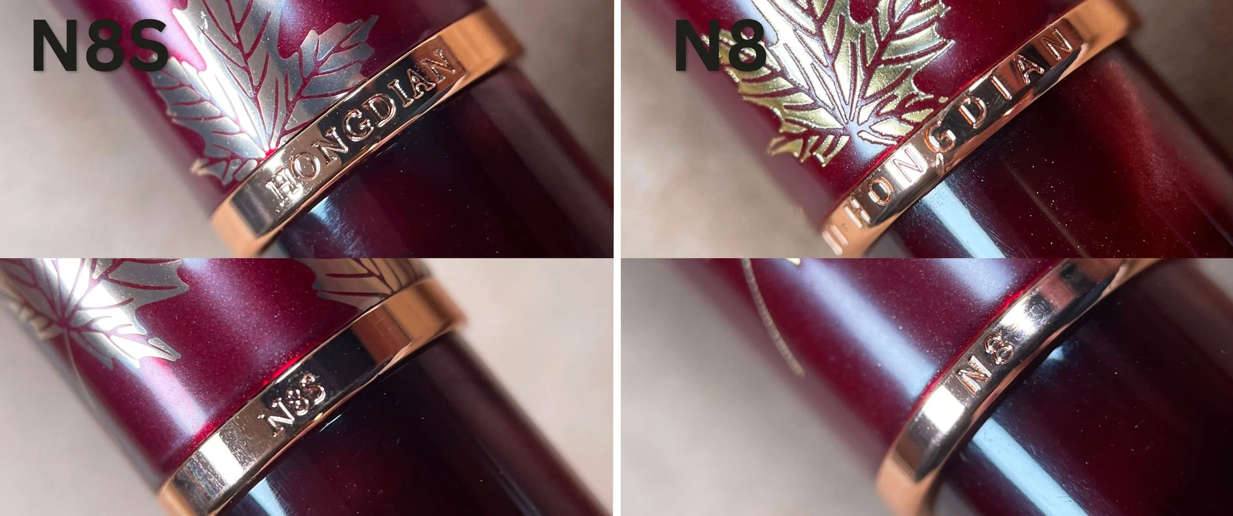
At the bottom of the cap, there’s a small change to the band. On the front, the band still says “Hongdian”, and the back side has the model of the pen, but the small changes make a big difference. The band is slightly wider, less rounded at the bottom, and frames the writing better. The font is nicer, more elegant, and less spaced out. I never noticed it before, but the cap band on my old N8 has quite the imperfection on it right above and below the G in “Hongdian”.
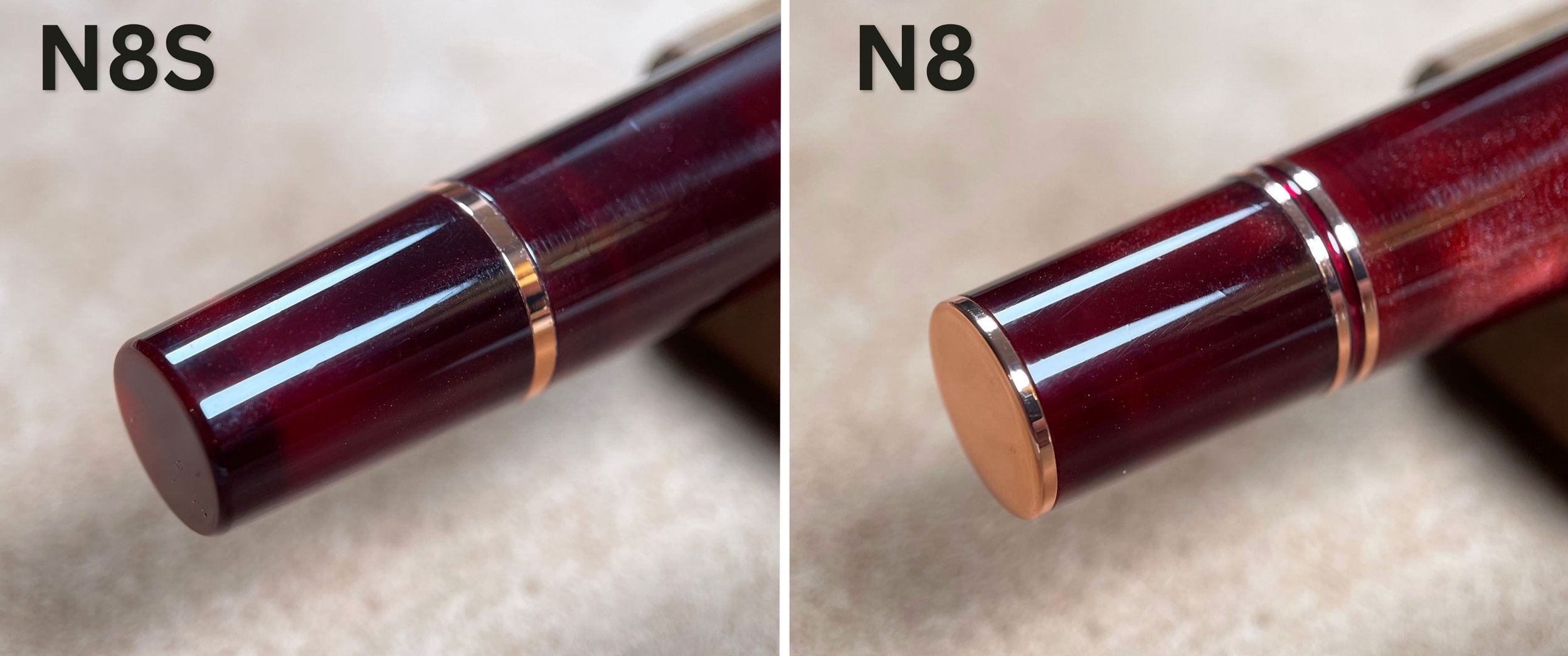
Another small change is the bottom band and finial of the pen. The new pen now has one band instead of two, and no longer has the bottom metal piece. The N8S is also slightly more tapered at the bottom. Again, it’s a small change, but it cleans up the design of the pen nicely, and I prefer it.
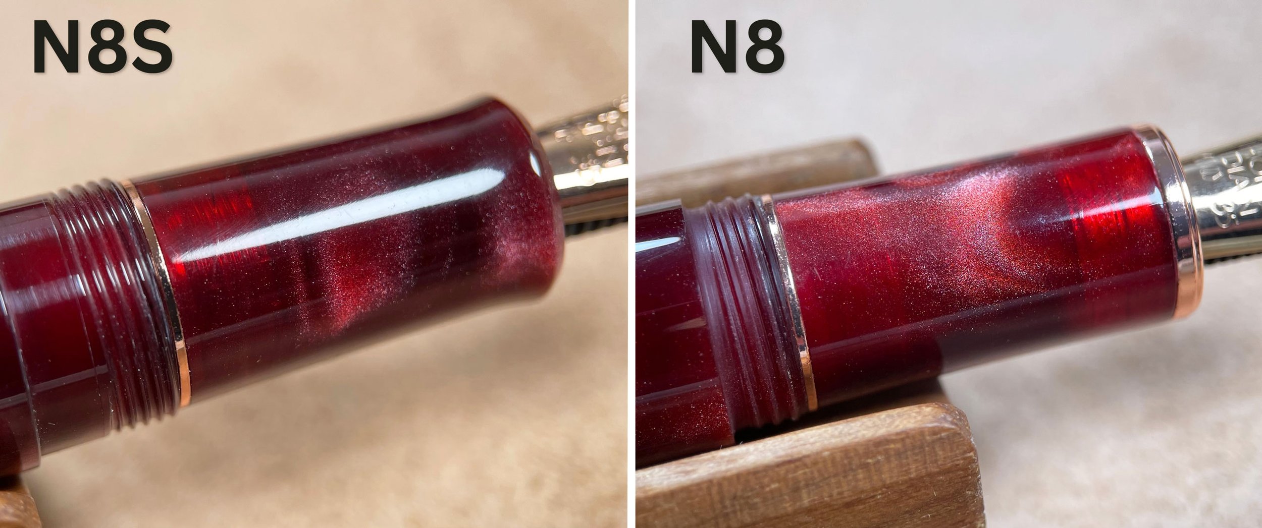
With the cap off, we find the grip section, and although it’s roughly the same size as the old pen (11.75mm), we can see a few major changes to the design. The biggest one is that the metal band at the end of the grip section is now gone. The band is replaced by a slight taper and lip at the end of the section, and (for me) this makes the new N8S significantly more comfortable to hold. I never thought the old N8 was necessarily uncomfortable, but this feels more ergonomic and secure in the hand, especially during long writing sessions. I also prefer not to have a band at the end of the grip section because it can be a common point of failure that causes leaks. Oils and acids from the hand often react with the metals, and they can age poorly over time.
At the back of the grip and the end of the barrel, we can see that the threads on the new N8S are not only finer, but there’s a step between the threads and the rest of the barrel. Functionally, it’s better. The old N8 always felt like it unscrewed a little too easily, but now the threads are smoother, the cap feels more secure, and the seal is better. It all feels a little tighter than before, and that’s a huge plus for the N8S.
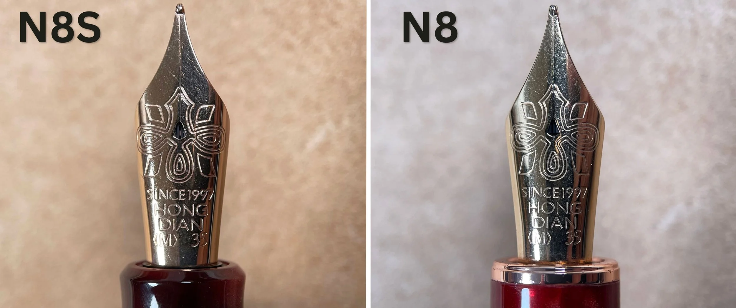
One of the changes to the new model is supposed to be the nib (something I’ll address further during the writing tests). I expected that there would be some difference in the look of the nib, but no, it looks exactly the same
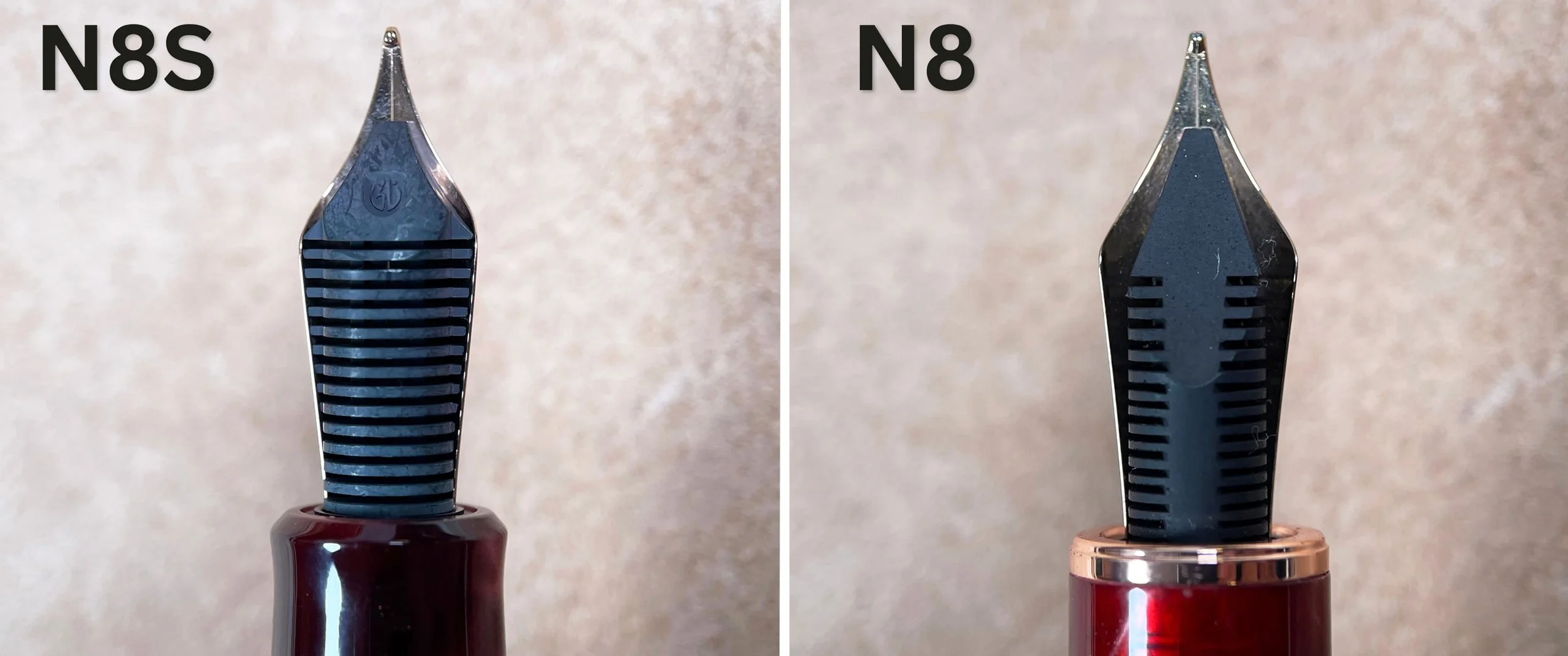
What isn’t the same, however, is the feed. While the old N8 was equipped with an ebonite feed, the new N8S has a redesigned plastic one. This may be considered a downgrade by many, but as long as the feed is well-designed and supplies the needed ink to the nib it’s paired with, it shouldn’t be a problem. The plastic feed will also have less need for adjustment and be more user-friendly overall. For a less expensive fountain pen, I consider this a plus.
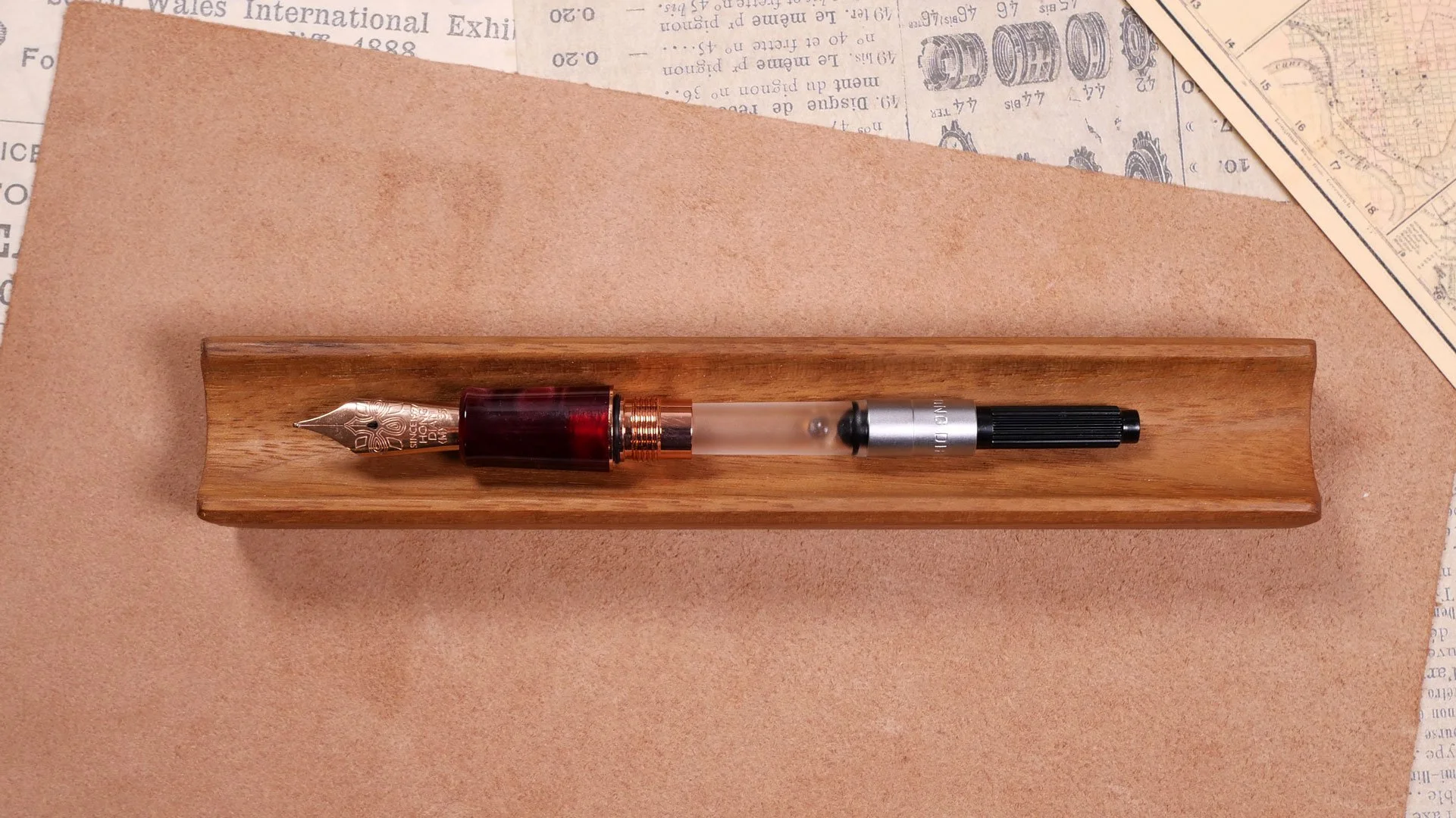
Inside the pen, the filling system is exactly the same, complete with the Hongdian converter with the agitator ball inside. Personally, I don’t care for the agitator ball and would prefer a standard international converter for convenience, but the Hongdian is functional, and I’m glad it came with one at all.
The Writing Experience
As I mentioned before, the new pen has a much more comfortable grip section. In the hand, unposted, the pen feels light and well balanced. Like the old pen, the N8S will also post, although the cap feels more secure on the new N8S (no doubt thanks to being more tapered at the end). With that said, posting the metal cap on the pen backweights the pen a lot. I’ve never been a fan of posting my pens, but in this case, it’s especially uncomfortable to do so.
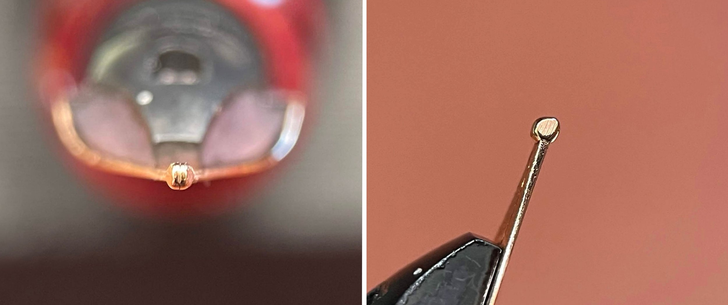
Above, you can see the nib is basically perfect. The tines look slightly tight to me, but this isn’t always a problem, especially if the nib is supposed to be softer. More interesting is the side profile of the nib! Compared to the round tipping material of the old pen, the nib on the N8S now has a chisel on the sides. That will make for a more unique writing experience with some minor line variation. I’m surprised to see it on a pen in this price range. Very cool!
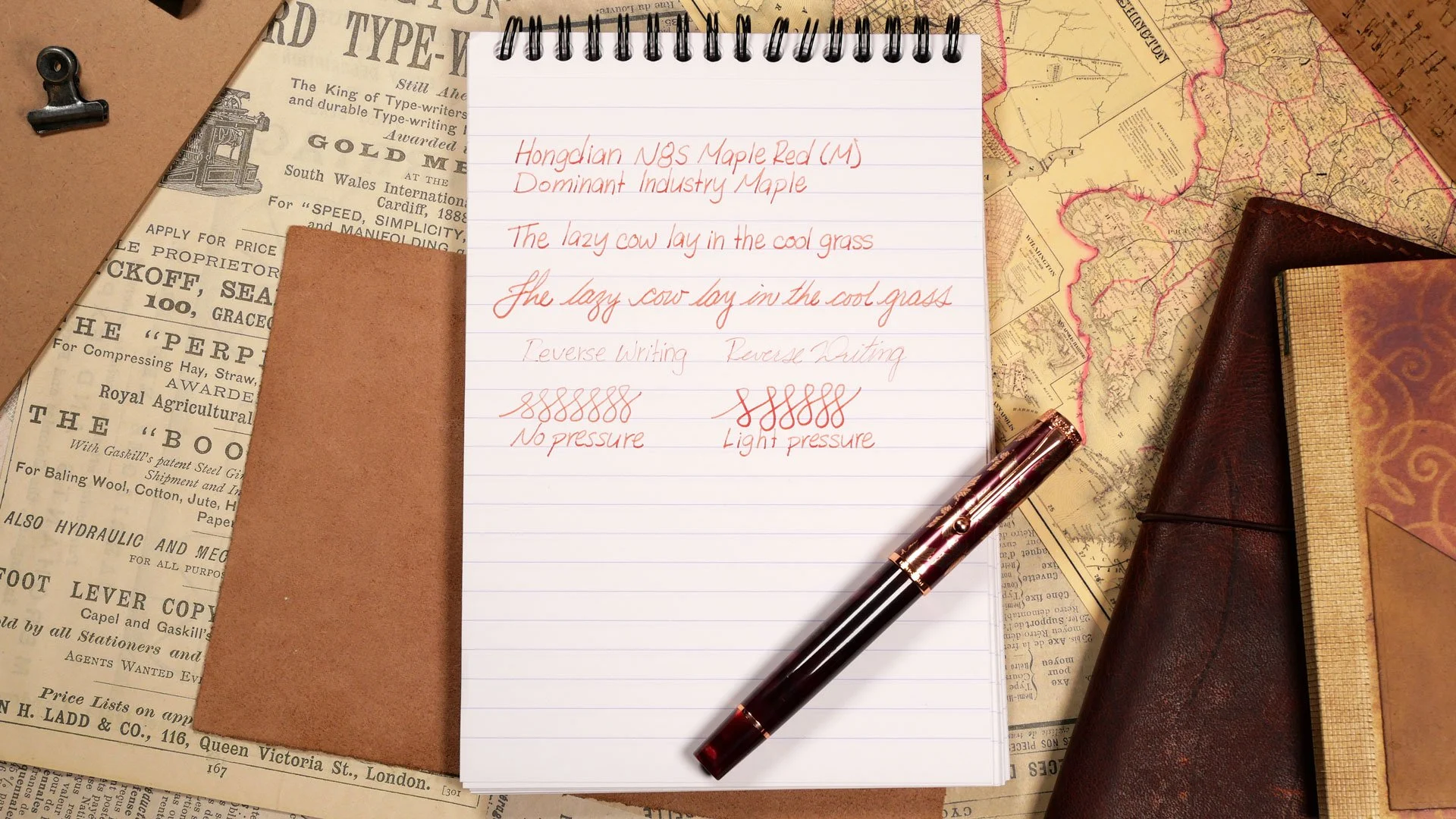
With the pen inked up, the writing experience is great. I got the pen with a medium nib, and I can confirm the new nib is softer than the old one (which was quite stiff). It’s not significantly softer to the point that I would call it flexy, or even bouncy, but it’s noticeable when you compare them side by side. I don’t necessarily have a preference between soft or stiff nibs, but I think most people would agree that this is an upgrade. I mentioned earlier that the tines on this pen looked tight, but it doesn’t matter because the softer nib gives easily and lets the ink flow without the need for extra pressure. Having said that, the nib responds nicely to a little extra pressure and will release a lot more ink.
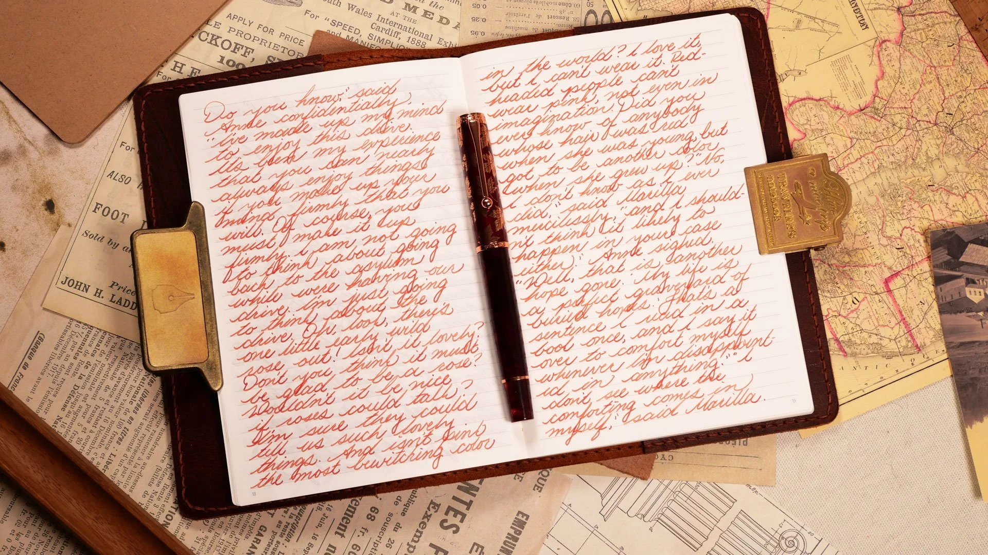
I thought the change to the shape of the nib would create some extra feedback, but surprisingly, it didn’t. Everything was smooth. The new feed didn’t seem to have any problems keeping up the flow either.
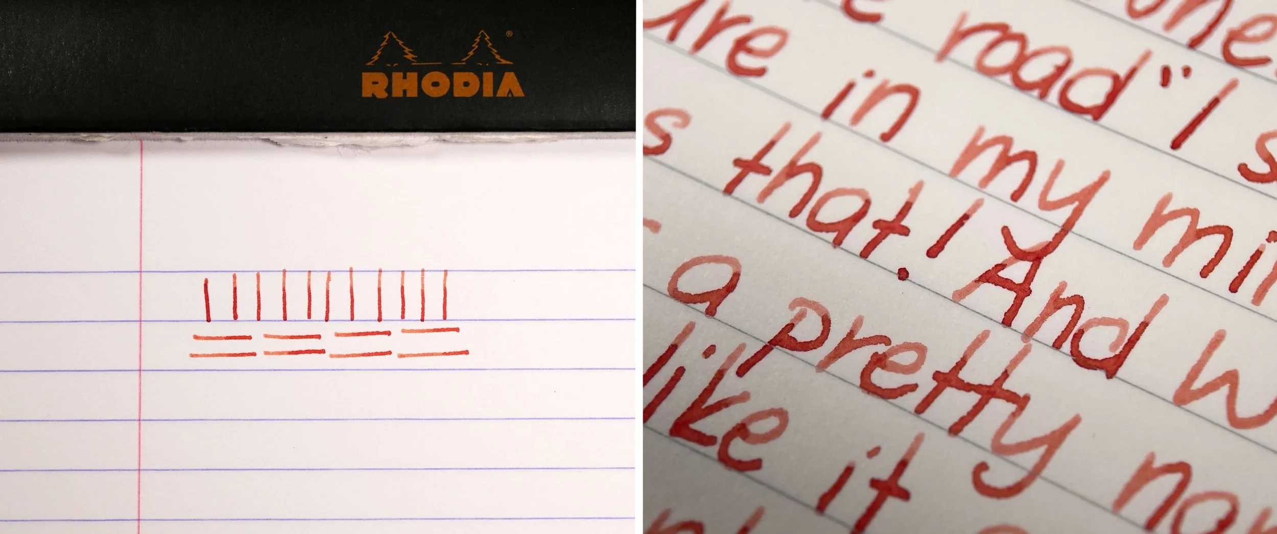
As far as line variation goes, there’s not quite as much as I would have expected based on the shape of the nib. The side strokes are just a little wider than the down strokes, but it’s fairly tame. It’s not as apparent in writing as I would have thought either. Whether that’s good or bad is down to preference, but I think for a standard medium nib, it’s just what it needs to be. Anyone looking for more line variation can opt for the Long Knife nib that’s now available with this pen.
The Verdict
When I saw that Hongdian had come out with a new updated N8S model, I wasn’t sure that the changes would be that significant, and I was hesitant to order it, especially because I already liked the original pen; it seemed a little unnecessary. The thing is, though, the update was necessary, and it’s not until you can see them side by side that you start to appreciate that the original pen seems a little crude in comparison. They dialed back a lot of the overly decorative details around the body of the pen, while refining the main features around the cap. Every little change they made refined the pen in just the right way. It’s beautiful. The best way to put it is something I caught myself saying aloud: It’s way better.