Waterman Serenity Blue
Ink Review # 1


*Please note that the scan is the accurate representation of this color.
Disclosure: This post contains affiliate links. If you click and make a purchase, I may earn a small commission.
Overview
The Color and Properties
Waterman Serenity Blue is a medium blue that offers some light shading. It can appear slightly darker where the ink pools, but the color saturation is high, and it tends to make for a more solid line. Depending on the pen and paper you’re writing with, you might notice a gentle red sheen, and in some cases, this might give Serenity blue a slightly purple appearance. You might get some outlining with broader or wetter nibs as well, but it’s not enough for me to call this a sheening ink.
Ink Splat
Chromatography
Performance on paper | Dry Times | Water Resistance
Serenity Blue behaves quite well. During my tests, I didn’t experience any detectible feathering or bleed-through on any of the test pages. This ink should be safe on most fountain pen-friendly papers.
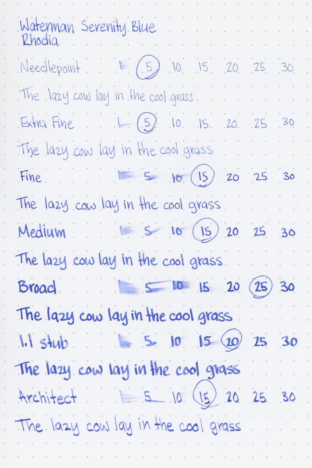

Rhodia


Leuchtturm1917
The dry times are mostly average, although I feel that the larger nib sizes take longer to dry than they should. They were particularly bad on the Leuchtturm page, where the broad through architect nibs just barely managed to dry by the 30-second mark.
There’s some water resistance, but it’s not great. The ink will hold up enough to just be readable if not hazy.
More Pages


Performance in the Pen | Cleaning
The ink performs as it should, writing with a consistent medium-wet flow across all the test nibs with minimal pressure. For an ink that has a higher flow, I expected it would feel more lubricated. It’s not bad by any means – the writing experience is still comfortable – but I anticipated more.
Cleaning was relatively easy, and it only took a few minutes for the water to run clear.
Writing Samples
Written on 52 gsm Tomoe River paper (white) with a medium nib
Written on 52 gsm Tomoe River paper (white) with a fine nib
Written on Midori MD (cream) paper with a medium nib
Sample taken on Leuchtturm1917 paper
Performance in a pen: 8.5/10
Performance on paper: 10/10
Color saturation: 6/10
Sheening: 2/10
Shading: 2/10
Dry time: 7.5/10
Water resistance: 3.5/10
Ease of cleaning: 8.5/10
Shimmer: None
My personal thoughts…
There are a lot of things that could be said about Waterman Serenity Blue. It’s perhaps the most popular color in Waterman’s entire line. It’s safe, and inoffensive, in more ways than one. I can’t imagine the color will offend very many people, and it almost certainly won’t offend many pens. It’s not a terrible color by any means, but it’s also not a very exciting one either. That’s something that I feel is multiplied by the feeling that it’s almost forced upon you if you go anywhere near a vintage pen. It’s the closest I can imagine an ink to being considered “essential”. I get it, it’s safe. It’s tried and true, but that doesn’t mean I have to like it. I use Serenity Blue myself in plenty of my vintage pens, but then, Serenity Blue isn’t exactly what I enjoy about using a vintage pen.
Written on 52gsm Tomoe River paper (white) with a Esterbrook J (medium nib)
More images/info:
Featured in the photography and writing samples:
Waterman Serenity Blue (Amazon)
Esterbrook J, 9668 medium nib
Sheaffer Snorkel Sentinel, fine nib
GoodInkPressions 52 gsm Tomoe River notebook
Midori B6 Slim lined notebook (Amazon)
Jenika’s Journals Blue Pueblo Leather B6 Slim notebook cover
Traveler’s Company brass clip (Amazon)
Nakabayashi Hikigiri Slim scissors (Amazon)
Tim Holtz card file (Amazon)
Theory 11 Blue Tycoon playing cards (Amazon)
Current text: The Picture of Dorian Gray by Oscar Wilde (Amazon)
Tools and materials used in the writing samples:
A TWSBI Diamond 580 AL with 7 nib units, including a Needlepoint grind, EF, F, M, B, 1.1mm stub, and an Architect grind. All nibs are tuned to perform at the same medium wetness.
A Rhodia No16 A5 DotPad
A Leuchtturm1917 A5 Notebook
A Midori MD A5 Notebook
A 68 gsm A5 Tomoe River Notebook
A Maruman Mnemosyne A5 Spiral Notebook
A Kokuyo Campus A5 Notebook