Wearingeul 20,000 Leagues Under The Sea
Ink Review #138


*Please note that the scan is the accurate representation of this color.
Disclosure: This ink was sent to me by Wearingeul for the purpose of review. This in no way impacts my review, and as always, all of my thoughts and opinions are my own. This post also contains affiliate links. If you click and make a purchase, I may earn a small commission.
Overview
The Color and Properties
Wearingeul 20,000 Leagues Under the Sea is a shimmering ink. The base color is a vibrant blue that shades with a soft cut between light and deeper tones in both print and cursive. There is a minor red sheen as well that’s mostly noticeable in large swatches. It can be seen in writing around the edges of letters and shaded areas, especially in print. To my eyes, however, paired with the base color of the ink, it looks more purple than red.
The shimmer is golden and bright (although, over the base color, it sometimes looks like it has a slightly greenish tinge). While it’s not overly shimmery, there’s enough of it to be easy to see in any lighting.
Ink Splat
Ink Droplets
Chromatography
Performance on Paper | Dry Times | Water Resistance
20,000 Leagues Under the Sea is mostly well-behaved, and I didn’t notice any bleeding or feathering on most of my test sheets (there was a minor spot of bleedthrough on Kokuyo). In the writing samples, however, I did occasionally have some minor feathering on the Tomoe River paper when lifting off to agitate the shimmer in the pen. Still, the ink should be fine on most fountain pen-friendly papers under normal writing conditions.


Rhodia


Leuchtturm1917
The dry times are average, with the large nib sizes often drying between 15 and 25 seconds and 10-15 seconds with the fine nibs (although they were surprisingly low on Rhodia paper).
There’s unfortunately not much in the way of water resistance, and water exposure quickly washes away most of the color. There were some faint shadows left behind, but they’re not the easiest to see. The irony is not lost on me.
More Pages


Performance in the Pen | Cleaning
20,000 Leagues Under the Sea has a medium flow, and it’s smooth enough for an average but comfortable writing experience, especially regarding not feeling sandy from the particulates in the ink. The ink requires some agitation to keep the shimmer flowing consistently, and something I noticed while doing that is how quickly the ink seems to saturate/darken in the nib when lifting off, making the ink darker for a few words before returning to normal. It’s not an issue, but it does give the ink a more dynamic look.
I had a single clog when I began testing this ink with the broad nib; however, it cleared easily, and there were no further issues. None of the other nibs had any hard starts, skips, or clogs, and the ink seemed to handle fast writing well.
I was initially concerned that there may be some staining based on the color, but thankfully the ink cleaned out of the pen and nib units in just 2 soaks and flushes, leaving the pen crystal clear of any stains. Unfortunately, there were still the typical rings of shimmer left behind in the pen.
Writing Samples
Written on 52 gsm Tomoe River paper (white, 5mm ruling) with a medium nib.
Written on Midori MD paper (cream, 7mm ruling) with a medium nib.
Performance in a pen: 7.5/10
Performance on paper: 9/10
Color saturation: 7/10
Sheening: 2/10
Shading: 5/10
Dry time: 7.5/10
Water resistance: 1/10
Ease of cleaning: 6.5/10
Shimmer: Medium, Golden
My personal thoughts (and spoilers)...
Sometimes you have an ink such as this one, and you don’t have to take more than one look at it to see just how well it captures its source of inspiration. It’s just so easy to see right away the wide range of scenes in the book that could have influenced it. I can see the endless ocean, illuminated by the powerful lights of the Nautilus, the underwater forests and coral reefs, and the glittering treasures at the bottom of Vigo Bay. I could go on, but it’s already evident that this is the perfect ink to complement Jules Verne’s iconic novel. Even if you aren’t interested in the ink for its namesake novel, it’s still a beautiful and well-performing ink, and I highly recommend it.
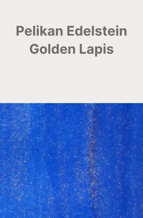
As a bonus, I think it would make a great alternative to Pelikan’s Golden Lapis! It’s not exactly the same and not quite as shimmery, but I couldn’t help but immediately notice the similarities.
Written in a 52 gsm Tomoe River notebook with a Nahvalur Original fountain pen (medium nib)
More images/info:
Featured in the photography and writing samples:
Wearingeul 20,000 Leagues Under the Sea
Retro51 Tornado Big Shot Nautilus (Amazon)
Retro51 Nautilus Pen Holder
GoodInkPressions A5 52gsm Tomoe River notebook
Midori B6 Slim lined notebook (Amazon)
Wearingeul Reservoir A5 grid notebook
Rohrer & Klinger glass dip pen
Dominant Industry Ink Muddler
Traveler’s Company brass clip (Amazon)
Tim Holtz mini bulldog clips (Amazon)
Current text: 20,000 Leagues Under the Sea by Jules Verne (Amazon)
Comparisons:

Tools and materials used in the writing samples:
A TWSBI Diamond 580 with 5 nib units, including an EF, F, M, B, and 1.1mm stub. All nibs are tuned to perform at the same wetness.
A Rhodia No16 A5 DotPad
A Leuchtturm1917 A5 Notebook
A Midori MD A5 Notebook
A 52 gsm A5 Tomoe River Notebook
A Maruman Mnemosyne A5 Spiral Notebook
A Kokuyo Campus A5 Notebook