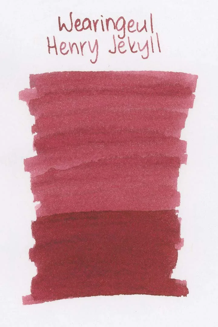
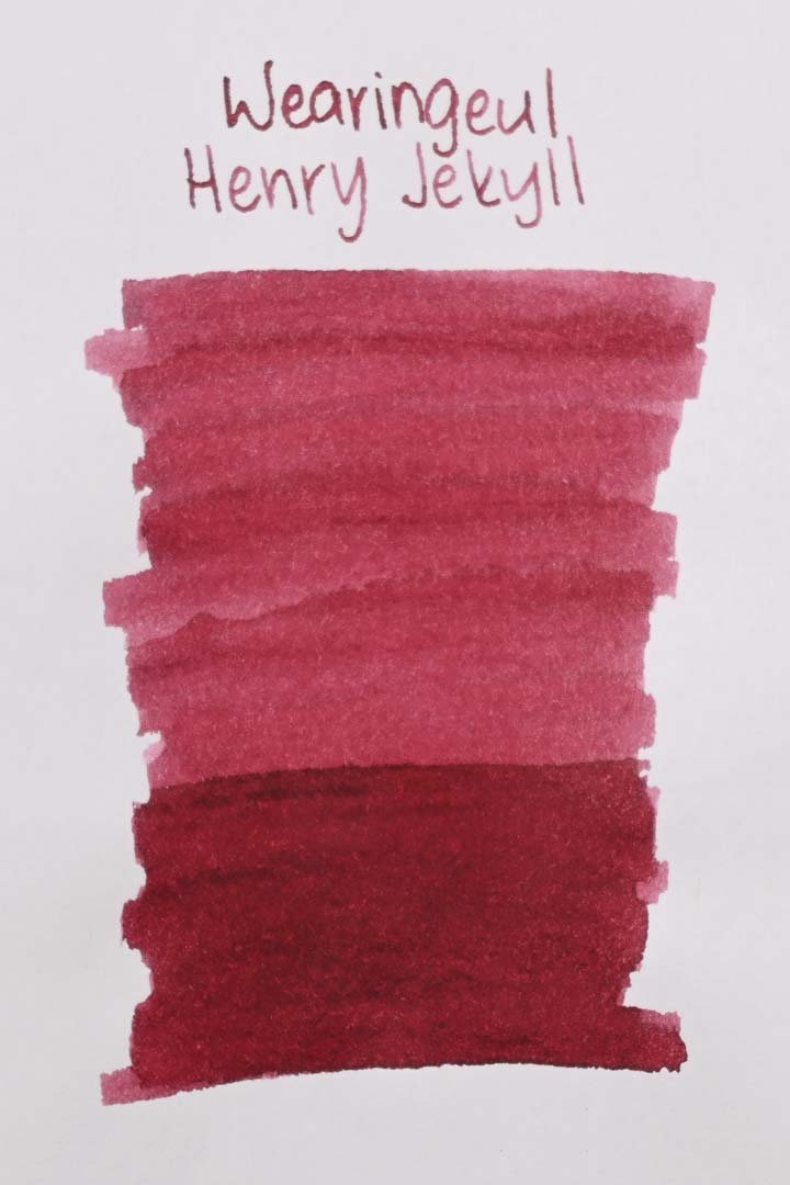
Wearingeul Henry Jekyll
Ink Review #160
*Please note that the scan is the accurate representation of this color.
Disclosure: This ink was sent to me by Wearingeul for the purpose of review. This in no way impacts my review, and as always, all of my thoughts and opinions are my own. This post also contains affiliate links. If you click and make a purchase, I may earn a small commission.
Overview
The Color and Properties
Wearingeul Henry Jekyll is a rosey pink ink with heavy red undertones. The ink shades with a crisp cut when writing in print and a soft cut when writing in cursive between its lighter pink and deeper reddish tones where the ink pools. There’s also a very slight yellow sheen that can be rarely seen around the edges of shaded areas. This is more easily visible on white paper.
Ink Splat
Ink Droplets
Chromatography
Performance on Paper | Dry Times | Water Resistance
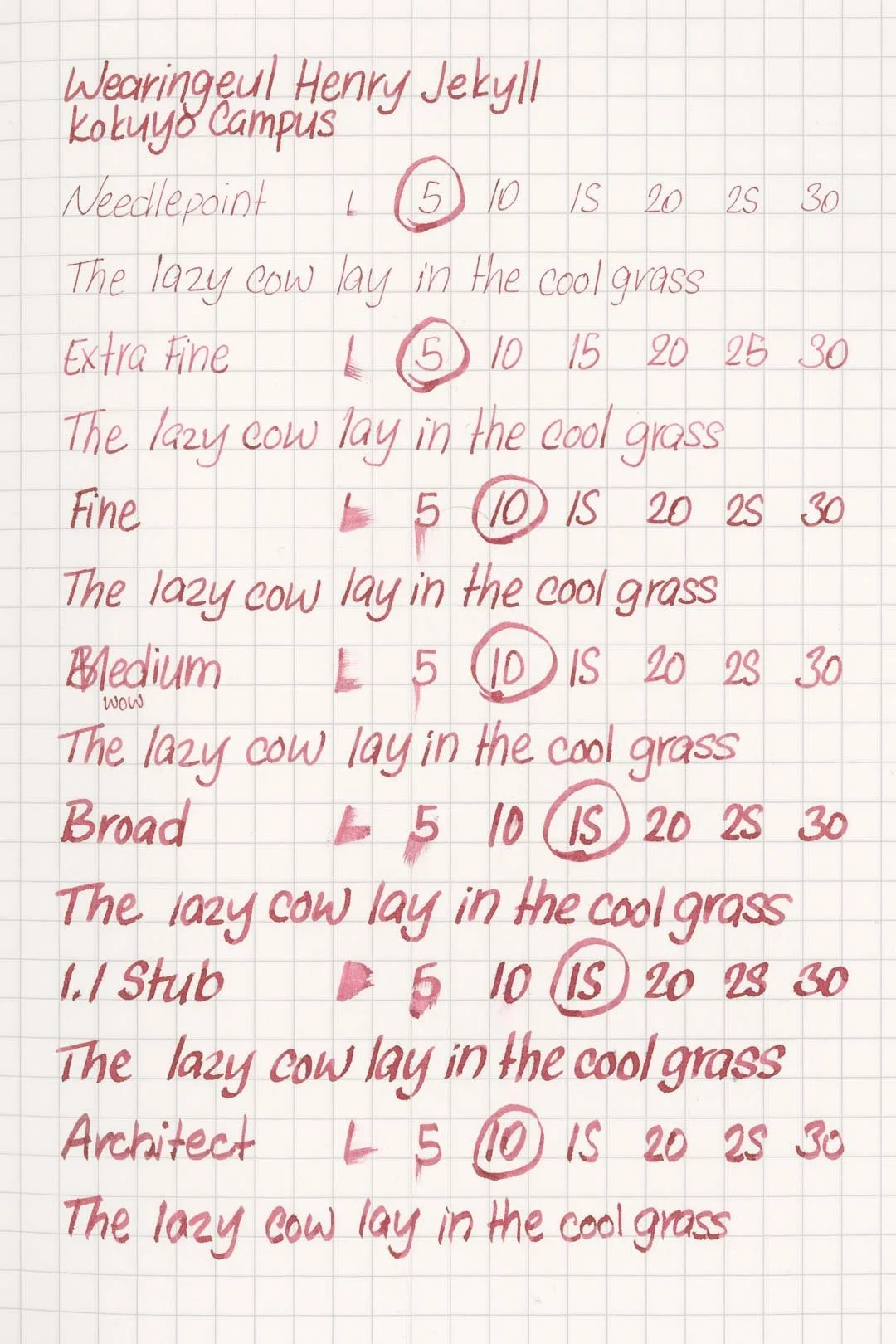
Henry Jekyll is mostly well-behaved, although I was surprised to see there was a lot of feathering in the ink droplets. This didn’t seem to be an issue in writing except on the Kokuyo sheet, where there was also minor bleeding and feathering. This ink should be fine on most fountain pen-friendly papers, but it may be susceptible to slight feathering when used with wetter writing pens.

Rhodia
Leuchtturm1917
The dry times are average, mostly drying between 15-25 seconds with the larger nib sizes and 10-20 seconds with the finer nibs. With that said, the dry times lacked consistency between papers, and the ink also seems to be mildly prone to smudging from residual hand moisture.
When exposed to water, the color quickly clouds over, but there are dark purple shadows left over that are easily readable, though messy.
More Pages

Performance in the Pen | Cleaning
Henry Jekyll has a very dry flow and poor lubrication. With that said, the ink performed better than expected. Despite the dry flow, the ink was able to keep up in the extended writing without any noticeable drops in flow. I had some minor dry starts with the wider nib sizes, but otherwise, the ink performed well enough without any stopping or skipping. As for the writing experience, it wasn’t great. The finer nib sizes are serviceable, but when using the broad nib for my writing sample, the dryness was nearly unbearable.
I half wonder if the dryness was an intentional choice on their part, and was perhaps needed so it would work correctly with their conversion solution that was originally intended to transform their Henry Jekyll ink into the Edward Hyde ink. Wearingeul also sent me their flow enhancer, and I’ll be testing that below.
The cleaning experience was mostly easy, and the color washed out of the pen and nib units quickly with a single soak and flush cycle. However, there was some remaining residue left over in the pen that wasn’t able to be cleaned with just flushing. This isn’t terribly difficult to clean with the use of a twisted-up paper towel, but it could prove more difficult to clean out in some pens.
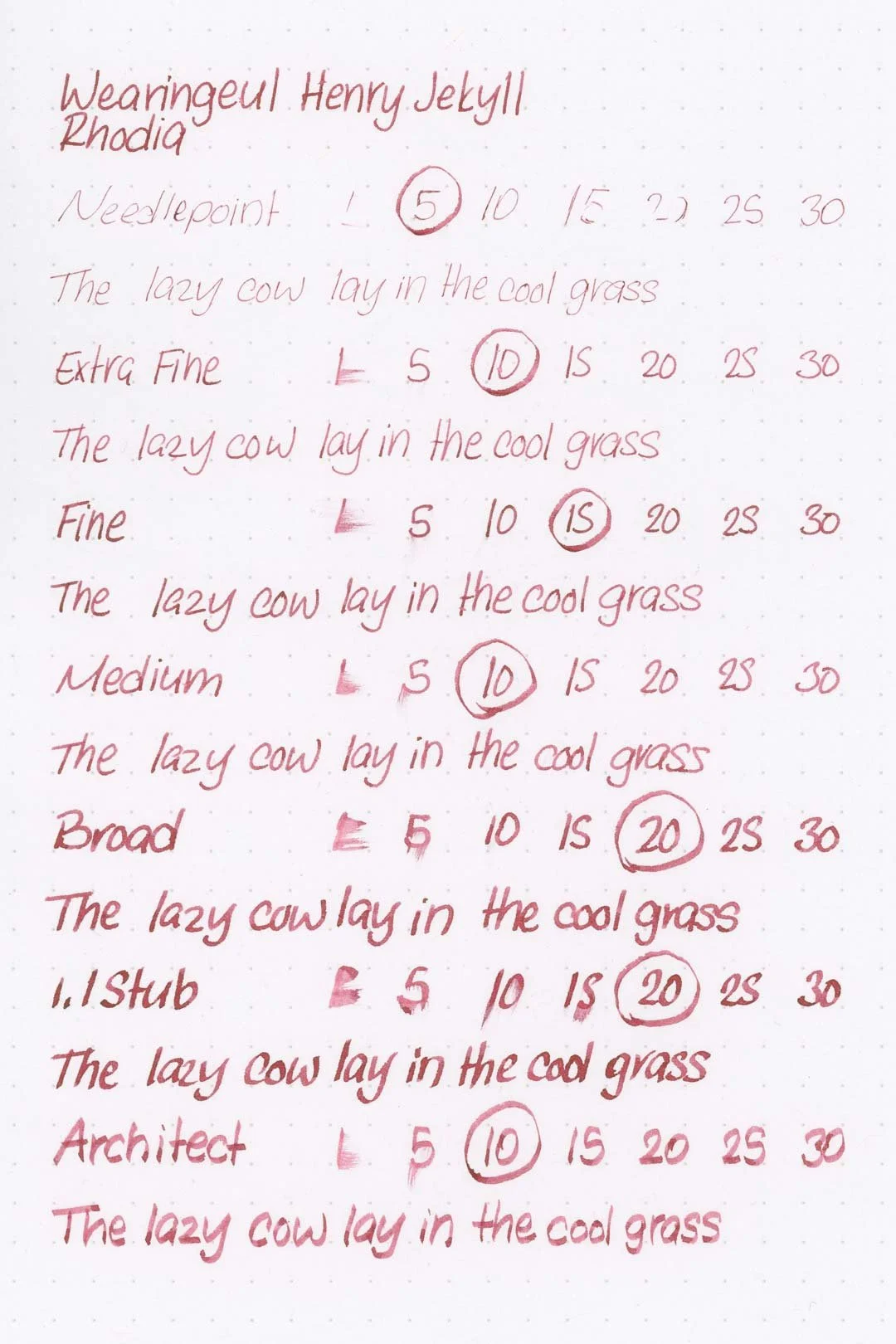
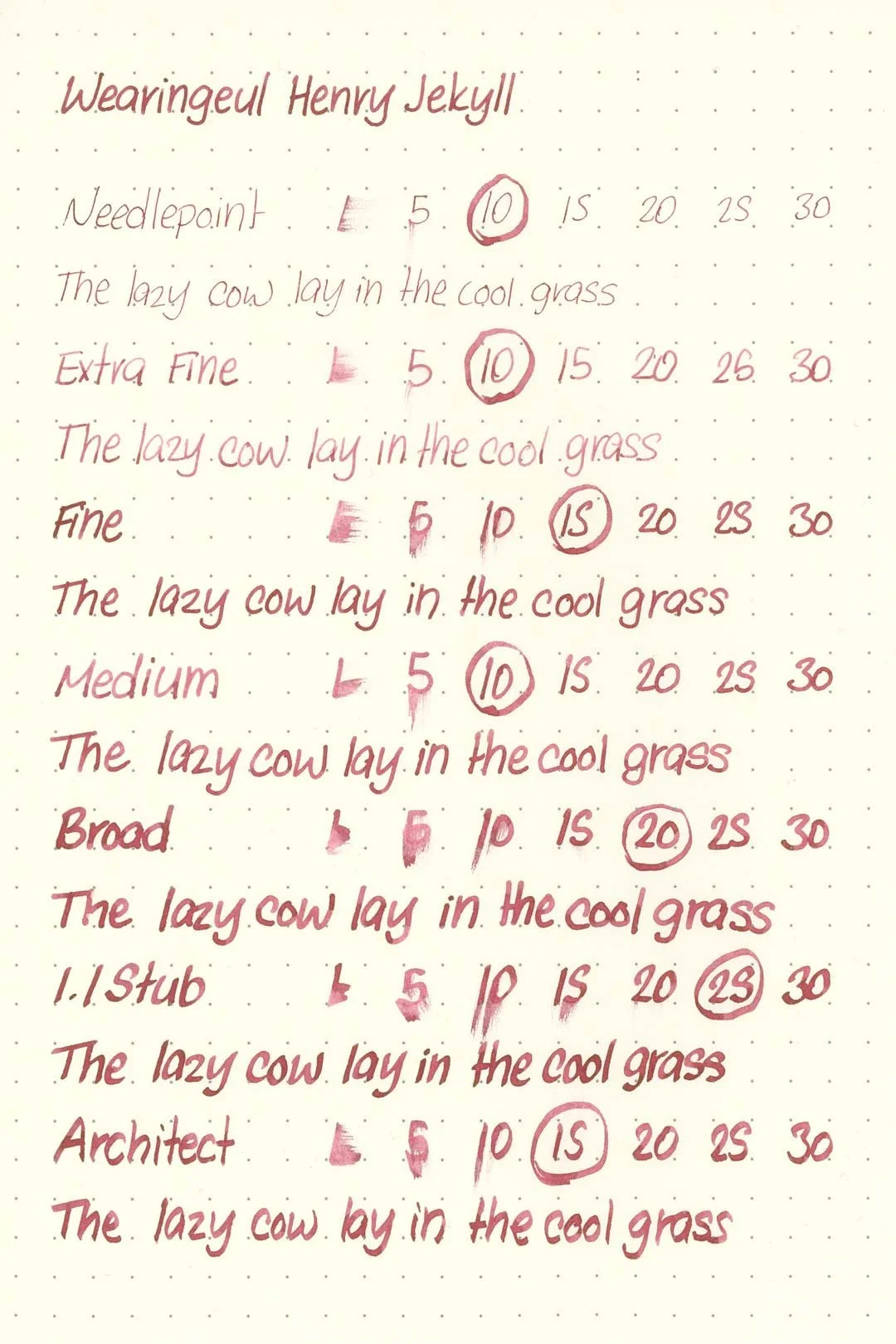
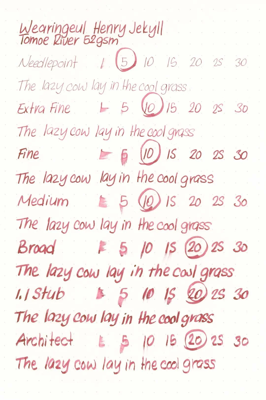
Writing Samples
Written on 52 gsm Tomoe River paper (white, 6mm ruling) with a medium nib.
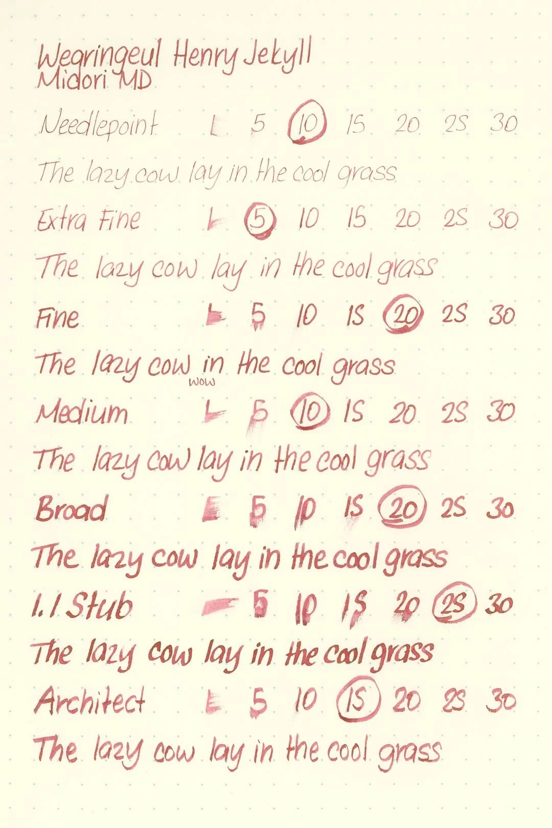
Written on Midori MD paper (cream, 7mm ruling) with a medium nib.
Written on Midori MD paper (cream, 7mm ruling) with a broad nib.
Flow Enhancer
The above writing sample is using a flow enhancing additive.
Because Wearingeul also sent me their Swan Elixir flow-enhancing additive, I thought I’d give it a go to see if it makes the experience any better. The top half of the writing sample above is without the flow enhancer, and the bottom half is with 2 drops of the flow enhancer. It’s difficult to tell, but you may be able to see that the line width is slightly wider. It may also look a tad darker, but surprisingly, it doesn’t seem to have noticeably changed any of the color properties, and that’s a great thing. More importantly, the flow enhancer made this ink significantly more enjoyable.
Performance in a pen: 6.5/10
Performance on paper: 9/10
Color saturation: 6.5/10
Sheening: 1/10
Shading: 5/10
Dry time: 6.5/10
Water resistance: 2/10
Ease of cleaning: 8.5/10
Shimmer: None
My personal thoughts (and spoilers, probably)...
The base color is an interesting choice (in a good way). I’ve always had an image of Henry Jekyll in a greener palette (no doubt thanks to my childhood memory of the character in The Pagemaster). I’m sure a large part of their decision had to do with the final color of Edward Hyde, which you would originally get after adding their conversion solution to the ink (since then, both inks have been released separately). Nonetheless, it’s an interesting look into the deeper concept of Dr. Jekyll’s character. Since his presence in the book is limited, there’s not a lot to go off. We know he’s wealthy and well-respected in Victorian society. We know he’s strongly conflicted between his darker impulses and maintaining a socially appropriate facade. We know that he has an interest in unorthodox scientific experimentation — enough to fall out with his close friend Dr. Lanyon before the events of the book, thanks to scientific disagreement. Based on that information, I think Wearingeul’s ink has the concept nailed down. Burgundy is a great choice to reflect Dr. Jekyll’s societal position. Focusing on the more pink tones of the ink can illustrate his unconventional and experimental chemical experiments. Yet, the ink is also dark enough to hint at something deeper in Jekyll’s character. It really is a beautiful shade, and I had a lot of fun dissecting all of the possible inspirations behind it.
The remaining question is whether I recommend it or not, and if you love both the book and color enough to justify it, maybe. Based on the writing experience, however, probably not. It is a great color, but in most cases, it’s not wonderful to write with. It may have been better with the flow enhancer, but I don’t base my reviews or recommendations on the use of additives — only on the experience of using an ink straight out of the bottle. And unfortunately, I did not find my experience with this ink in that context particularly enjoyable. There’s a very small sweet spot (between Fine and Medium nibs) where it feels okay, but overall, it wasn’t great.
Written on 52 gsm Tomoe River paper with a Sailor Pro Gear Slim (medium nib).
More images/info:
Featured in the photography and writing samples:
Wearingeul Henry Jekyll
Sailor Pro Gear Slim Wisteria, medium nib
52 gsm B6 Tomoe River notebook by Sterling Ink
Midori A6 lined notebook (Amazon)
Tim Holtz mini bulldog clips (Amazon)
Traveler’s Company Brass Clip
Wearingeul The Swan Elixir Flow Enhancer
Current text: The Strange Case of Dr. Jekyll and Mr. Hyde by Robert Louis Stevenson (Amazon)
Tools and materials used in the writing samples:
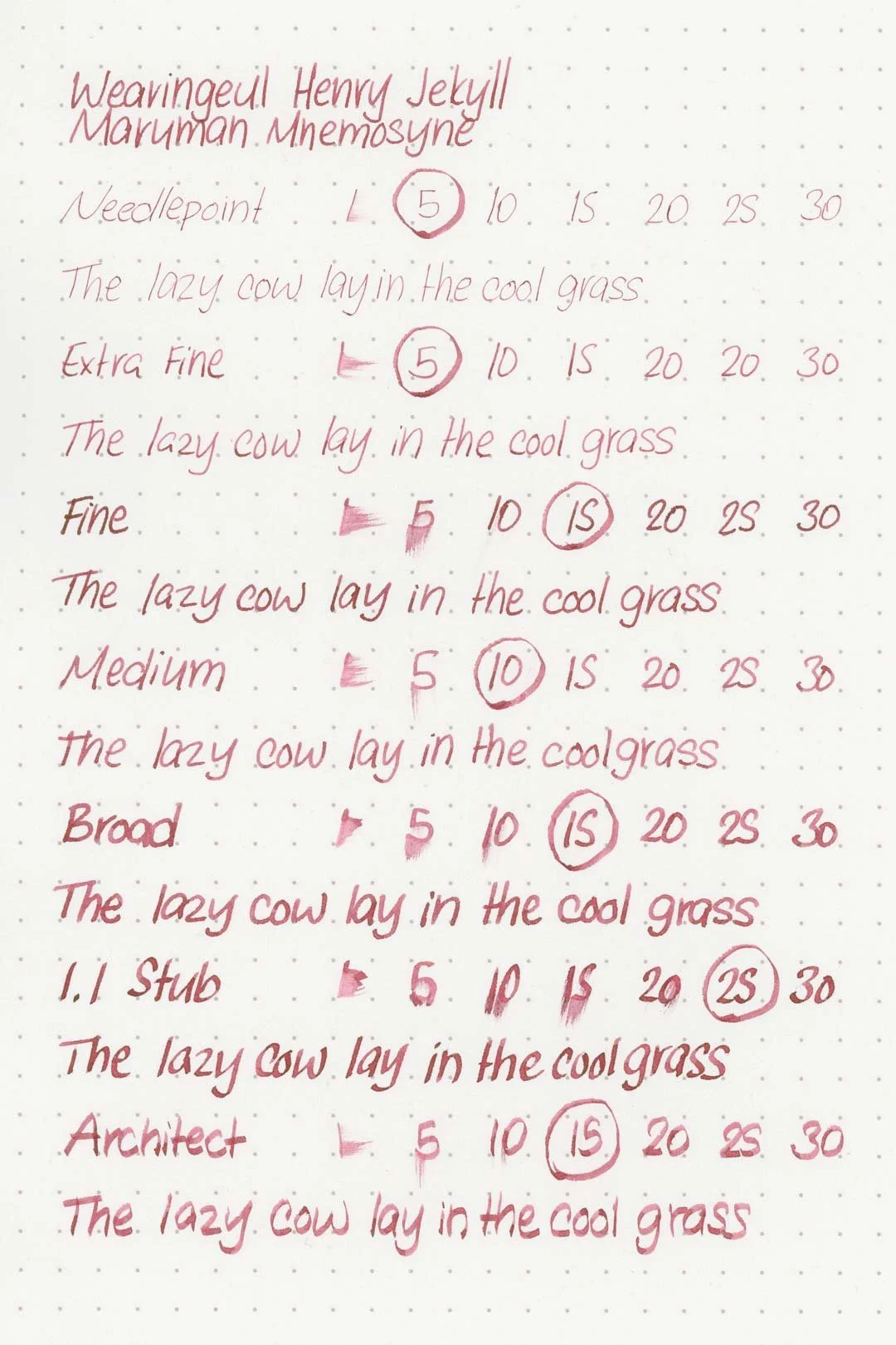
A TWSBI Diamond 580 AL with 7 nib units, including a Needlepoint grind, EF, F, M, B, 1.1mm stub, and an Architect grind. All nibs are tuned to perform at the same medium wetness.
A Rhodia No16 A5 DotPad
A Leuchtturm1917 A5 Notebook
A Midori MD A5 Notebook
A 52 gsm A5 Tomoe River Notebook
A Maruman Mnemosyne A5 Spiral Notebook
A Kokuyo Campus A5 Notebook