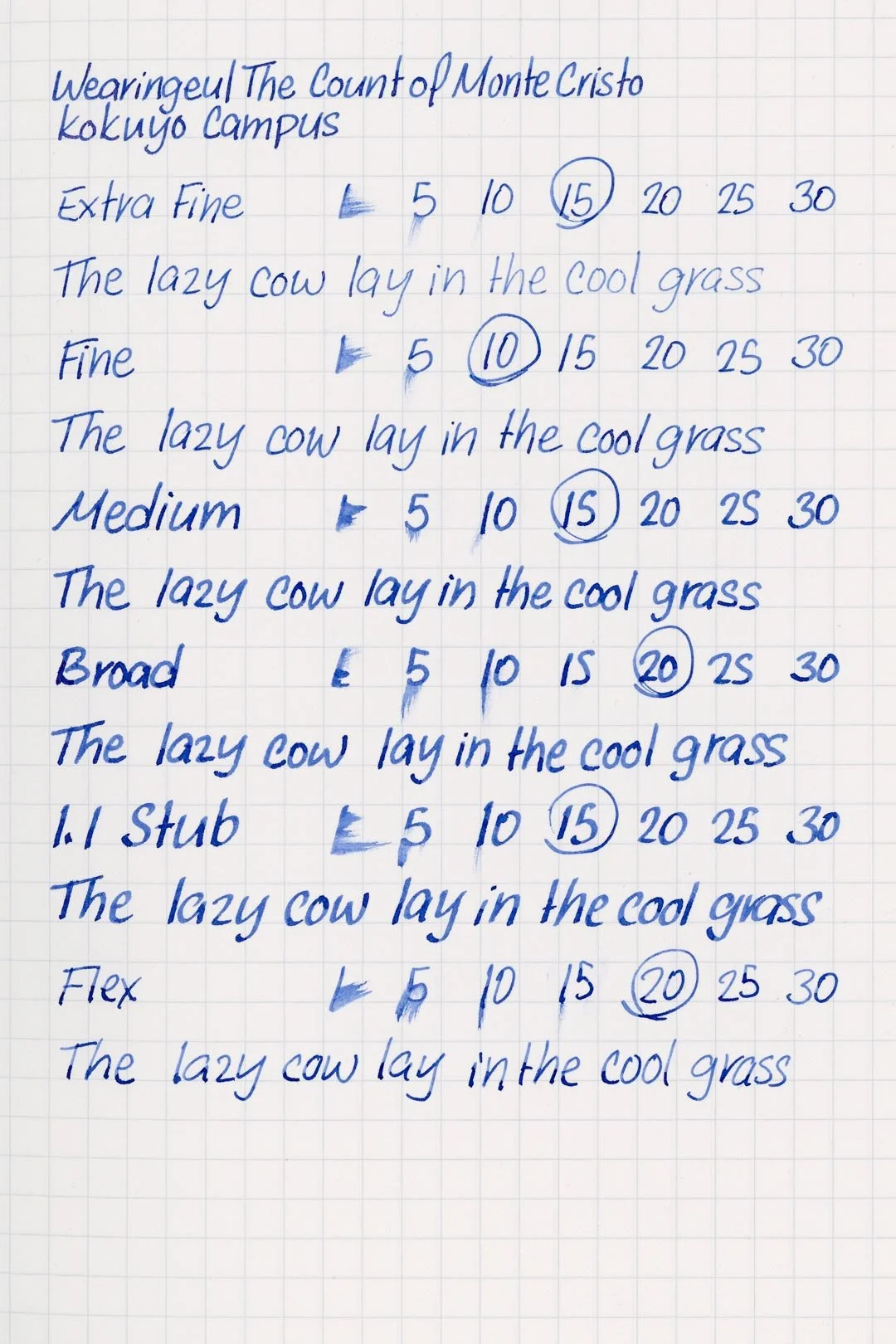
Wearingeul The Count of Monte Cristo
Ink Review #142
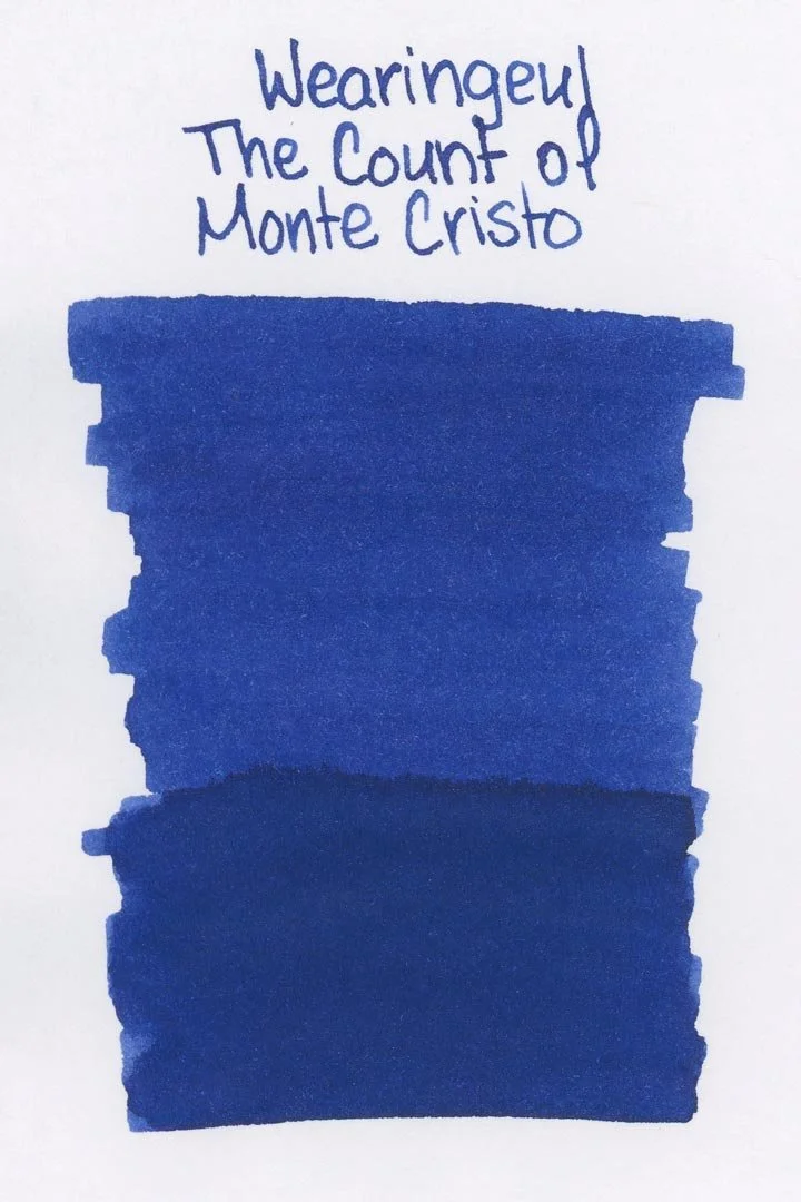

*Please note that the scan is the accurate representation of this color.
Disclosure: This ink was sent to me by Wearingeul for the purpose of review. This in no way impacts my review, and as always, all of my thoughts and opinions are my own. This post also contains affiliate links. If you click and make a purchase, I may earn a small commission.
Overview
The Color and Properties
Wearingeul The Count of Monte Cristo is a shimmering ink. The base color is a medium cobalt blue that shades with a soft gradient in cursive and a soft cut when writing in print. The shimmer is a bright violet that changes the look of the ink entirely, and unfortunately, it’s rather difficult to capture, because there’s unfortunately just not that much of it when using this ink in a pen. You’ll mostly notice the shimmer at the ends of letters. Anywhere else, the shimmer looks blue since there isn’t a high contrast between the base color and the shimmer. Because of this, there is a massive difference in how this color looks when used with a dip pen.
Ink Splat
Ink Droplets
Chromatography
Performance on Paper | Dry Times | Water Resistance
This ink is well-behaved, and there was only a single spot of bleed-through on the Kokuyo paper with the semi-flex nib. This ink should work great with most fountain pen-friendly papers.

Rhodia
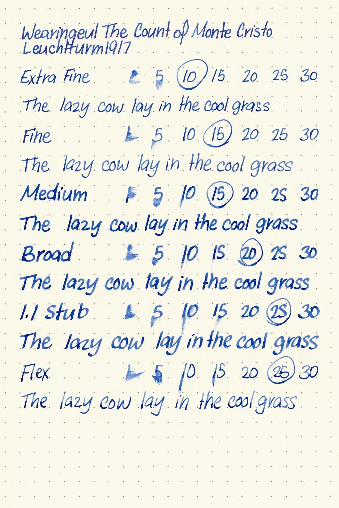
Leuchtturm1917
The dry times were slightly below average. The large nib sizes mostly dried within 15-20 seconds; however, there were many instances where it would take up to 25 seconds or more. The finer nib sizes remained at an average of 10-15 seconds to dry.
When exposed to water, the ink clouds over, but there’s still enough retention to make anything that was written legible (though messy).
More Pages


Performance in the Pen | Cleaning
The Count of Monte Cristo has a dry-medium flow, and that led to a few frustrating clogs with the extra fine and fine nibs. The other nibs thankfully didn’t have any issues with clogs, hard stops, or skipping; however, there’s still a general feeling of low lubrication. It’s not awful, but if you like slick inks, this isn’t going to be it. I mentioned earlier that there’s not all that much shimmer, and I think the lack of a significant flow has a lot to do with it. Agitating the pen doesn’t seem to help much, and maybe a higher-flowing feed may help, but your mileage may vary.
The cleaning process only required a single soak and flush for the color to wash out of the test pen and nib units. While there weren’t any large rings of shimmer or a haze left over along the barrel, there was still a minimal amount of shimmer along the piston crown that couldn’t be flushed out, requiring disassembly of the pen for extra cleaning.
Writing Samples
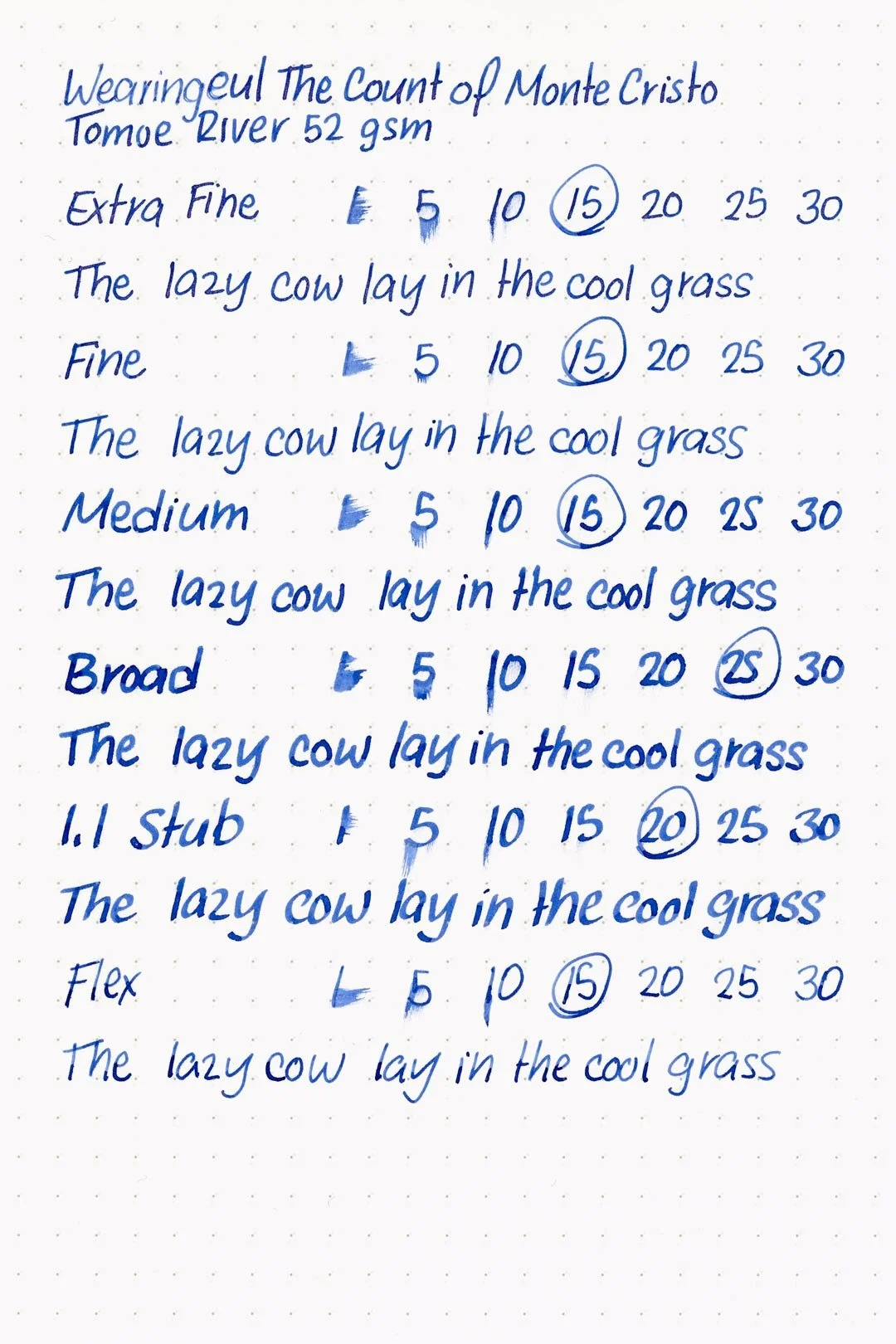
Written on 52 gsm Tomoe River paper (white, 7mm ruling) with a broad nib.
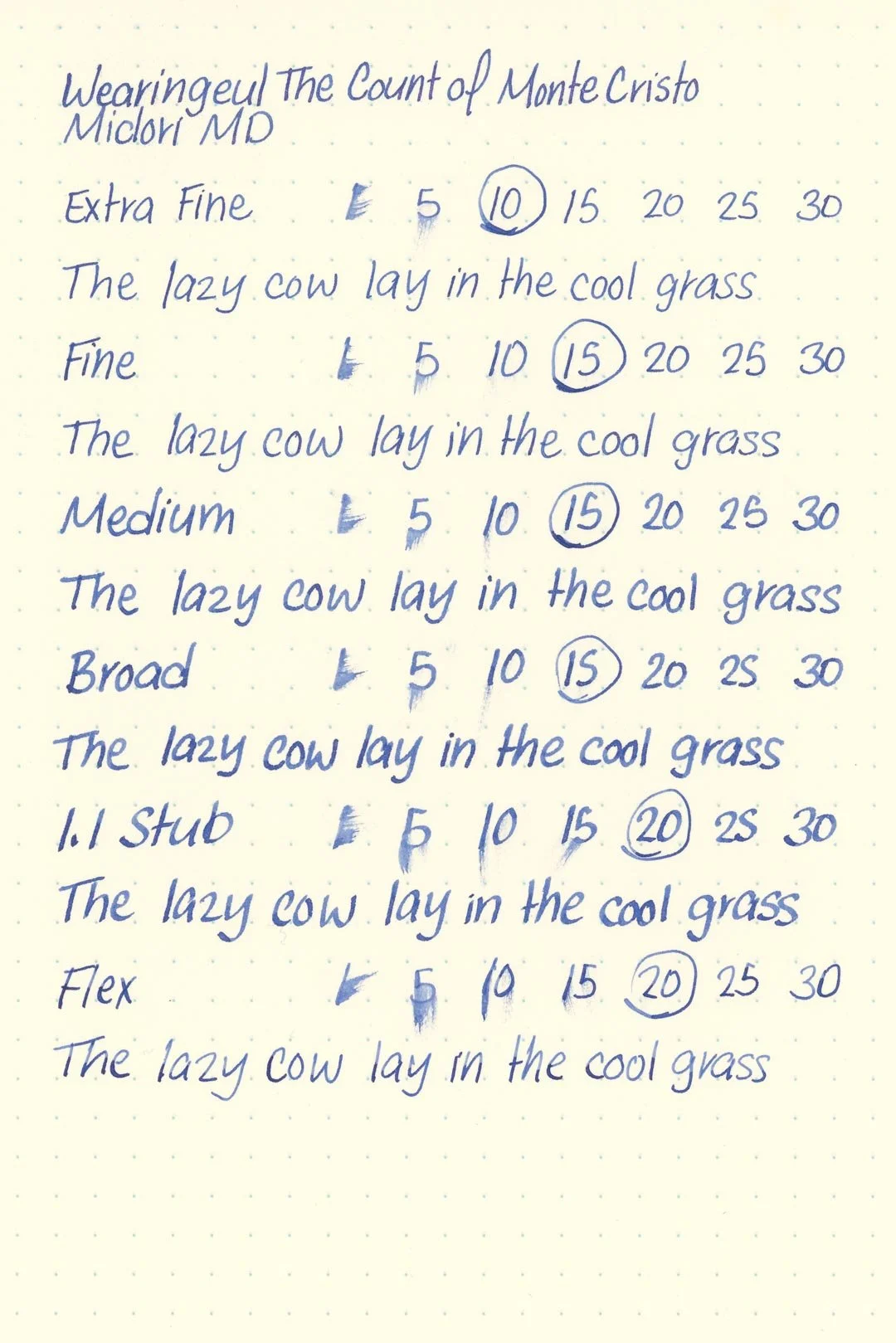
Written on Midori MD paper (cream, 7mm ruling) with a broad nib.
Written with a Dominant Industry Ink Muddler.
Performance in a pen: 7/10
Performance on paper: 10/10
Color saturation: 6/10
Sheening: 0/10
Shading: 4/10
Dry time: 6/10
Water resistance: 2/10
Ease of cleaning: 6.5/10
Shimmer: Violet, light
My personal thoughts (and spoilers, probably)...
As much as I love to see inks that take their inspiration from literature (or any form of media, really), I also have to admit that not everything is going to have some immediately obvious association with a color. The Count of Monte Cristo, I think, is one of those. How do you make a color for that without it feeling arbitrary? Wearingeul themselves state that the ink’s base color is reminiscent of the “cold abyss of the sea,” and I’m not denying that there are certainly parts of the early story where the sea is an important part of the plot; however, I’m not entirely convinced that it’s important enough. Yet, at the same time, there’s still not a lot to pull inspiration from. Except vengeance, and that’s where the violet shimmer comes in! “The radiant flame of vengeance,” as Wearingeul says, and it pulls everything together so beautifully. Not simply for its representation of revenge, but because of the opulence it adds to the ink as a whole. It’s magnificent, and it brings to mind the massive wealth that Edmond finds on the island of Monte Cristo. My only problem here is I wish it were heavier on the shimmer, but otherwise, it’s brilliant.
Written on 52 gsm Tomoe River paper with a Conklin Endura Deco Crest (broad nib).
More images/info:
Featured in the photography and writing samples:
Wearingeul The Count of Monte Cristo
Conklin Endura Deco Crest
52 gsm A5 Tomoe River notebook by GoodInkPressions
Midori A6 lined notebook (Amazon)
Traveler’s Company Brass Clip
Dominant Industry Ink Muddler
Rohrer & Klinger glass dip pen
Current text: The Count of Monte Cristo by Alexandre Dumas (Amazon)
Tools and materials used in the writing samples:
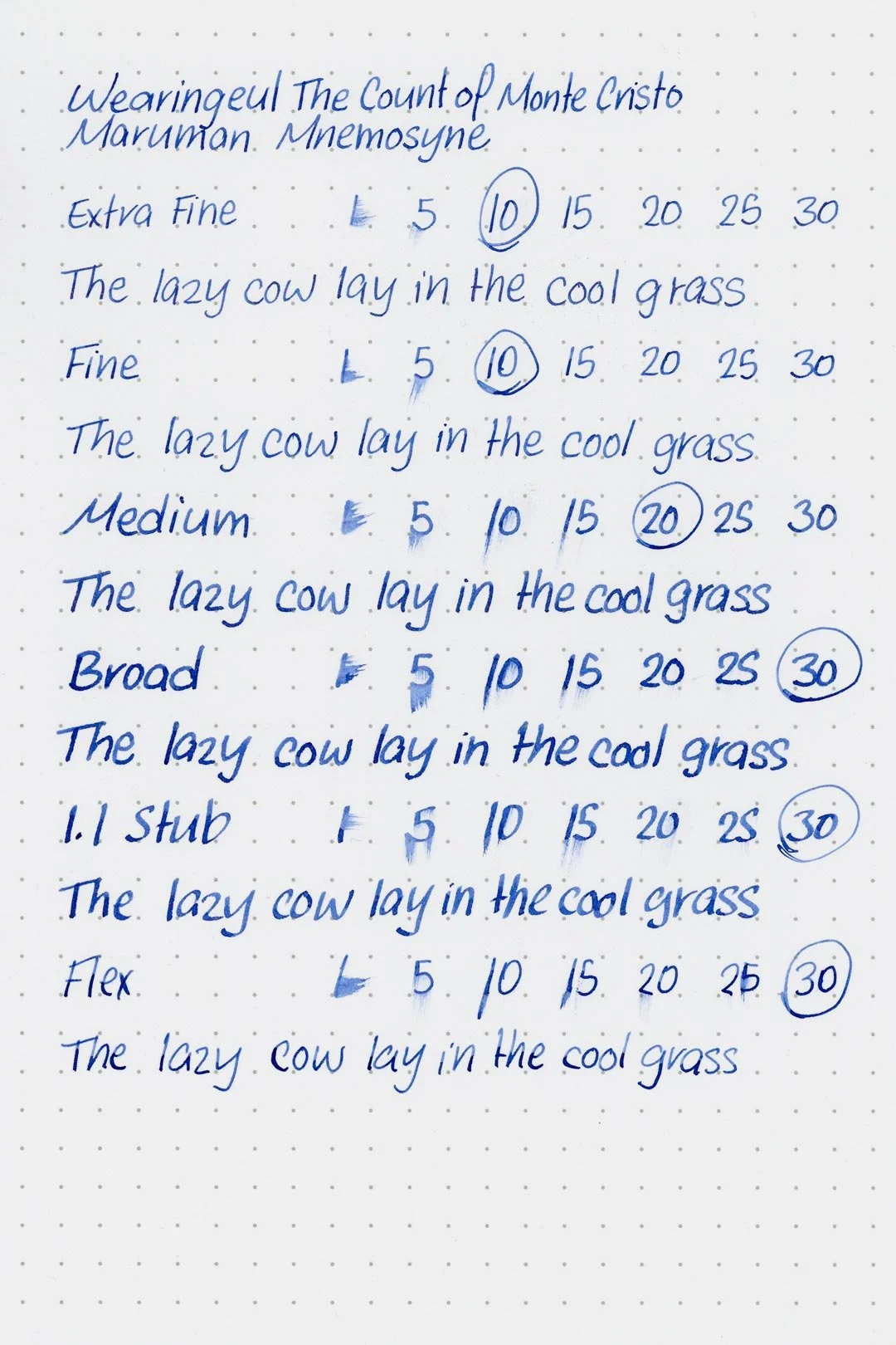
A TWSBI Diamond 580 with 5 nib units, including an EF, F, M, B, and 1.1mm stub. All nibs are tuned to perform at the same wetness.
A Rhodia No16 A5 DotPad
A Leuchtturm1917 A5 Notebook
A Midori MD A5 Notebook
A 52 gsm A5 Tomoe River Notebook
A Maruman Mnemosyne A5 Spiral Notebook
A Kokuyo Campus A5 Notebook