Wearingeul The Picture of Dorian Gray
Ink Review #162
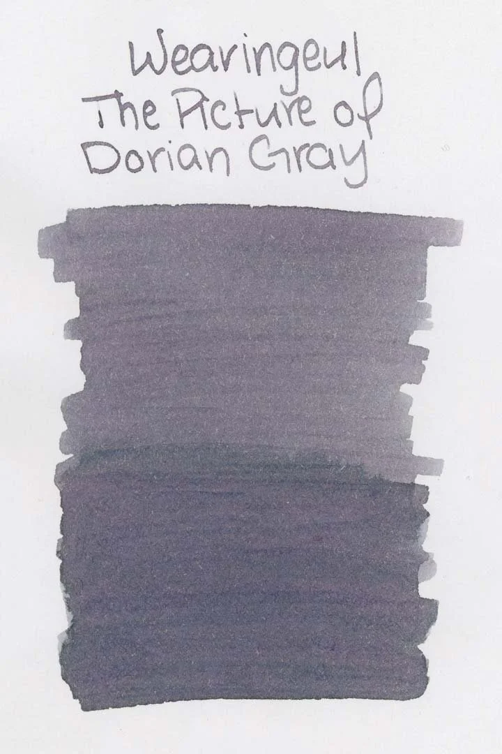

*Please note that the scan is the accurate representation of this color.
Disclosure: This ink was sent to me by Wearingeul for the purpose of review. This in no way impacts my review, and as always, all of my thoughts and opinions are my own. This post also contains affiliate links. If you click and make a purchase, I may earn a small commission.
Overview
The Color and Properties
Wearingeul’s The Picture of Dorian Gray is a light grey ink with heavy purple and blue undertones. The ink shades with a soft cut in both print and cursive writing, where the ink pools. The inside of shaded areas have a soft gradient from the center out to the edges of the letters that give the letters a sort of blushy look that's more noticeable on white paper and with larger nib sizes. White papers also seem to help bring out the more purple tones of this ink.
The color is light, but I never found it difficult to see or read, even when darker inks are used on the opposite side of the page.
Ink Splat
Ink Droplets
Chromatography
Performance on Paper | Dry Times | Water Resistance
Dorian Gray is well-behaved, only showing minor bleed-through on the Kokuyo paper. There was some very light feathering around the edges of the ink droplets, but I think this ink should be more than fine on most fountain pen-friendly papers with most pen combinations.

Rhodia
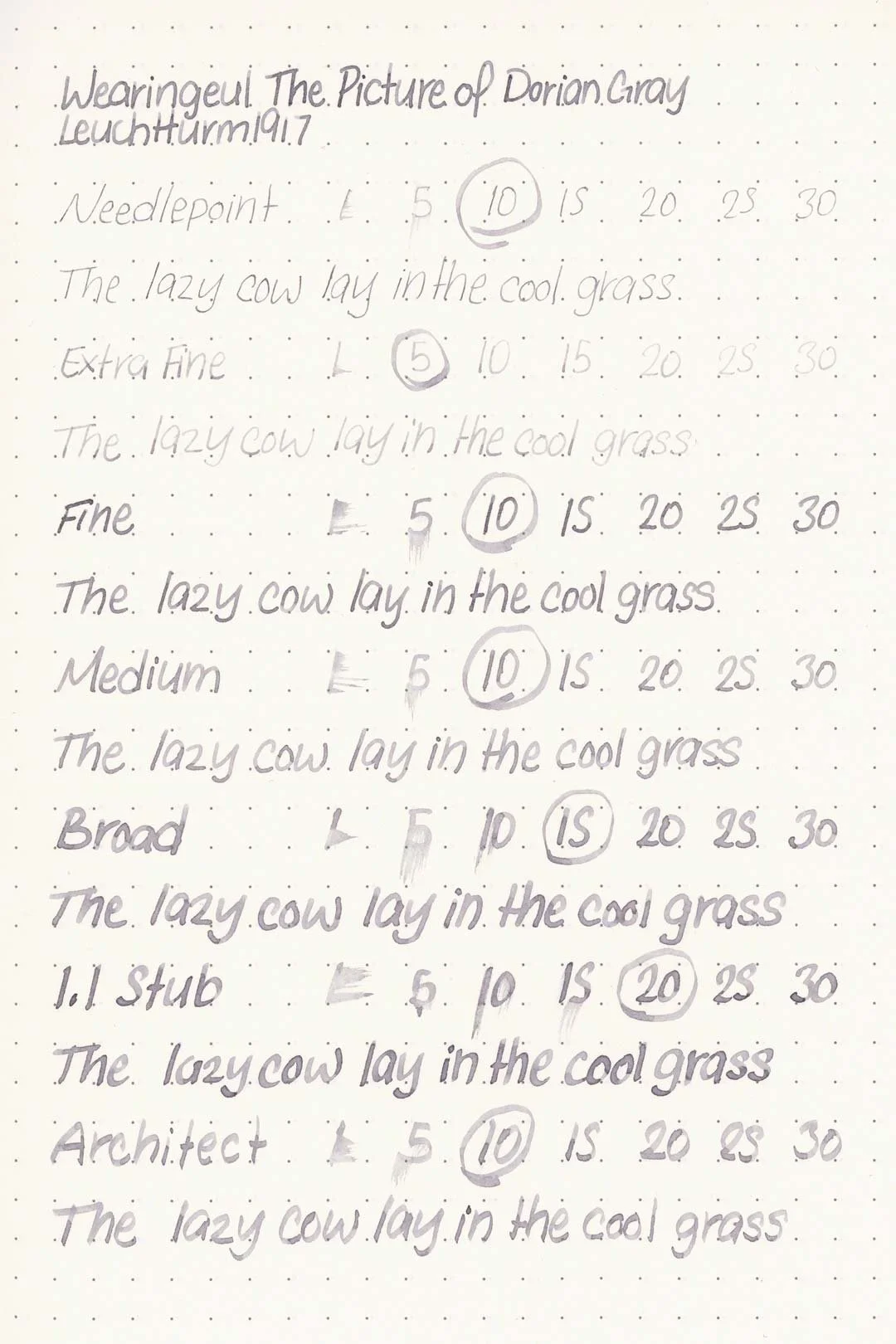
Leuchtturm1917
The dry times are great, especially on Rhodia, where it never took longer than 10 seconds to dry. The dry times on the other papers were also good, rarely taking more than 15 seconds, and never more than 20 to dry.
The water resistance isn’t the best, however, and most of the color quickly washes away. There are some light traces of writing left over after brief water exposure, but it’s light and readability may vary.
More Pages


Performance in the Pen | Cleaning
This ink has a dry-medium flow, but it performs surprisingly well despite that. Across all of my test nibs, I only experienced some minor hard starting with the 1.1 stub. Otherwise, there weren’t any issues, and the ink kept up well during extended writing. The lubrication isn’t especially slick, but it’s enough to provide a comfortable writing experience, especially if you’re writing with a wetter-tuned pen.
Cleaning this ink out was easy, and a single flush washed the color out of the pen and nib units without any visible color or residue remaining in the pen.
Writing Samples
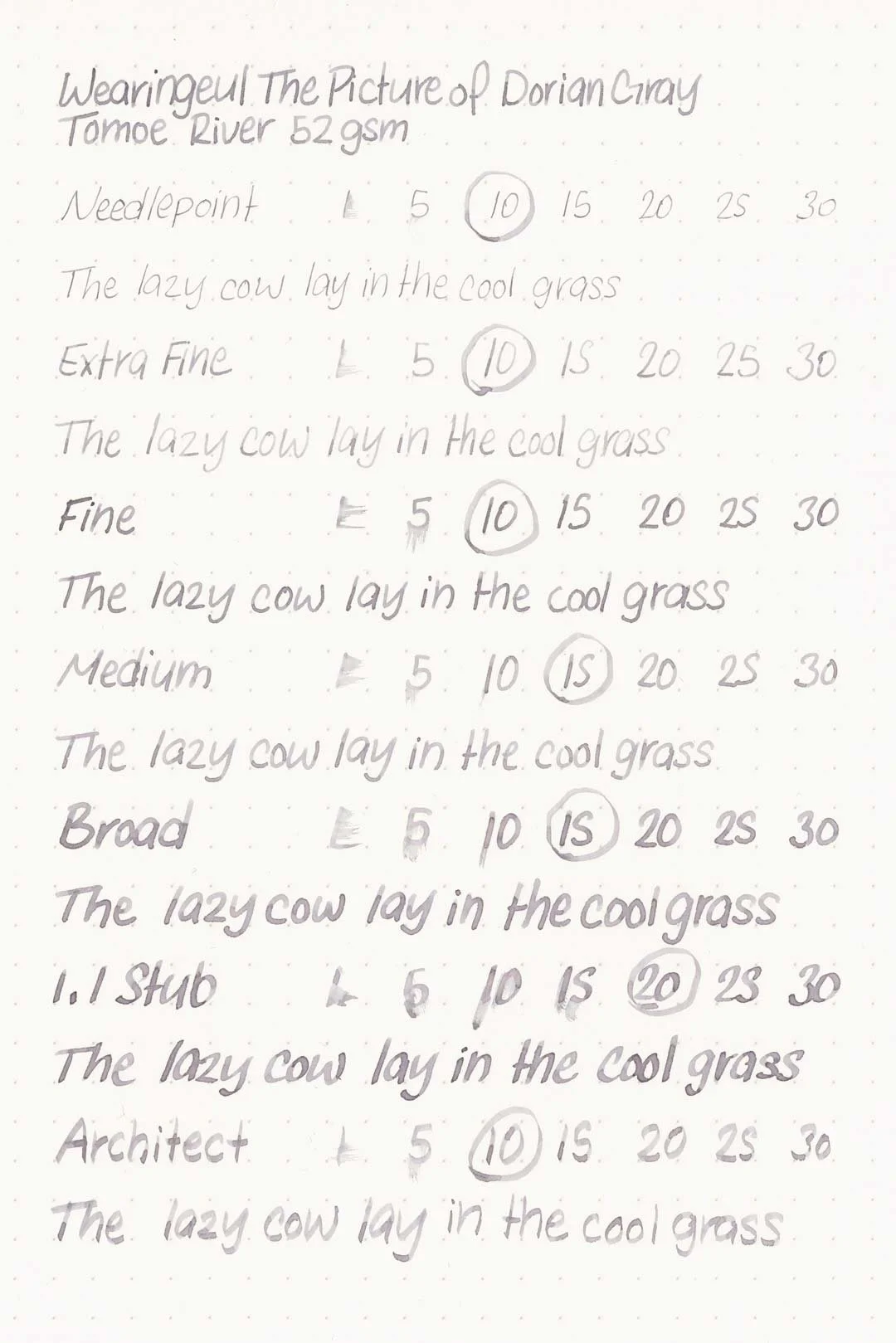
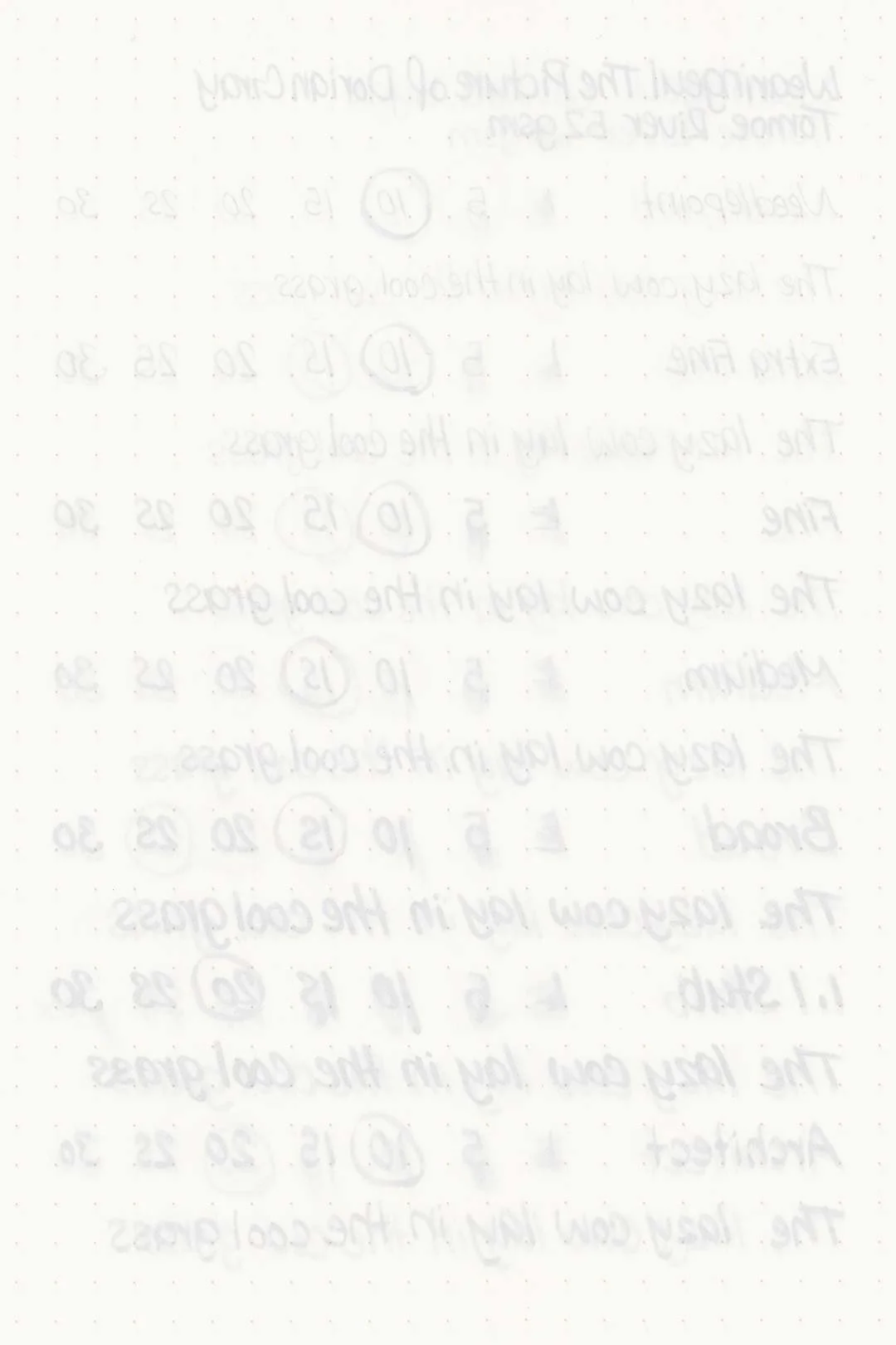
Written on 52 gsm Tomoe River paper (white, 6mm ruling) with a medium nib.
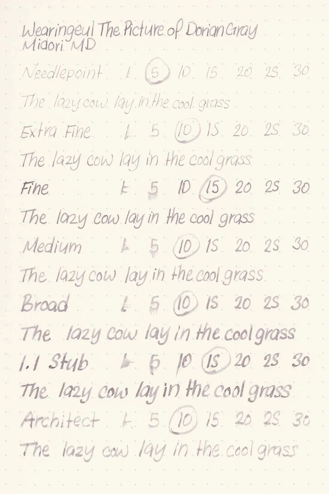
Written on Midori MD paper (cream, 7mm ruling) with a medium nib.
Performance in a pen: 8.5/10
Performance on paper: 10/10
Color saturation: 4/10
Sheening: 0/10
Shading: 6/10
Dry time: 9/10
Water resistance: 1/10
Ease of cleaning: 10/10
Shimmer: None
My personal thoughts (and spoilers, probably)...
The Picture of Dorian Gray is another example of a book that’s difficult to put into color. If the ink is based on the titular character himself, there are a few options to choose from based on his description (perhaps a golden ink to match his hair with blue shimmer representing his eyes). Gray as a color may even seem like an arbitrary choice based on the name. A major takeaway, however, is that Dorian Gray was more or less a blank and highly impressionable slate. With that in mind, a white ink would make sense, but that would be absurd and, I imagine, impossible. So the next best thing would be gray! And a gray ink is a great thing because it’s easy to see all the little nuances and undertones. More than Dorian’s outward appearance, it makes for a perfect visualization of his soul, with hints of purple corruption coming to the surface while he continues to wear his veneer of an innocent and untainted nature.
So, the color is good. But do I recommend it as an ink? Yes! It’s an excellent ink. I mentioned earlier that it’s better with a wetter-tuned pen, and I recommend that not only for the writing experience but because it’ll bring out more of the fine nuances this ink has. I wouldn’t consider this an everyday writer — it’s something to be enjoyed, and if that’s what you’re looking for, then it would make a great addition to your collection, especially if you love the book.
Written on 52 gsm Tomoe River paper with a Pelikan M620 Place de la Concorde (medium nib).
More images/info:
Featured in the photography and writing samples:
Wearingeul The Picture of Dorian Gray
Pelikan M620 Place de la Concorde, medium nib
52 gsm B6 Tomoe River notebook by Sterling Ink
Midori A6 lined notebook (Amazon)
Traveler’s Company Brass Clip (Amazon)
Tim Holtz mini bulldog clips (Amazon)
MVLXLX 3 Pen Case, Blue (Amazon)
Franklin-Christoph pen roll
Jenika’s Journals notebook covers
Portland Leather Storm Gray Leather Wrap Journal
Current text: The Picture of Dorian Gray by Oscar Wilde (Amazon)
Tools and materials used in the writing samples:
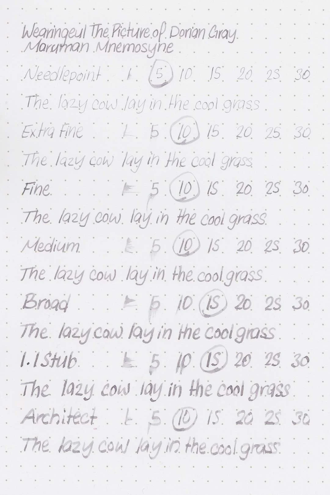
A TWSBI Diamond 580 AL with 7 nib units, including a Needlepoint grind, EF, F, M, B, 1.1mm stub, and an Architect grind. All nibs are tuned to perform at the same medium wetness.
A Rhodia No16 A5 DotPad
A Leuchtturm1917 A5 Notebook
A Midori MD A5 Notebook
A 52 gsm A5 Tomoe River Notebook
A Maruman Mnemosyne A5 Spiral Notebook
A Kokuyo Campus A5 Notebook