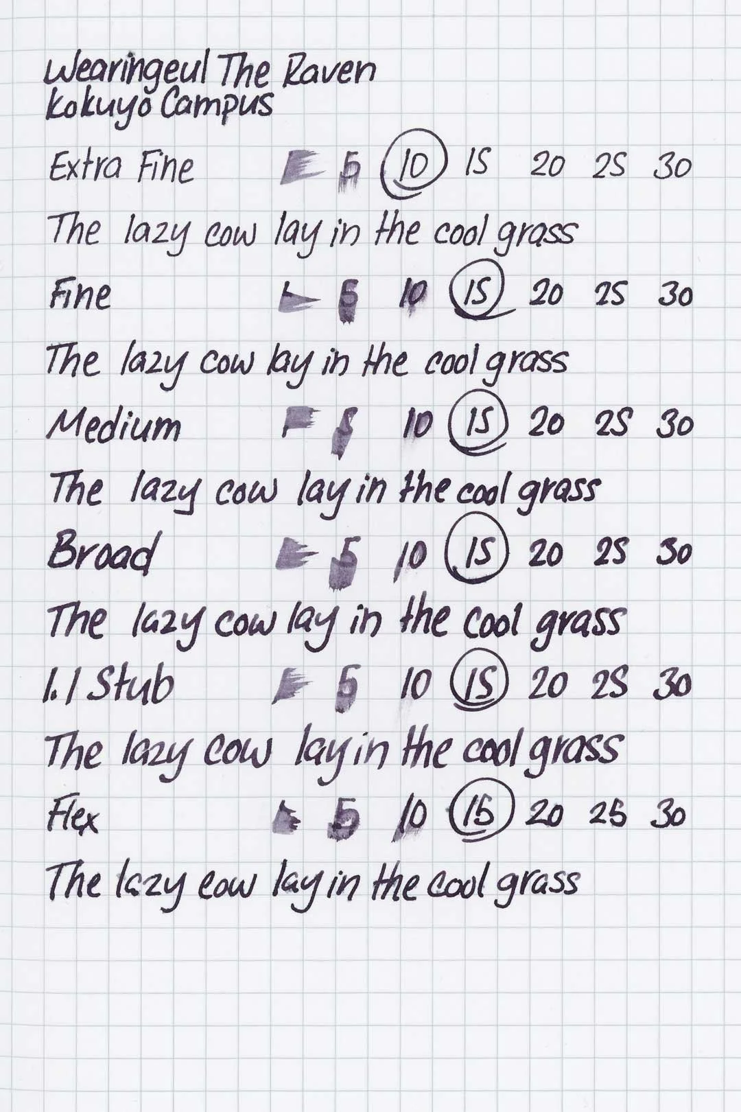
Wearingeul The Raven
Ink Review #158
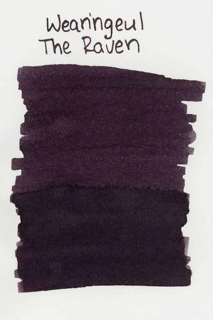
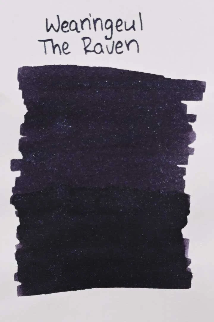
*Please note that the scan is the accurate representation of this color.
Disclosure: This ink was sent to me by Wearingeul for the purpose of review. This in no way impacts my review, and as always, all of my thoughts and opinions are my own. This post also contains affiliate links. If you click and make a purchase, I may earn a small commission.
Overview
The Color and Properties
Wearingeul The Raven is a shimmering ink. The base color is a dark purple that shades with a soft gradient in cursive and a soft cut when writing in print. The base color also dries with a slightly matte finish. It has a blue and purple shimmer that pairs nicely with the base color and is surprisingly easy to see despite there being less contrast between the two. There is also very slight dull yellow sheen that you may notice around the edges of letters.
Ink Splat
Ink Droplets
Chromatography
Performance on Paper | Dry Times | Water Resistance
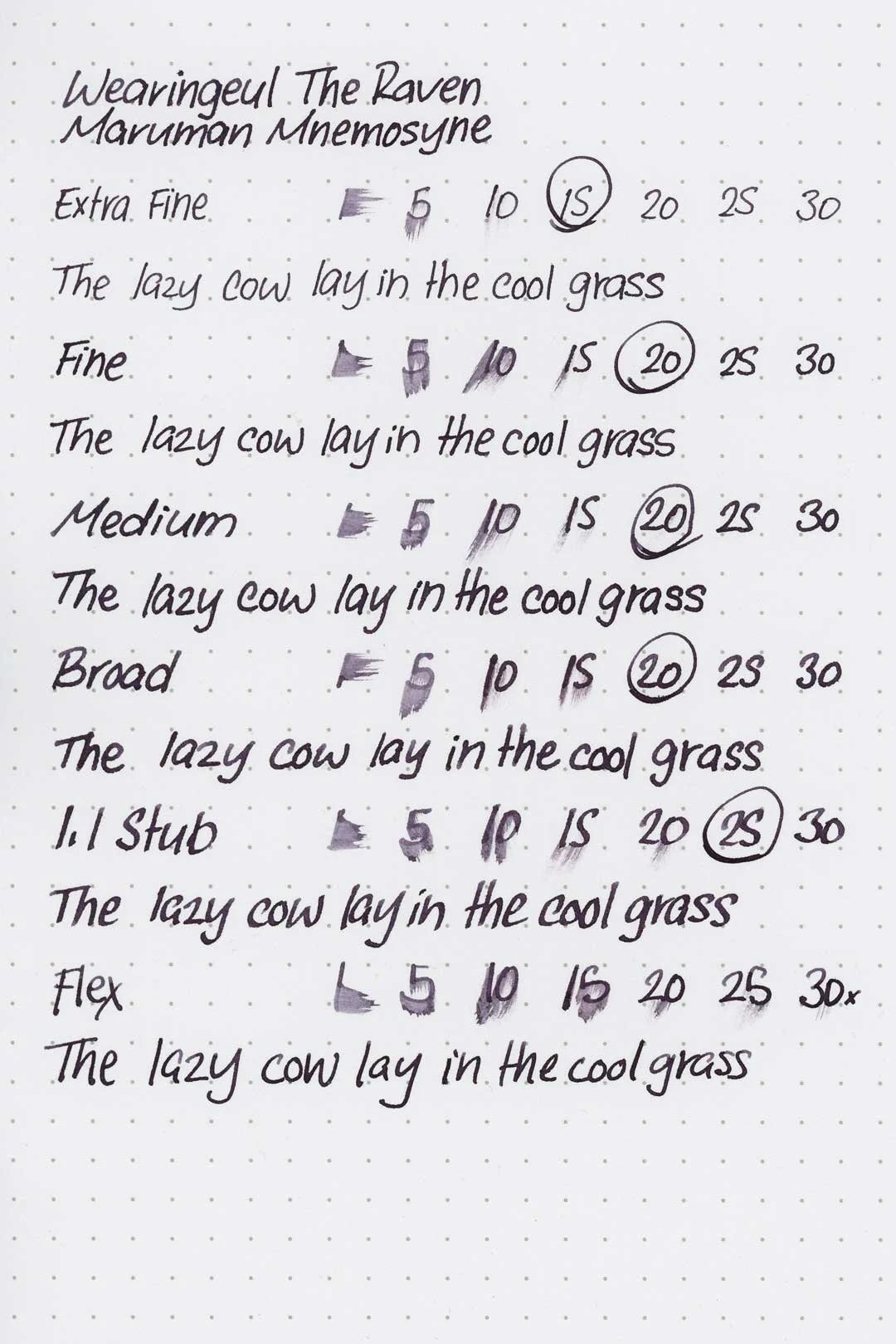
The Raven is mostly well-behaved, but there was some heavy bleed-through and feathering in the Kokuyo notebook. There was also some minor feathering on the Leuchtturm and Maruman Mnemosyne papers, as well as around the edges of the ink droplets. Using this ink with wetter pens may push some papers to their limits, but otherwise this ink should be safe on most fountain pen-friendly papers.
Rhodia
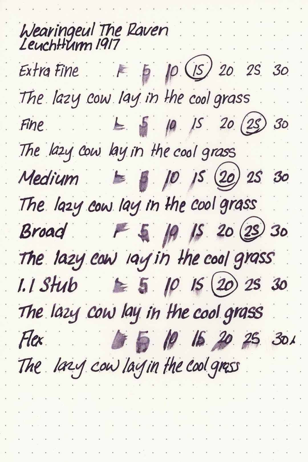
Leuchtturm1917
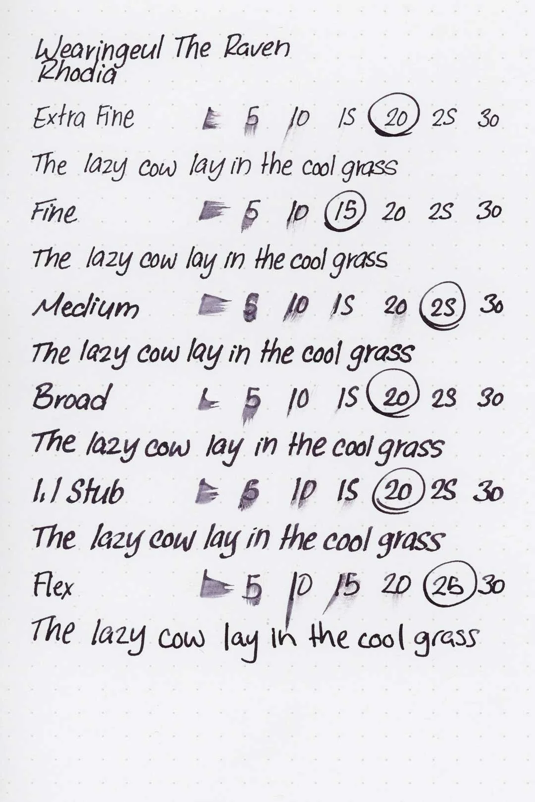
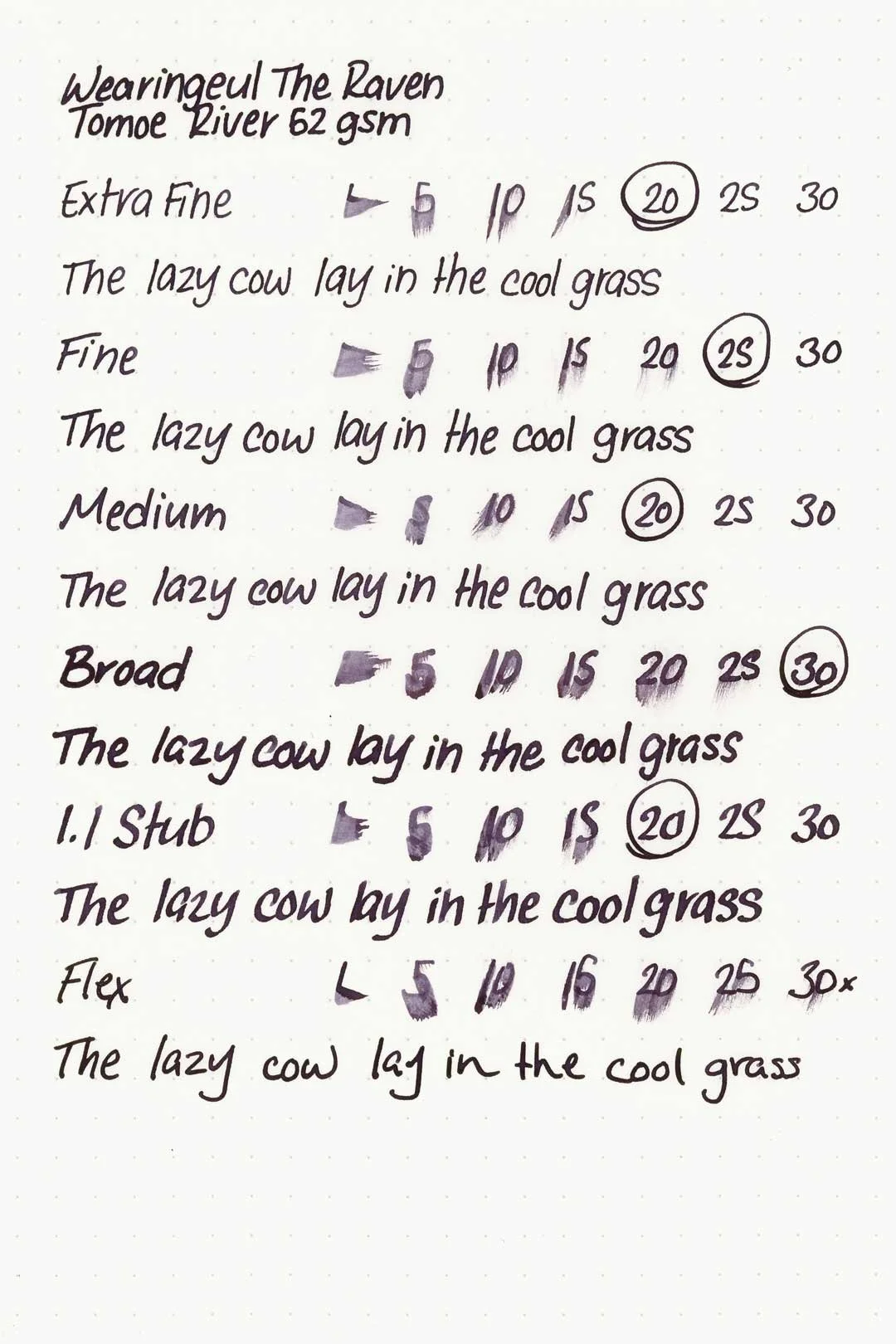
The dry times were below average, often taking between 20 and 30 (or longer) to dry between all the nib sizes.
Water exposure causes heavy clouding, but despite being messy, the writing is still very dark and easily legible.
More Pages
Performance in the Pen | Cleaning
The Raven has a wet flow and is well lubricated, making for a very comfortable writing experience. I didn’t run into any hard starts, skips, stops, or clogs, and there weren’t any noticeable drops in flow during my extended writing tests. The shimmer flows well, but still requires minor agitation to keep it consistent in writing.
When cleaning, the base color washed out very quickly, and surprisingly so did most of the shimmer. There weren’t any signs of shimmer sticking to the inner walls of the barrel, but there was still a small amount of shimmer around the piston crown. It may still require disassembly to get it all out, but this is an overall better cleaning experience than most shimmering inks.
Writing Samples
Written on 52 gsm Tomoe River paper (white, 6mm ruling) with a medium nib.
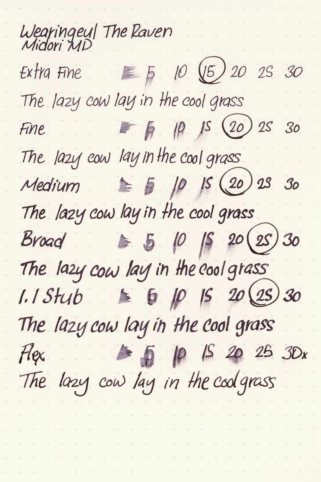
Written on Midori MD paper (cream, 7mm ruling) with a medium nib.
Performance in a pen: 10/10
Performance on paper: 7/10
Color saturation: 710
Sheening: 1/10
Shading: 3/10
Dry time: 6/10
Water resistance: 3/10
Ease of cleaning: 8/10
Shimmer: blue and purple, medium
My personal thoughts...
I’ll start with the base color — I’ve mentioned it before, but a matte finish to an ink is one of my all-time favorite traits. It’s not a common trait, and even less so with a shimmering ink, so it’s really refreshing to see! The color itself, minus the shimmer, is excellent, and it reminds me of a grape popsicle. Actually, it’s a lot like a darker Diamine Grape. Even if it were just the base color, this would have been a winner to me, but the shimmer puts it on another level. It’s gorgeous and, thank goodness, it works well. This is the experience that I want when I get a new shimmering ink. It’s not overly shimmery, but the shimmer isn’t lacking either. It’s right on the money, and that means that the ink can carry a more serious tone while still looking special. Maybe I’m a biased purple ink lover (or perhaps a biased Poe-loving Marylander), but this ink is fantastic.
On that note, it’s time for my signature move: over-analyzing the color choice.
It probably goes without saying that a dark purple to represent this poem just feels right. It immediately matches the setting as depicted in the famous first line, “Once upon a midnight dreary,” conjuring the grim atmosphere of the “bleak December” night and the poet’s fire-lit chamber. But it goes even deeper. Purple appears twice in the poem in a symbolic sense, once in the third stanza in reference to “each purple curtain” and later when it mentions the “velvet-violet lining” of a seat cushion.
These observations beg the question, what exactly does the purple itself represent? You could write several dissertations on this alone, but to keep it simple, let’s see what Wearingeul has to say. They describe the ink as follows: ”The raven sits before the poet who cries for his lost love. Amid the echo of the repeated “Nevermore,” sorrow that cannot fade spreads in deep violet, while blue and violet glitters shimmer softly like the memories that will never disappear.”
I love this image, the shimmer spread across the dark violet surface reflecting the haunting memories of the poet’s lost love. And the deep purple is the inescapable sorrow itself.
It would be so easy to ramble on about how well Wearingeul nailed this ink, but we’ll leave it this for now. Overall, a flawless match for such a poetic masterpiece.
Written on 52 gsm Tomoe River paper with a Retro51 Tornado “The Raven” fountain pen (medium nib).
More images/info:
Featured in the photography and writing samples:
Wearingeul The Raven
Retro51 Tornado “The Raven” Pen Boutique exclusive, medium nib
52 gsm B6 Tomoe River notebook by Sterling Ink
Midori A6 lined notebook (Amazon)
Jenika’s Journals Leather Notebook Covers
Tim Holtz Mini Bulldog Clips (Amazon)
Current text: Anne of Green Gables by LM Montgomery (Amazon)
Tools and materials used in the writing samples:
A TWSBI Diamond 580 with 5 nib units, including an EF, F, M, B, and 1.1mm stub. All nibs are tuned to perform at the same wetness.
A Rhodia No16 A5 DotPad
A Leuchtturm1917 A5 Notebook
A Midori MD A5 Notebook
A 52 gsm A5 Tomoe River Notebook
A Maruman Mnemosyne A5 Spiral Notebook
A Kokuyo Campus A5 Notebook