Diamine Earl Grey
Ink Review #19
*Please note that the scan is the accurate representation of this color.
This is the 2017 ink of the year made by Diamine for r/fountainpens. This is also the first of the Reddit inks.
Overview
The Color and Properties
Diamine Earl Grey is a medium grey that shades crisply where the ink pools. Not only does it shade between expected differing intensities of light and dark grey, but the pooled ink will often appear purple, or even slightly pink on the right paper, and in the right lighting. If you want a deeper purple-grey, that would be easy, just use a wetter pen. The pink undertones are always there, but they might be harder to achieve in abundance. The variability in flow could become a nuisance, but with a dryer or wide nib, and on the right paper, it should be possible to bring that out.
Ink splat
Ink droplets
Chromatography
Performance on Paper | Dry Times | Water Resistance
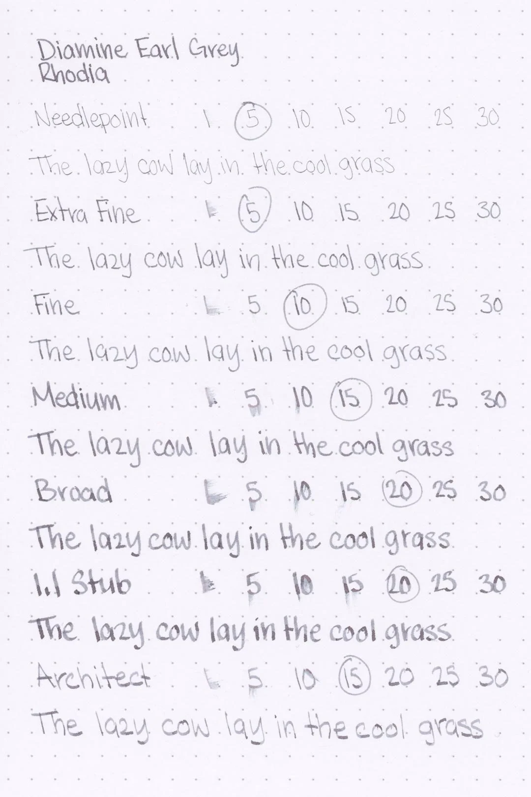
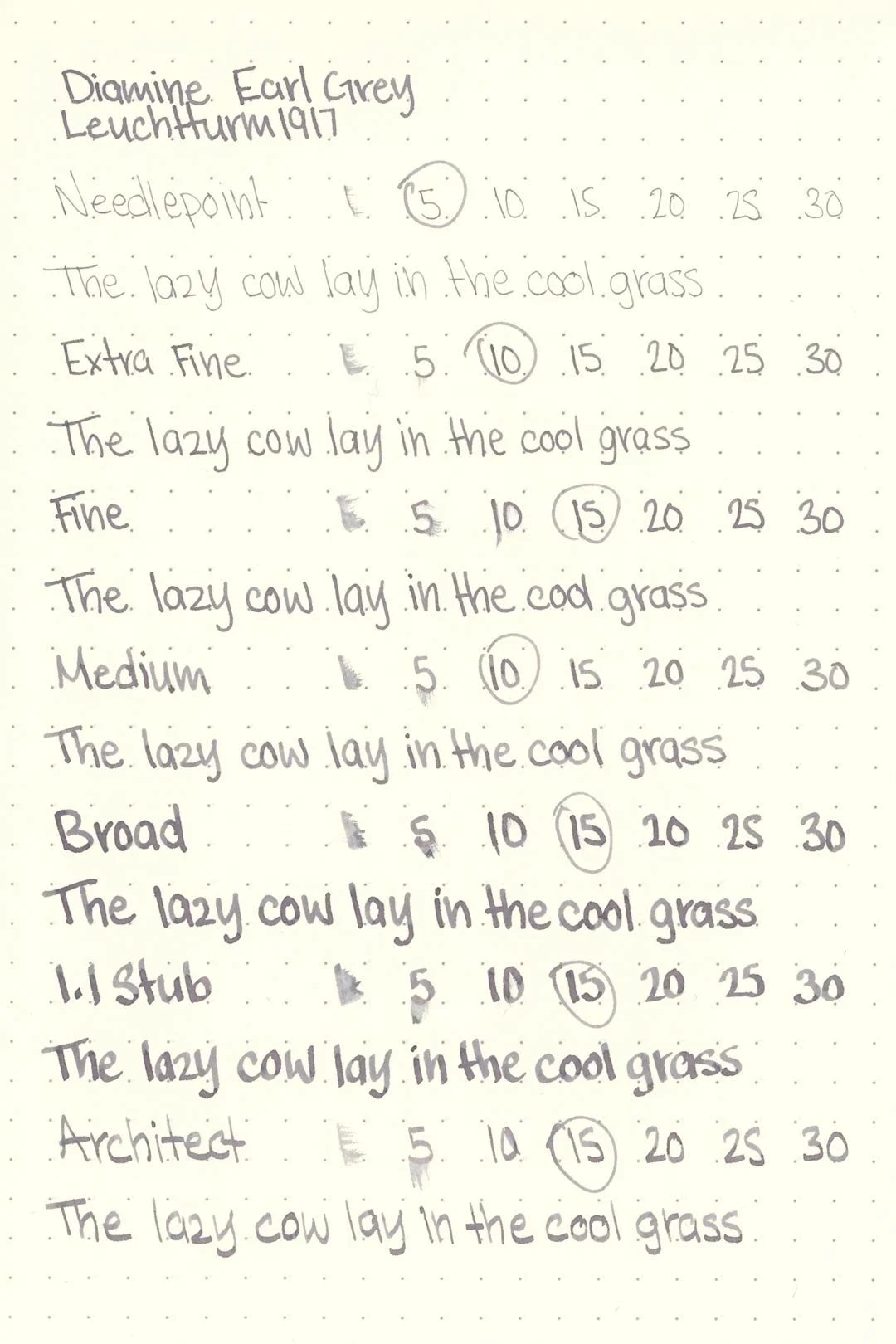
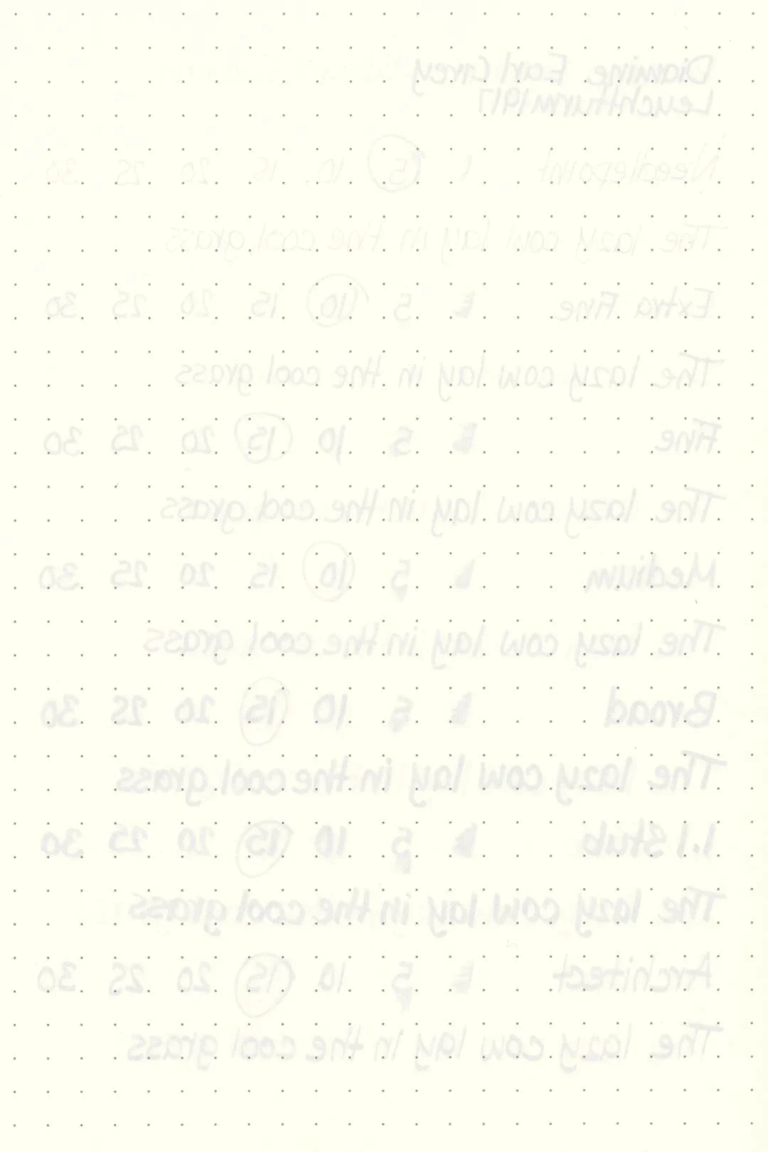
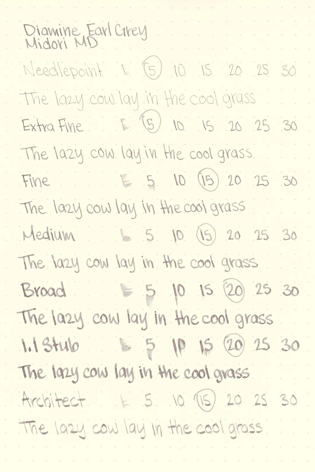
Diamine Earl Grey performed well on paper. I didn’t notice any feathering or bleeding on any of the test papers. This ink should be fine on most fountain pen-friendly papers.
Rhodia
Leuchtturm1917
The dry times were mostly average. The finer nibs dried within 10 seconds, while the larger nibs dried within 20, but I found the dry times to be surprisingly lower on the Leuchtturm and Maruman papers, where the larger nibs dried within 15 seconds.
Water resistance can always be a hit or miss with grey inks, and unfortunately, I found that Earl Grey had poor water resistance, with most of the writing washing away and leaving few readable traces.
More Pages
Midori MD
Maruman
Tomoe River
Kokuyo
Performance in the Pen | Cleaning
Earl Grey is mostly well-behaved. I didn’t experience any hard starts, skips, or stops during my tests. The ink initially had a medium-wet flow, but I quickly noticed that as the nib size got larger, the flow felt drier and less lubricated. This had the largest impact when writing on Rhodia, where it felt as if there was barely any lubrication at all, making for a very uncomfortable and uninspiring writing experience.
As expected, the ink cleaned out very quickly and didn’t leave any staining or residue in the pen.
Writing Samples
Written on 52 gsm Tomoe River paper (white, 5mm ruling) with a medium nib.
Written on Midori MD paper (cream, 7mm ruling) with a fine nib.
Written on Midori MD paper (cream, 7mm ruling) with a medium nib.
Performance in a pen: 7.5/10
Performance on paper: 10/10
Color saturation: 5/10
Sheening: 0/10
Shading: 8/10
Dry time: 9/10
Water resistance: 1/10
Ease of cleaning: 10/10
Shimmer: None
Hot take
This one’s fascinating. It’s certainly a gorgeous color, but why is it called Earl Grey? It doesn’t resemble Earl Grey tea, brewed or loose leaf. After years of wondering over this question, I finally dug through r/fountainpens history to discover the origin story of the reddit/Diamine collaboration that has gifted us with so many lovely inks. I was desperately hoping to discover a wealth of lore behind a grey ink named after Earl Grey tea. Surely it wasn't an arbitrary association between the name “Earl Grey” and a grey ink?
Alas, much to my dismay, it appears the reasoning behind the name is, in fact, entirely arbitrary. According to the original collaboration announcement, the idea started with a user comment that garnered popularity in which the user suggested their preference for a blue-grey ink with the name Earl Grey.
That’s it. That’s the story.
Don’t get me wrong — I love the ink, and the name, and there’s nothing wrong with this backstory or anyone who voted for this suggestion. But I had hoped that there would be a more thematic connection between the ink name and the color and I’m a little disappointed that there isn’t.
Written on 52 gsm Tomoe River paper with a Pilot Custom 74 (medium nib).
More images/info:
You might be interested in:
Tools and materials used in the writing samples:
A TWSBI Diamond 580 AL with 7 nib units, including a Needlepoint grind, EF, F, M, B, 1.1mm stub, and an Architect grind. All nibs are tuned to perform at the same medium wetness.
A Rhodia No16 A5 DotPad
A Leuchtturm1917 A5 Notebook
A Midori MD A5 Notebook
A 68 gsm A5 Tomoe River Notebook
A Maruman Mnemosyne A5 Spiral Notebook
A Kokuyo Campus A5 Notebook
Sources:
Original announcement: https://www.reddit.com/r/fountainpens/comments/6ou7y2/diamine_have_offered_to_make_rfountainpens_an_ink/
Winner announcement: https://www.reddit.com/r/fountainpens/comments/70gap0/diamine_rfountainpens_ink_winner/


