Dominant Industry Earl Grey Tea
Ink Review #35

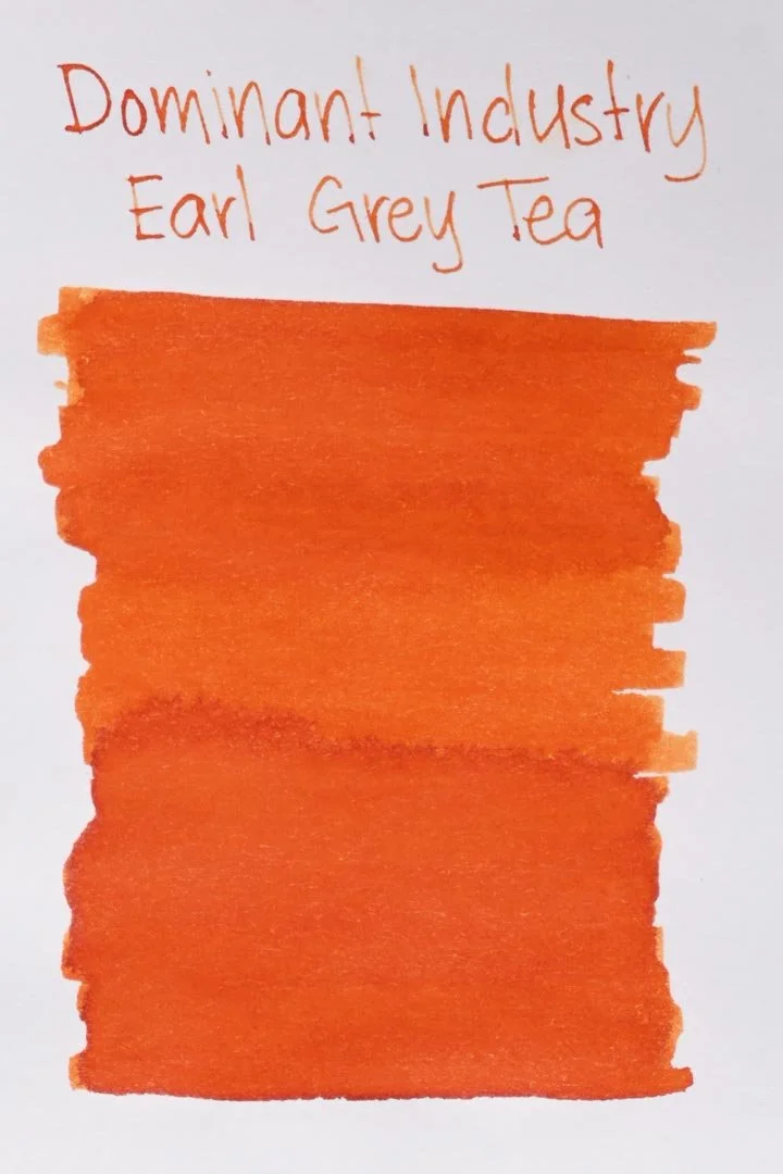
*Please note that the scan is the accurate representation of this color.
Disclosure: This post contains affiliate links. If you click and make a purchase, I may earn a small commission.
Overview
The Color and Properties
Dominant Industry Earl Grey Tea is a vibrant reddish orange. It exhibits some light shading, but it shows with a softer gradient and less tone variation than expected. There’s still enough shading to give this ink some character, but it has a creamier appearance, rather than a hard and crisp cut between lighter and darker tones.
Ink Splat
Droplets
Chromatography
Performance on Paper | Dry Times | Water Resistance
Earl Grey Tea had good performance on paper. I didn’t get any bleed-through or feathering on any of my test pages during my tests, and this ink should be fine on most fountain pen-friendly papers.


Rhodia


Leuchtturm1917
The dry times were just slightly above average: the finer nibs dried faster than usual, but the larger nibs stuck around the 20-second mark.
Unfortunately, water resistance was poor, and anything left over would most likely be difficult to read.
More Pages


Performance in the Pen | Cleaning
Overall, Earl Grey Tea had excellent performance. The ink had a medium but consistent and well-lubricated wetness across all of the test nibs. I didn’t experience any hard starts, skips, or stops during my writing tests.
Cleaning took slightly longer than usual, but nothing was needed outside of a few soaks and flushes.
Writing Samples
Written on 52 gsm Tomoe River Paper (white, 5mm ruling) with a medium nib.
Written on Midori MD paper (cream, 7mm ruling) with a medium nib.
Performance in a pen: 10/10
Performance on paper: 10/10
Color saturation: 5.5/10
Sheening: 0/10
Shading: 3/10
Dry time: 8/10
Water resistance: 1/10
Ease of cleaning: 7.5/10
Shimmer: None
My personal thoughts…
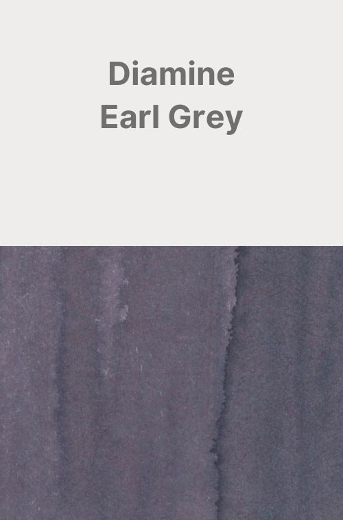
Despite still enjoying the color when Diamine released their Earl Grey in 2017, I remained disappointed that it was no more than an arbitrary choice of color that had essentially nothing to do with my favorite choice of tea. Needless to say, when I spotted this ink at the DC Pen Show I was overjoyed — far more than I should willingly admit. And it lived up to my expectations. The end result is a warming and surprisingly unique shade of orange that’s almost glowing with depth. Most importantly? It does, in fact, look like Earl Grey tea. What more can I ask for? This is what I wanted.
Written with a Barrel and Nib Flora fountain pen on 52 gsm Tomoe River Paper.
And I even got to brew a cup of tea.
More images/info:
Featured in the photography and writing samples:
Dominant Industry Earl Grey Tea
Barrel and Nib Flora fountain pen, medium nib
A5 52 gsm Tomoe River dotted notebook by GoodInkPressions
Midori A6 lined notebook (Amazon)
Galen Leather undyed A6 notebook cover
Galen Leather Crazy Horse Honey Ocre A5 zipper folio
Traveler’s Company Brass Clip (Amazon)
Galen Leather Brass Clip
Numi Organic Aged Earl Grey Tea (Amazon)
Current text: The Picture of Dorian Gray by Oscar Wilde (Amazon)
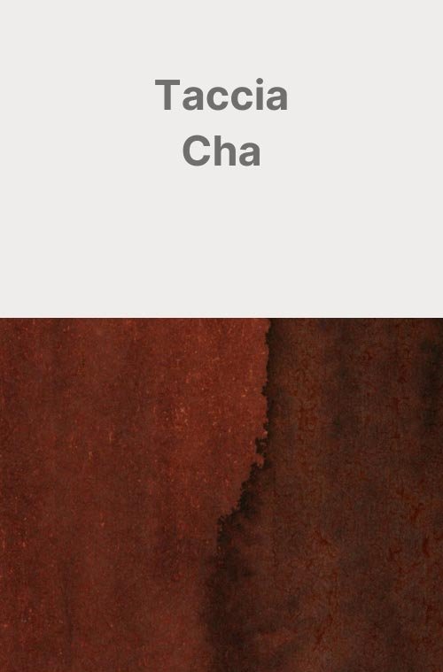
Other tea-themed inks:
You might be interested in:
More images/info:
Tools and materials used in the writing samples:
A TWSBI Diamond 580 AL with 7 nib units, including a Needlepoint grind, EF, F, M, B, 1.1mm stub, and an Architect grind. All nibs are tuned to perform at the same medium wetness.
A Rhodia No16 A5 DotPad
A Leuchtturm1917 A5 Notebook
A Midori MD A5 Notebook
A 68 gsm A5 Tomoe River Notebook
A Maruman Mnemosyne A5 Spiral Notebook
A Kokuyo Campus A5 Notebook