Diamine Inkvent 2025: Day 19 — Overcast
Disclosure: This post contains affiliate links. If you click and make a purchase, I may earn a small commission.
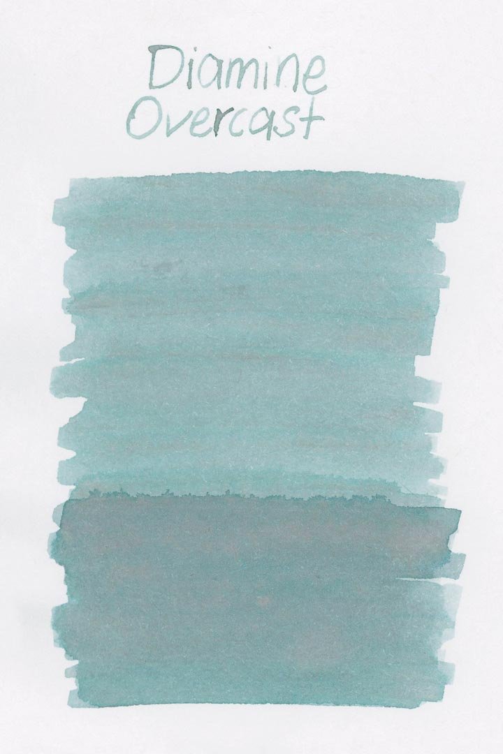
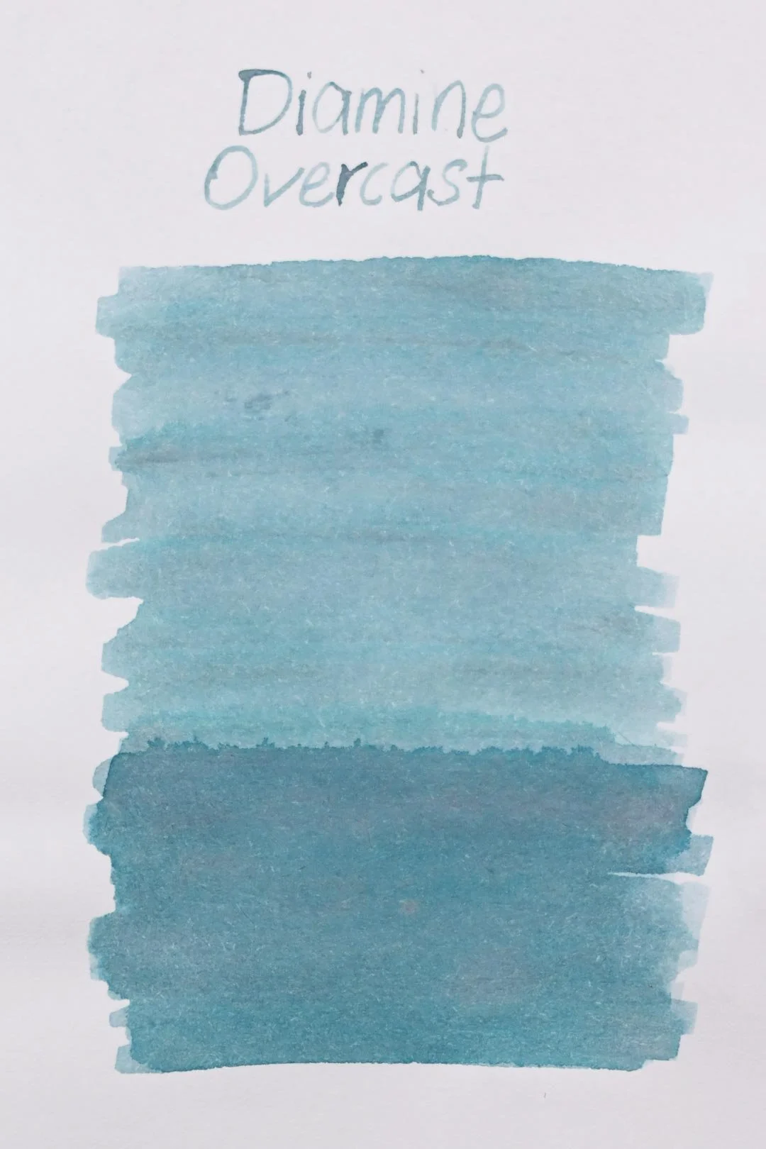
*Please note that the scan is the accurate representation of this color.
Day 19!
Welcome to day 19! Today, we’re looking at Overcast!
The Color and Properties
Diamine Overcast is a standard ink. The base color is a light blue with green undertones. In large concentrations (such as swatches and splats), the ink has a lot of interesting shading properties, where it can shade anywhere from a pinkish-grey to green, to dark blue, to even black. Unfortunately, these properties don’t translate into writing, and the shading will mostly go from its light base color to a slightly darker blue. Where the ink pools the heaviest (such as where letters cross each other), you may notice some slight grey in the shading, or a soft green or black outline around the shaded areas.
Ink splat
Ink droplets
Performance | Cleaning
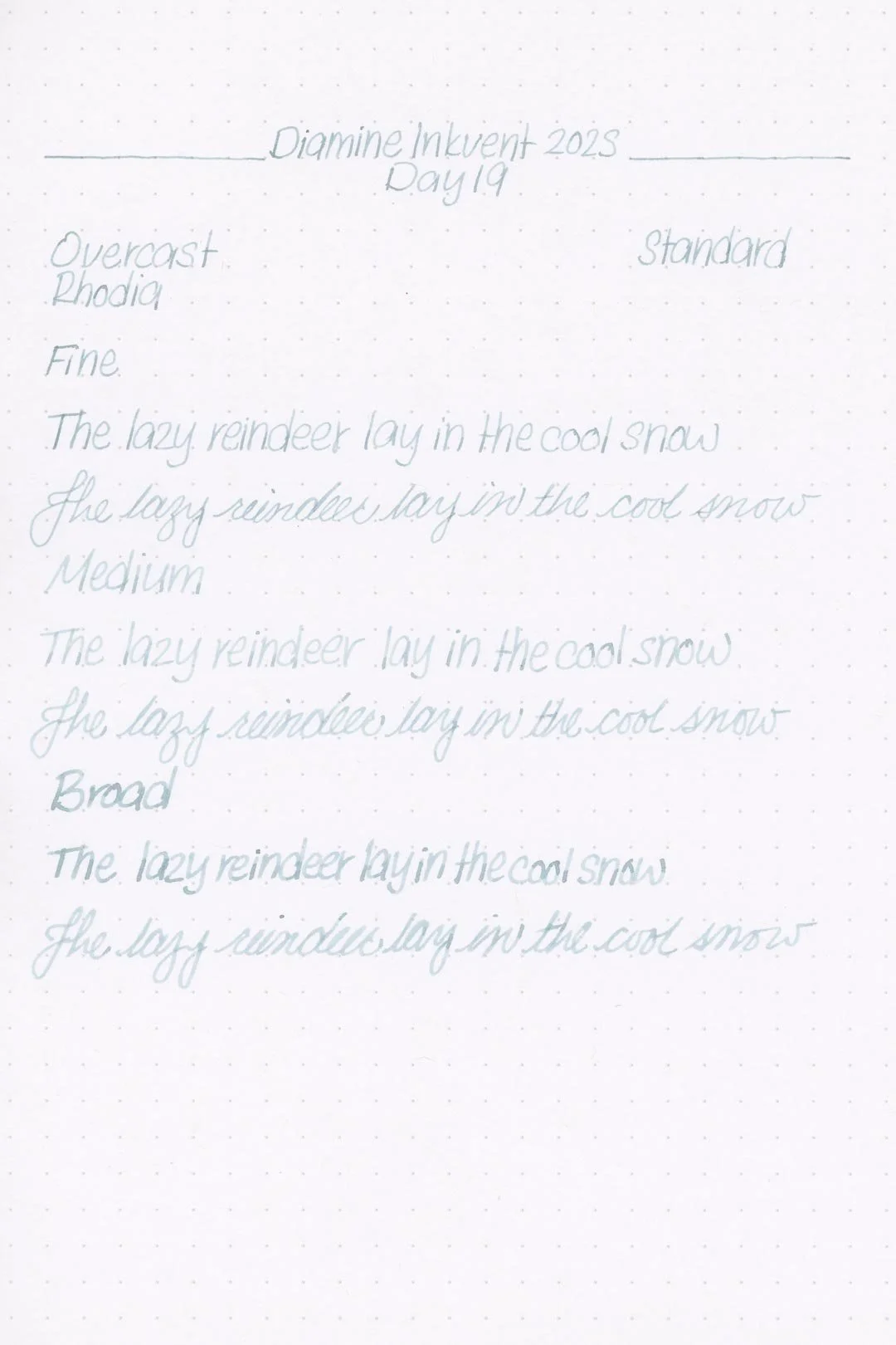
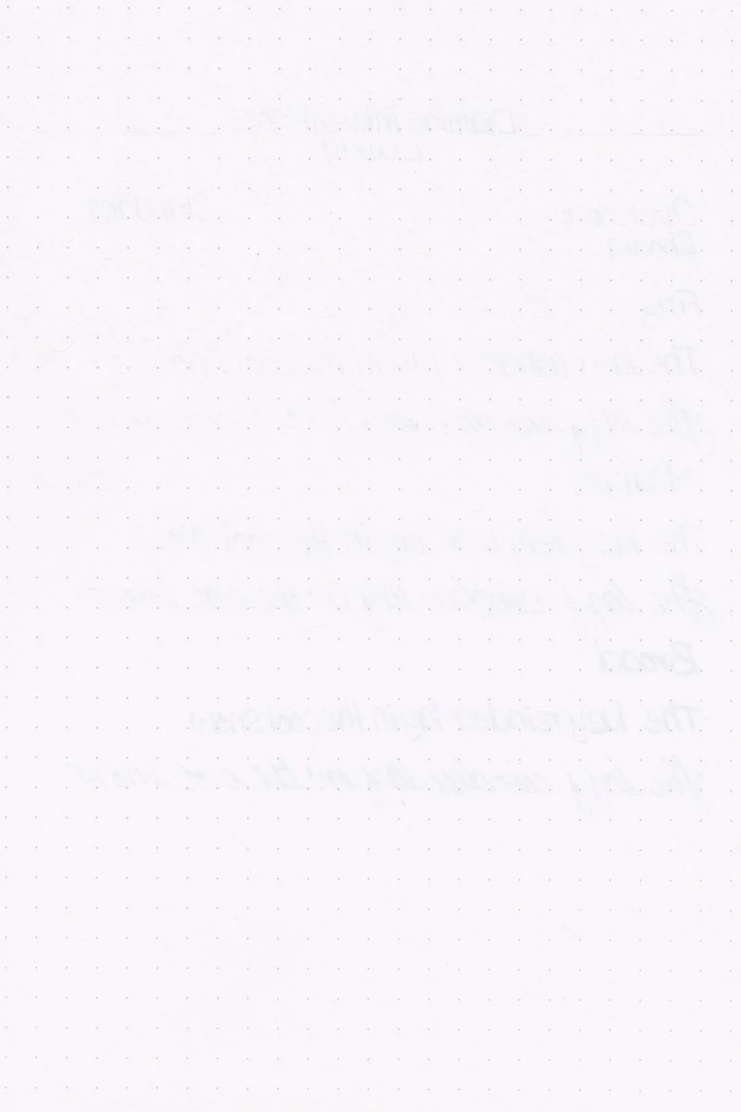
Rhodia
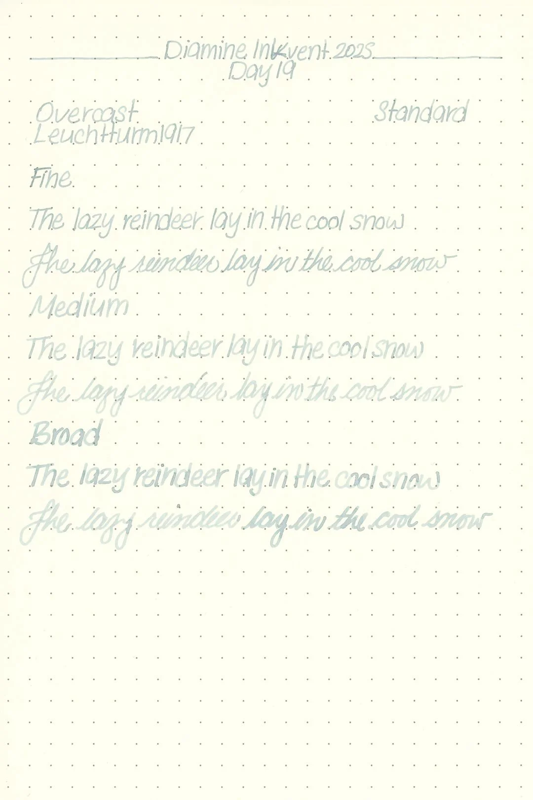
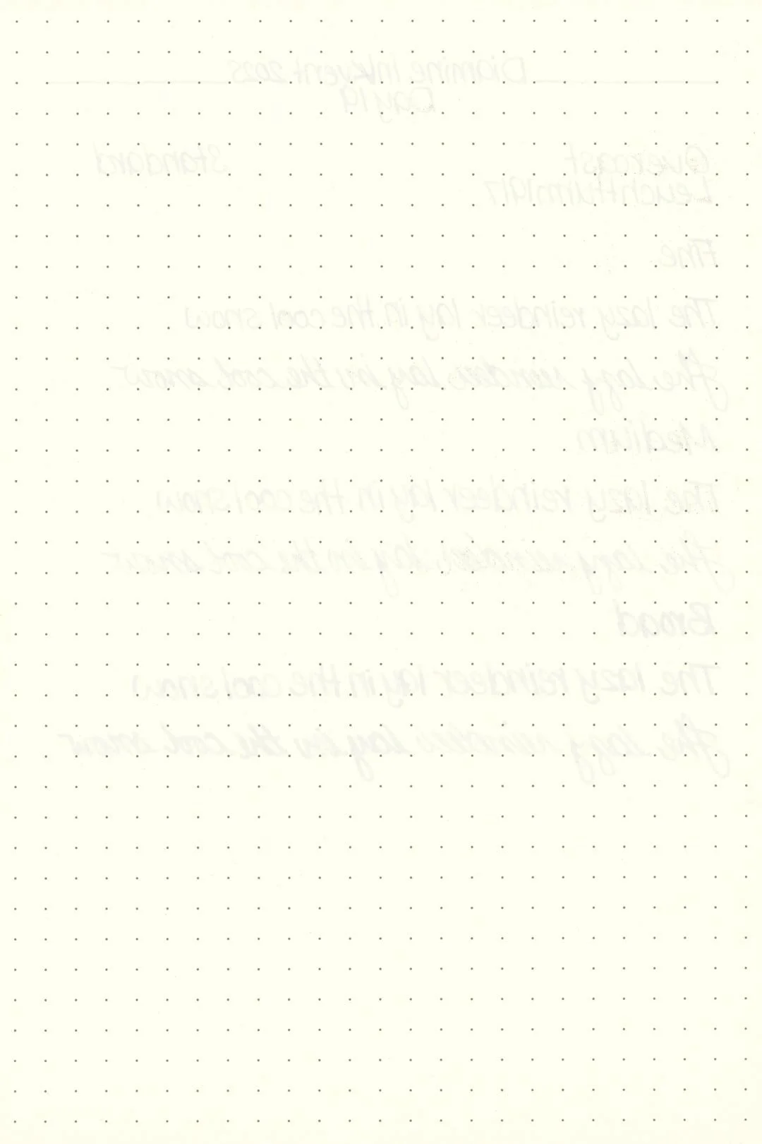
Leuchtturm
Overcast seems well-behaved, and during my tests, I didn’t detect any traces of bleeding or feathering on any of my papers. This isn’t much of a surprise because Overcast has quite a dry flow. I didn’t experience any hard starts, skips, or flow drops, but the lubrication was poor, and the writing experience wasn’t the most pleasant, especially with larger nib sizes, where the ink felt almost non-existent on smoother papers. Still, I didn’t observe any drops in flow during my writing tests.
The cleaning experience was as expected and only took a single set of soaking and flushing with a bulb syringe to clean out the pen and nib units, with no color or residue remaining in the pen.
Writing Samples
Written on 52 gsm Tomoe River paper (white, 7mm ruling) with a medium nib.
Written on Midori MD paper (cream, 7mm ruling), with a medium nib.
Taken in lower, single sided lighting to better showcase the shimmer.
My personal thoughts…
Overcast is another weak entry in 2025’s calendar. I wouldn’t say the color is bad, but it feels like it falls just short of being something more special. It has so much more character in large concentrations like swatches or splats, but in writing, it doesn’t pull it off. Instead, it feels like another generic toss at a cool wintry blue, and it feels like there are already so many across the Inkvent catalogue. The writing experience is overwhelmingly dry and lacking any redeeming value, which is a shame, because I think just a little more flow would have brought out the character this ink so desperately needs.
Written on 52 gsm Tomoe River paper with a medium nib.
More Images/Info:
Featured in the photography and writing samples:
Diamine Overcast
TWSBI Diamond 580, medium nib
Traveler’s Company “Have a Nice Trip” brass clip — Endless Pens | Amazon
Nanami Paper Tomoe River Cafe Note B6 Slim - Ruled
Midori MD A6 lined notebook — Amazon
Current text: A Christmas Carol by Charles Dickens — Amazon
Enjoying this content? Consider donating or joining our Patreon! It goes a long way to allow me to put more content like this together (and hopefully, make it even better!), and every little bit is an immense help.
Tools and materials used in the writing samples:
A TWSBI Diamond 580 AL with 3 nib units including a Fine, Medium, and Broad. All nibs are tuned to perform at the same wetness.
A Rhodia No16 A5 DotPad
A Leuchtturm1917 A5 Notebook