Diamine Inkvent 2025: Day 7 — Blush
Disclosure: This post contains affiliate links. If you click and make a purchase, I may earn a small commission.
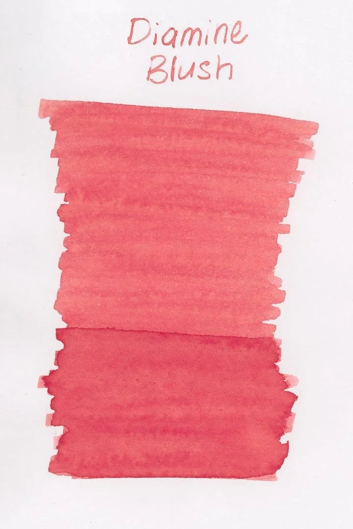
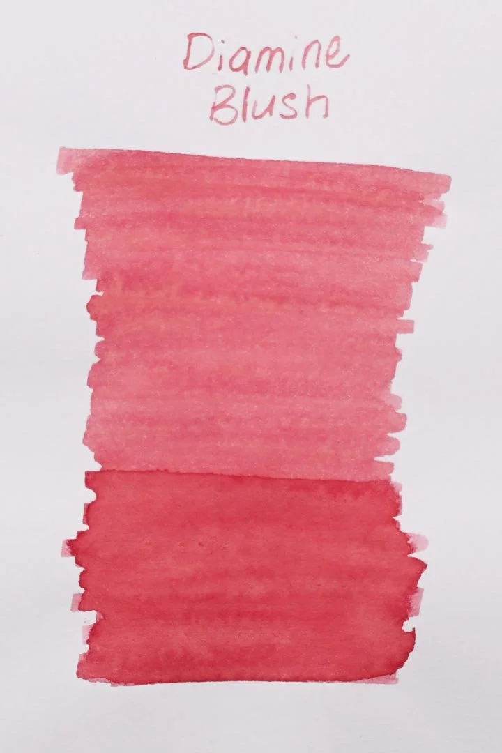
*Please note that the scan is the accurate representation of this color.
Day 7!
Hello everyone! For day 7 of Diamine Inkvent, we have Blush.
The Color and Properties
Diamine Blush is a standard ink. The color is pink with minor orange undertones (mostly in large concentrations such as swatches or splats). In writing, the ink is a paler pink that shades with a crisp cut when writing in cursive, and a crisp cut and darker pink edges around pooled areas when writing in print. Although this ink is pale, it’s surprisingly easy to see, even with darker writing on the opposite side of the page, and cream paper darkens the ink up significantly.
Ink splat
Ink droplets
Performance | Cleaning
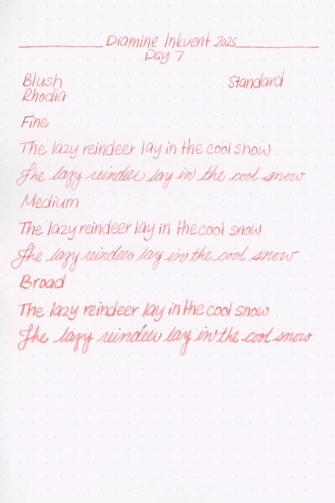
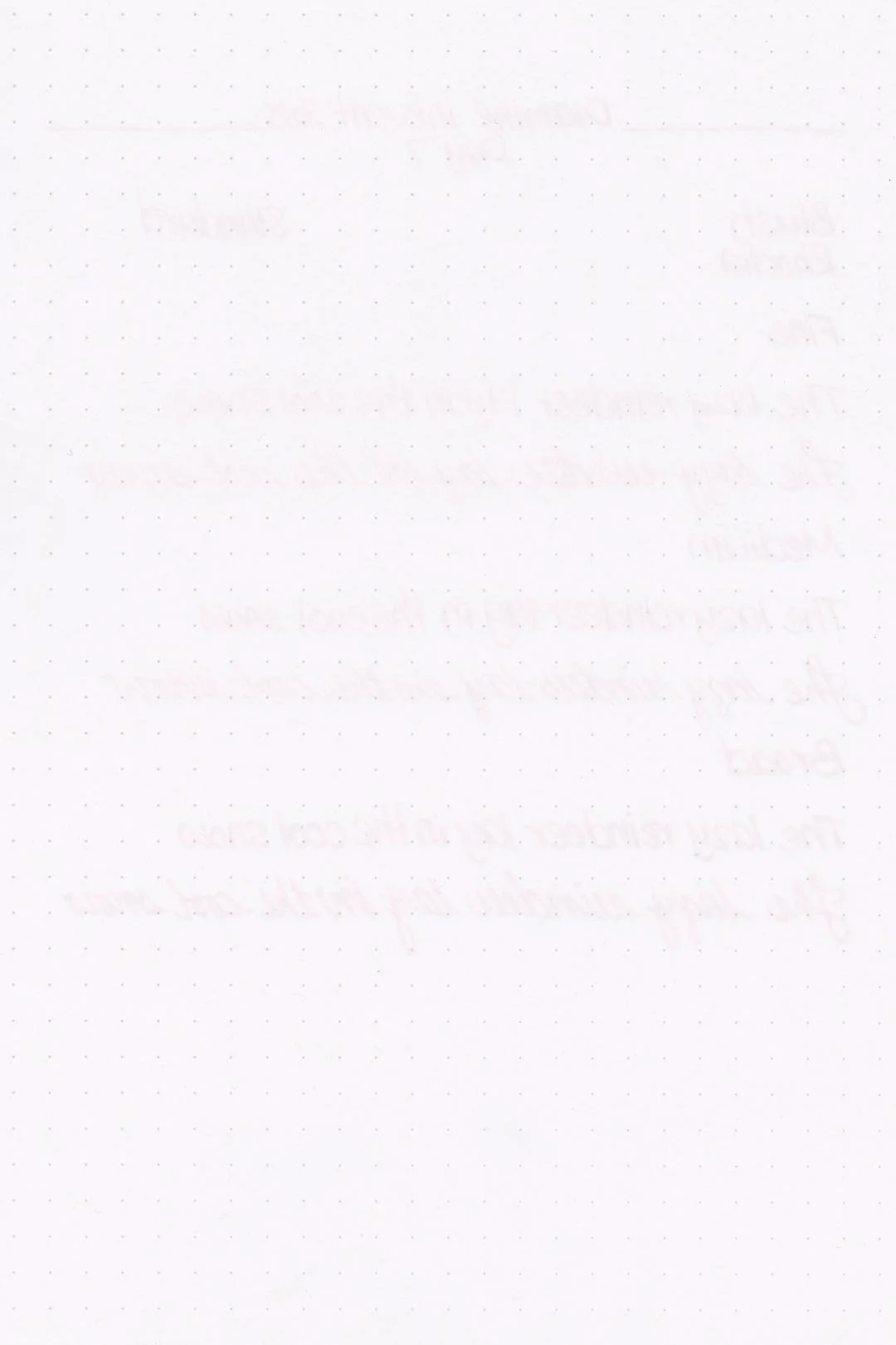
Rhodia
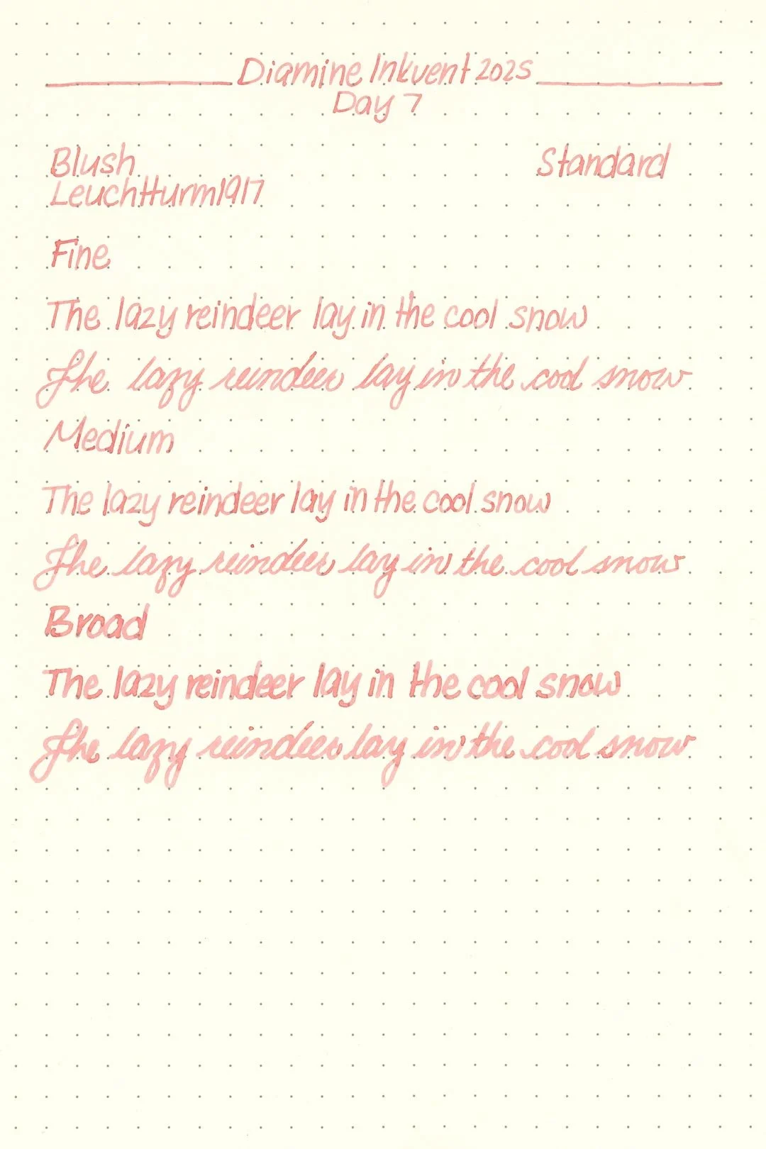

Leuchtturm
Blush has a medium flow and is well lubricated enough for a comfortable writing experience. I didn’t experience any hard starts, stops, or skips during my tests, and there weren’t any noticeable drops in flow during my extended writing tests. I didn’t notice any traces of bleeding or feathering on any of the papers I tested with, and overall Blush seems very well behaved.
The cleaning experience was also simple, and a single soak and flush with a bulb syringe had the pen and nib units clean, with no remaining color or residue visible.
Writing Samples
Written on 52 gsm Tomoe River paper (white, 7mm ruling) with a medium nib.
Written on Midori MD paper (cream, 7mm ruling), with a medium nib.
My personal thoughts…
As far as pale pink inks go, Blush performs surprisingly well! I was really impressed by the consistent flow, and I’d say it’s overall one of the better pale pinks I’ve tried. The color isn’t bad either. It’s not quite so pale that it’s hard on the eyes. Even though cream papers help darken the ink, I think I prefer the way it looks on white paper. It’s more subtle, and I think it looks slightly more elegant that way. I also love that it’s a cool-toned pink that doesn’t lean blue (something I’ve never been a fan of). Does it feel on theme with Inkvent, though? My first thought is that it’s inspired by the rosy pink of a blush champagne, which is thematically relevant for the festive season. Another possibility, albeit a slightly tenuous one, is that pale wintry pinks like this are a surprisingly popular color for a variety of Christmas decorations. Either way, I think the name and color are seasonally appropriate. It’s a very nice ink, and one I can recommend.
Written on 52 gsm Tomoe River paper with a medium nib.
More Images/Info:
Featured in the photography and writing samples:
Diamine Blush
Traveler’s Company “Have a Nice Trip” brass clip — Endless Pens | Amazon
Traveler’s Company brass clip — Endless Pens | Amazon
Nanami Paper Tomoe River Cafe Note B6 Slim - Ruled
Midori MD A6 lined notebook — Amazon
Current text: A Christmas Carol by Charles Dickens — Amazon
Enjoying this content? Consider donating or joining our Patreon! It goes a long way to allow me to put more content like this together (and hopefully, make it even better!), and every little bit is an immense help.
Tools and materials used in the writing samples:
A TWSBI Diamond 580 AL with 3 nib units including a Fine, Medium, and Broad. All nibs are tuned to perform at the same wetness.
A Rhodia No16 A5 DotPad
A Leuchtturm1917 A5 Notebook