Diamine Pumpkin
Ink Review #13
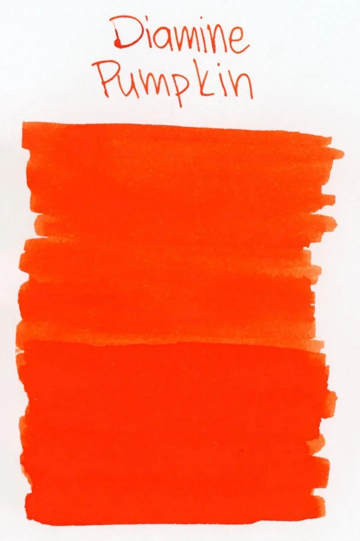

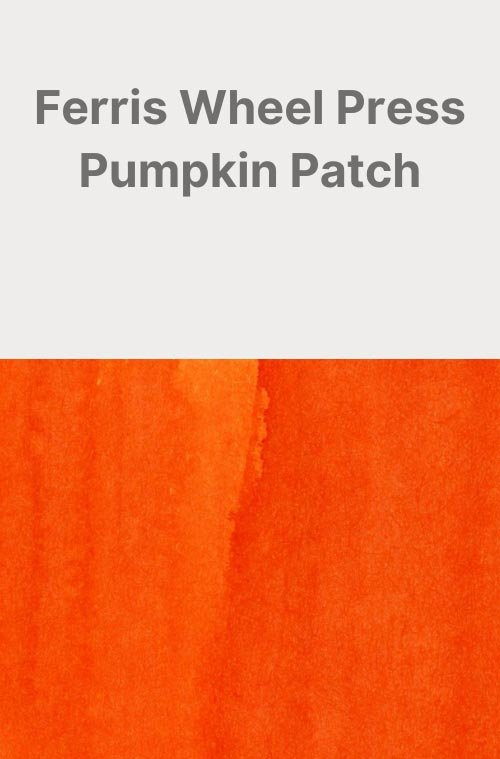
*Please note that the scan is the accurate representation of this color.
Disclosure: This post contains affiliate links. If you click and make a purchase, I may earn a small commission.
Overview
The Color and Properties
Diamine Pumpkin is a vibrant orange. It’s a mostly solid color that doesn’t offer a lot of shading or color variation. Any shading you do experience will be minimal, and any lighter tones that may be present are so often going to be overpowered by the saturated, searing orange that you’ll rarely see them.
Ink splat
Ink droplets
Chromatography
Performance on Paper | Dry Times | Water Resistance
Diamine Pumpkin was very well-behaved on paper: there was no feathering and no bleeding on any of the test pages.

Rhodia


Leuchtturm1917
Dry times were average and uniform, with few discrepancies across the different test papers.
There was some water resistance, but it unfortunately left a cloudy and smudgy mess that isn’t easily legible.
More Pages


Performance in the Pen | Cleaning
Pumpkin was also well-behaved in the pen. The ink had a medium flow that provided ample lubrication that felt consistent in all of the test nibs. I didn’t experience any hard starts, skips, or stops during the tests. I do want to note that this ink does have a tendency to crust up quickly and there may be a high chance for nib creep.
This is a highly saturated orange and I expected difficulties cleaning, but thankfully, cleaning was much easier than expected. The water ran clear with a standard flush and didn’t leave any residue in the barrel or on the piston.
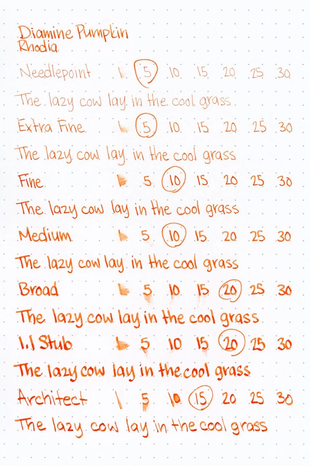
Writing Samples
Written on Endless Reglia paper (white, 5mm ruling) with a medium nib
Written on Leuchtturm1917 paper (cream, 5mm ruling) with a medium nib
Performance in a pen: 9.5/10
Performance on paper: 10/10
Color saturation: 8/10
Sheening: 0/10
Shading: 3/10
Dry time: 7.5/10
Water resistance: 4/10
Ease of cleaning: 8/10
Shimmer: None
My personal thoughts...
I hate to say it, but I just don’t really care for this one. There’s nothing exactly wrong with the color or the performance, but It’s just so underwhelming. Maybe it was unfair of me to expect a deluge of the inky essences of autumn pumpkin perfection. It does look remotely pumpkin colored at a glance, but then the color almost feels too saturated to truly resemble one. Honestly, it could just be any orange, so for a moment let’s imagine that it wasn’t even named Pumpkin. Does it get any better? Not really, I’m still underwhelmed.
I wanted pumpkins, but all I got was disappointment.
Edit 10/15/2024: You know, I have to admit that since reviewing this it’s grown on me a little. It’s still not a favorite, but it does put you in the mood for spooky season, no?
Samples written in a Leuchtturm1917 notebook (cursive) and an Endless Recorder notebook (Regalia paper, print) with a Nahvalur Original Plus "Pumpkin Marmalade" (medium nib)

More images/info:
Featured in the photography and writing samples:
Diamine Pumpkin
Nahvalur Original Plus “Pumpkin Marmalade”, medium nib
Rickshaw Sleepy Hollow single pen sleeve
Roses Without Thorns pop-up card
Bicycle Boo Back playing cards
Color comparisons:
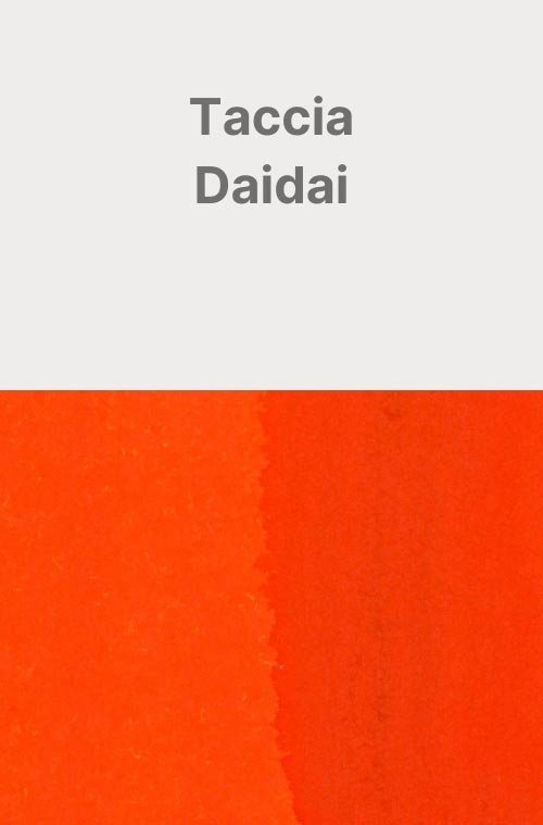
More pumpkin-themed colors:
Tools and materials used in the writing samples:
A TWSBI Diamond 580 AL with 7 nib units, including a Needlepoint grind, EF, F, M, B, 1.1mm stub, and an Architect grind. All nibs are tuned to perform at the same medium wetness.
A Rhodia No16 A5 DotPad
A Leuchtturm1917 A5 Notebook
A Midori MD A5 Notebook
A 68 gsm A5 Tomoe River Notebook
A Maruman Mnemosyne A5 Spiral Notebook
A Kokuyo Campus A5 Notebook