Taccia Daidai
Ink Review #30
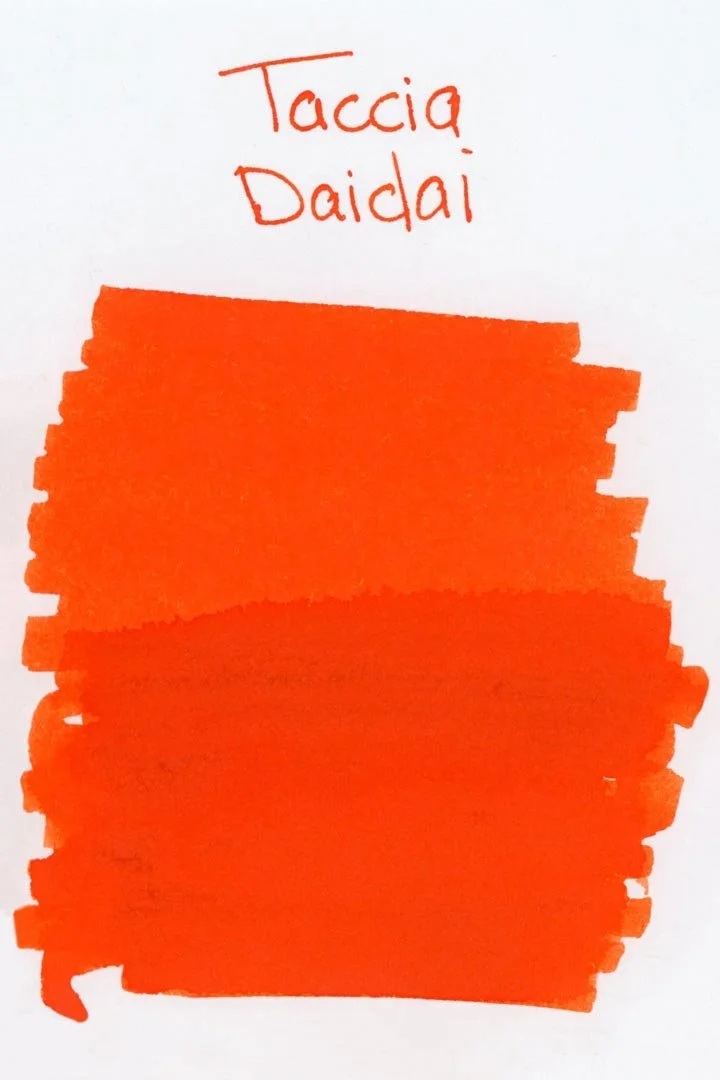

*Please note that the scan is the accurate representation of this color.
Overview
The Color | Properties
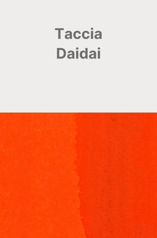
Taccia Daidai is a bright and vibrant orange. In writing, the ink looks mostly solid and there’s not a lot of shading, especially when writing in cursive; however, you may notice some minor tonal variation with a soft cut around where the ink pools, especially when writing in print.
I found it very difficult to capture the vibrance of this ink in the photography, especially on the cream paper. While the ink shines in good lighting, a lot of the brown tones tend to come through when the lighting is less than ideal.
Ink Splat
Droplets
Chromatography
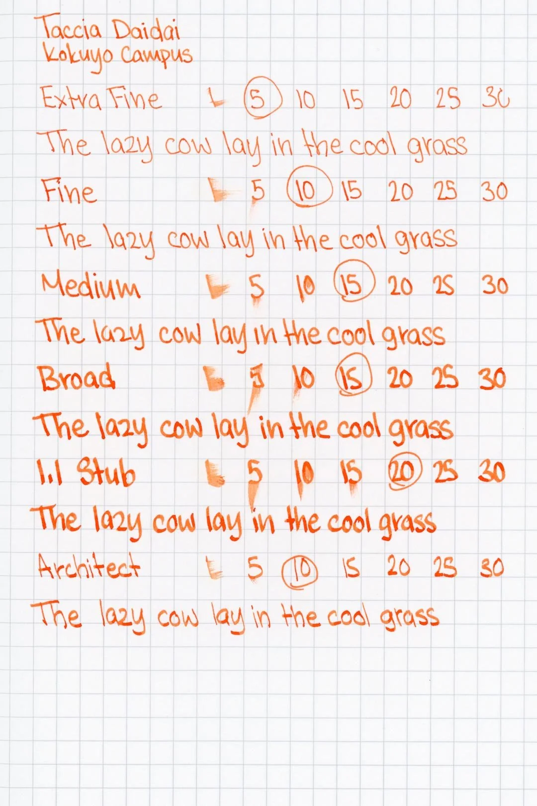
Performance on Paper | Dry Times | Water Resistance
Daidai’s performance is okay, but not great. There was one spot of bleed-through on Kokuyo, and surprisingly, there was not only some micro feathering, but also some bleed-through on the Leuchtturm paper. There was also a lot of feathering in the ink splat and droplets. The ink should still be safe on a lot of fountain pen-friendly papers; however, it may be prone to feathering and light bleeding on some.
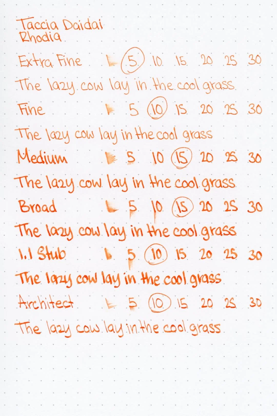

Rhodia

Leuchtturm1917
Bleed-through on Leuchtturm
The dry times are average with the larger nib sizes drying around 15-20 seconds (although the dry times were noticeably better on both Rhodia and Leuchtturm paper).
Unfortunately, when exposed to water, the ink quickly clouds over, making anything that was written difficult to read.


Performance in the Pen | Cleaning
The performance was mixed. The ink has a medium flow, but right out of the gate, it refused to work with the needlepoint on any of the test papers. The other nibs all worked without any hard starts, skips, or stops, but I couldn’t help but notice a feeling of dryness despite the flow.
The ink took 2 sets of soaking and flushing to clean out, which is more than expected, but still, the ink washed out without any stains or residue left behind in the test pen or nib units.
Writing Samples
Written on 52 gsm Tomoe River paper (white, 7mm ruling) with a medium nib.
Written on Midori MD paper (cream, 7mm ruling) with an extra fine nib.
Written on Midori MD paper (cream, 7mm ruling) with a medium nib.
Performance in a pen: 8/10
Performance on paper: 7.5/10
Color saturation: 7/10
Sheening: 0/10
Shading: 2/10
Dry time: 7.5/10
Water resistance: 1/10
Ease of cleaning: 7.5/10
Shimmer: None
My personal thoughts...
I initially liked this color; it seemed like a nice, vibrant orange to me, and for a decent price. Unfortunately, the enjoyment died down fast — even more so while working on this review — after realizing how dry it felt on top of a decreasing enthusiasm for the color itself. I don’t think it resembles a daidai either. The color is so saturated, and feels so synthetic when I was looking for something that looked more natural. This one’s just not for me.
An update 2 years later…
You know, I was surprised when revisiting this ink to find that I don’t dislike the color as much as I used to. Especially when using it with an extra fine nib. It reminds me of an orange gel pen ink, and honestly, that’s not a terrible thing. With that said, it still has its shortcomings, and I’m still not sure that I would recommend this over another orange.
Written on 52 gsm Tomoe River paper with a pen by The Herbert Pen Company (medium nib).
More images/info:
Color comparisons:
Tools and materials used in the writing samples:
A TWSBI Diamond 580 AL with 7 nib units, including a Needlepoint grind, EF, F, M, B, 1.1mm stub, and an Architect grind. All nibs are tuned to perform at the same medium wetness.
A Rhodia No16 A5 DotPad
A Leuchtturm1917 A5 Notebook
A Midori MD A5 Notebook
A 68 gsm A5 Tomoe River Notebook
A Maruman Mnemosyne A5 Spiral Notebook
A Kokuyo Campus A5 Notebook