Monteverde Azure Noir
Ink Review #155
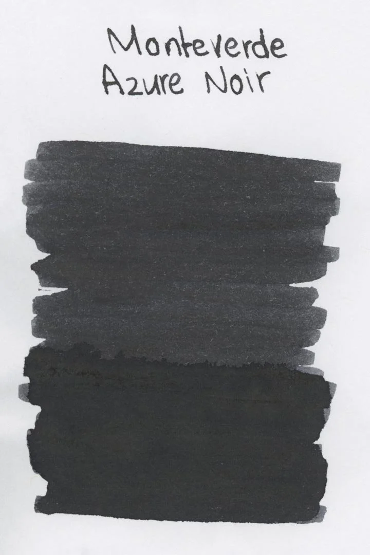
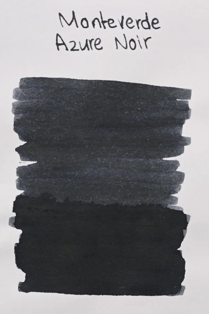
*Please note that the scan is the accurate representation of this color.
Disclosure: This post contains affiliate links. If you click and make a purchase, I may earn a small commission.
The Color and Properties
Monteverde Azure Noir is a blue-black (or really, blue-grey) that shades with a soft cut between light and dark tones when writing in both cursive and print. The amount of blue you see in this ink is very situational and can be influenced by a variety of factors. For instance, white paper shows it off significantly more than cream papers, as does the amount of ink laid down (for example, writing vs swatching, or heavy-handedness). Even the lighting in which it’s viewed will affect the appearance. In most cases, it looked more grey than blue to me (this may sound like a criticism, but it’s just an observation).
Ink splat
Ink droplets
Chromatography
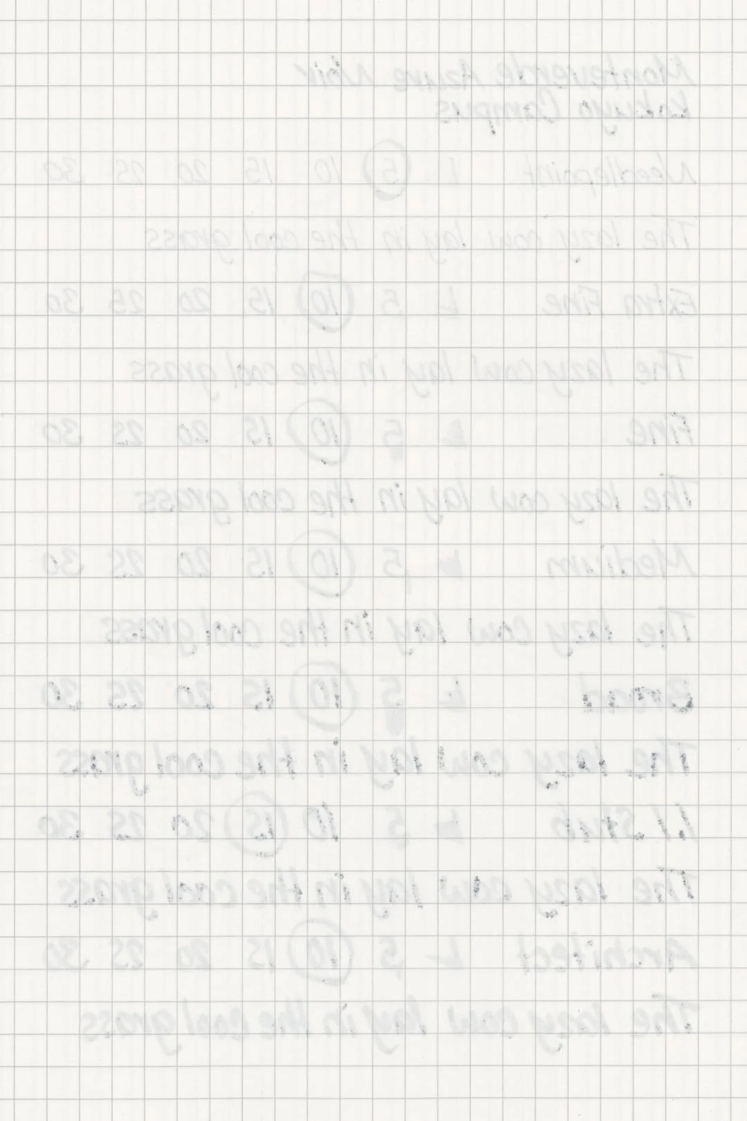
Performance on Paper | Dry Times | Water Resistance
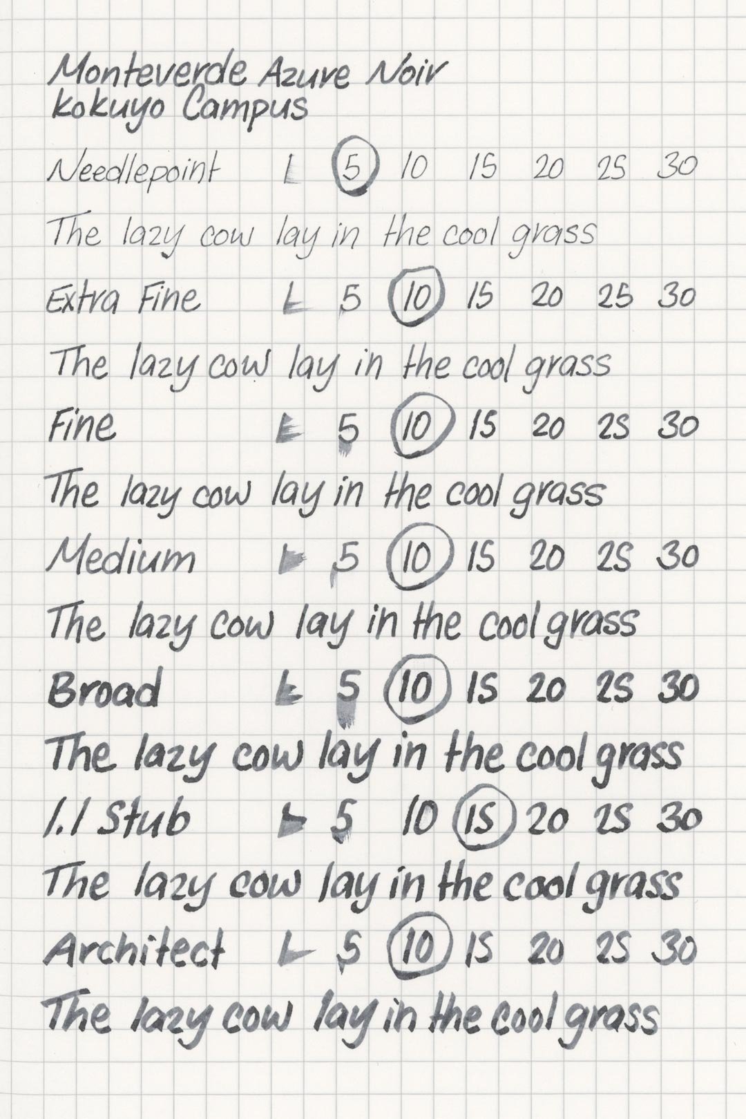
Based on the very feathery ink droplets above, I expected this ink to perform worse than it did, but it was surprisingly well-behaved. There was significant bleed-through in the Kokuyo notebook, and maybe the slightest amount of feathering on Leuchtturm (incredibly hard to see), but otherwise, none of the other test papers feathered or bled through. The ink should be fine with many fountain pen-friendly papers, especially the less absorbent ones, but based on those feathery droplets, I wouldn’t be surprised if this ink pushed those papers past their limits when used with wetly tuned pens.
Rhodia
Leuchtturm1917
The dry times are slightly above average, with the largest nib sizes drying at a normal 20 seconds; however, I was surprised to see that more often than not, the ink would dry around 10-15 seconds regardless of nib size. Unfortunately, that means the finer nibs took slightly longer than usual, but overall, the dry times are decent.
The water resistance was a nice surprise! There’s some color loss and clouding-over when the ink is exposed to water, but the remains are still dark and very legible.
More Pages

Performance in the Pen | Cleaning
Azure Noir has a medium flow and an average level of lubrication. It’s not slick, but it’s still smooth and comfortable enough to write with. Still, I wish it were just a tad slicker. The ink kept up well during extended writing, without any noticeable drops in flow, but I noticed a small tendency for dry starts on some letters when I was writing in print. It didn’t happen often, however, and the ink was otherwise well behaved during my tests.
This ink cleaned out quickly with just a single soak and flush. Initially, there were some rings of residue left over inside the barrel of my test pen, but they dissolved with basic water over a few nights with no visible traces left in the pen.
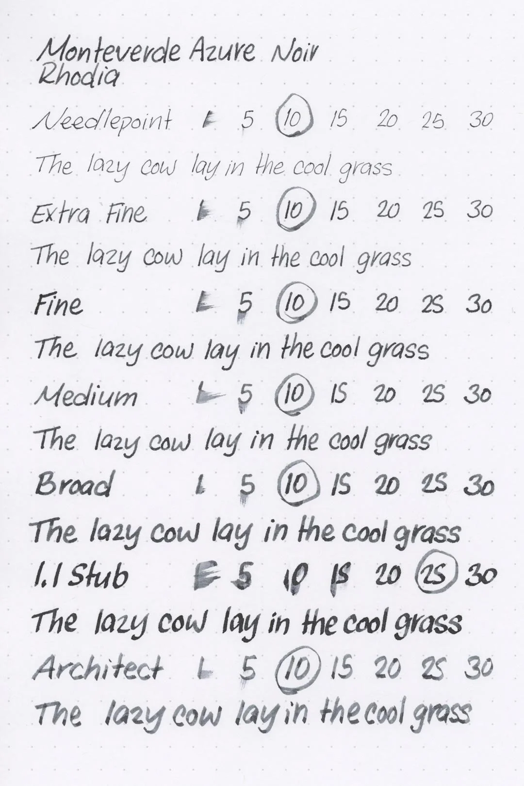
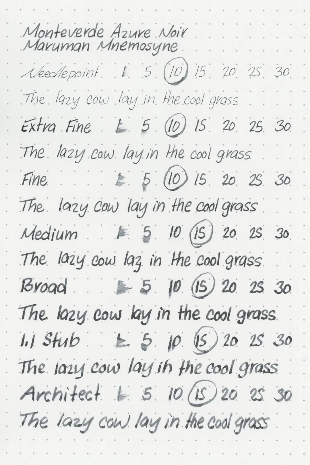
Writing Samples
Written on 52 gsm Tomoe River paper (white, 6mm ruling) with a medium nib.
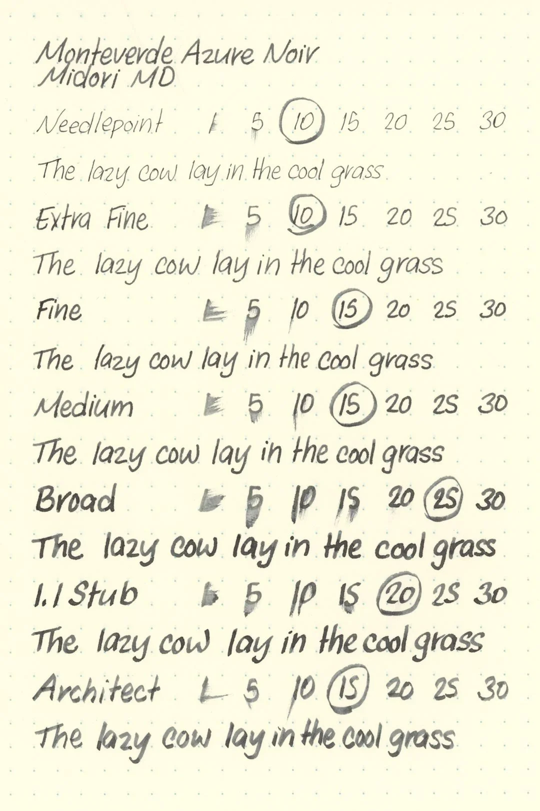
Written on Midori MD paper (cream, 7mm ruling) with a medium nib.
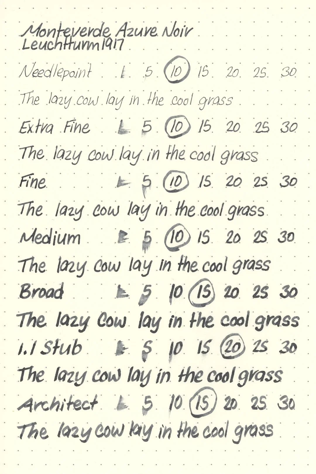
Written on Leuchtturm1917 paper (cream, 5mm ruling) with a medium nib.
Performance in a pen: 8/10
Performance on paper: 7.5/10
Color saturation: 6/10
Sheening: 0/10
Shading: 4/10
Dry time: 8/10
Water resistance: 5/10
Ease of cleaning: 7.5/10
Shimmer: None
My Personal Thoughts…
For the first ink in the Monteverde Noir Collection, Azure Noir is a safe start. Monteverde calls it a “calming shade of blue melded with black” and I’m guessing it was a lighter blue, because it doesn’t quite make a blue-black, but instead it’s more of a blueish-grey. I was immediately reminded of Edelstein Tanzanite (at least in writing, not so much swatches), and that’s not a bad thing. The color looks good, especially on white papers that let subtle blue tones shine through. With that said, the color also doesn’t exactly dive that deeply into Monteverde’s concept of expanding on blue/black with other colors, because, well, it’s still blue/black (ooooooooor grey, fine). Would I still recommend it? Sure, if you really like the color, then why not? It’s a fine ink, and I can see the more neutral color easily winning someone over, but personally, I’m more excited for some of the other colors in this ink set.
Written on 52 gsm Tomoe River Paper with an Edison Collier (medium nib).
More images/info:
Featured in the photography and writing samples:
Monteverde Azure Noir
Edison Collier, medium nib
52 gsm Tomoe River notebook by Sterling Ink
Midori MD A6 lined notebook (Amazon)
Leuchttum1916 A6 dot grid notebook
Field Notes Reporter’s Notebook (Amazon)
Field Notes ruled pocket notebook (Amazon)
Traveler’s Company brass clip (Amazon)
Tim Holtz mini bulldog clips (Amazon)
Magnifying Glass (Amazon)
Current text: The Maltese Falcon by Dashiell Hammett (Amazon)
Comparisons:

Tools and materials used in the writing samples:
A TWSBI Diamond 580 AL with 7 nib units, including a Needlepoint grind, EF, F, M, B, 1.1mm stub, and an Architect grind. All nibs are tuned to perform at the same medium wetness.
A Rhodia No16 A5 DotPad
A Leuchtturm1917 A5 Notebook
A Midori MD A5 Notebook
A 52 gsm A5 Tomoe River Notebook
A Maruman Mnemosyne A5 Spiral Notebook
A Kokuyo Campus A5 Notebook