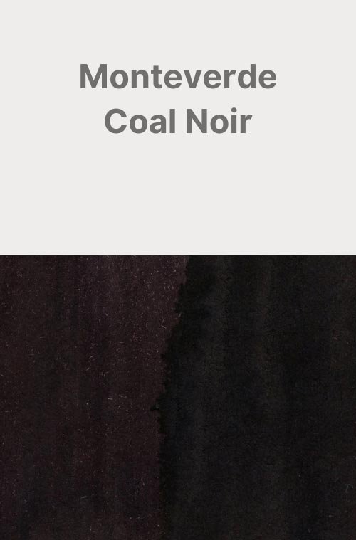
Monteverde Smoke Noir
Ink Review #157
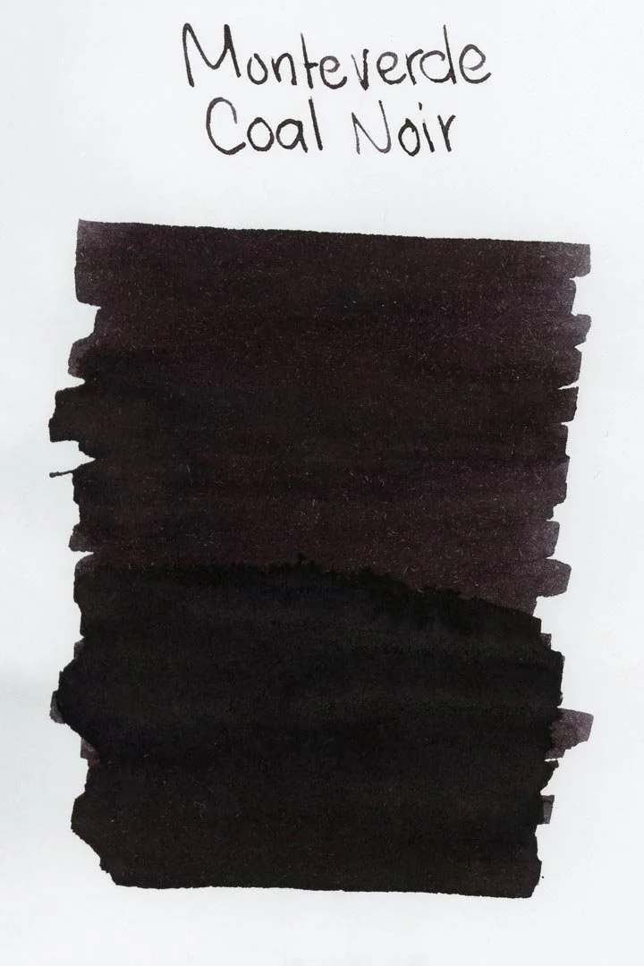
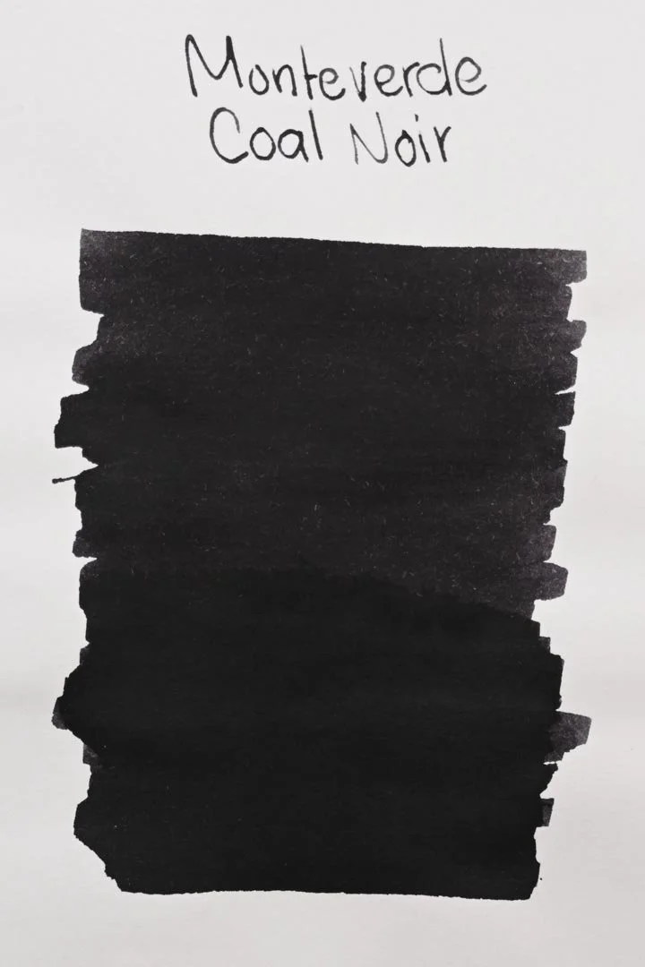
*Please note that the scan is the accurate representation of this color.
Disclosure: This post contains affiliate links. If you click and make a purchase, I may earn a small commission.
The Color and Properties
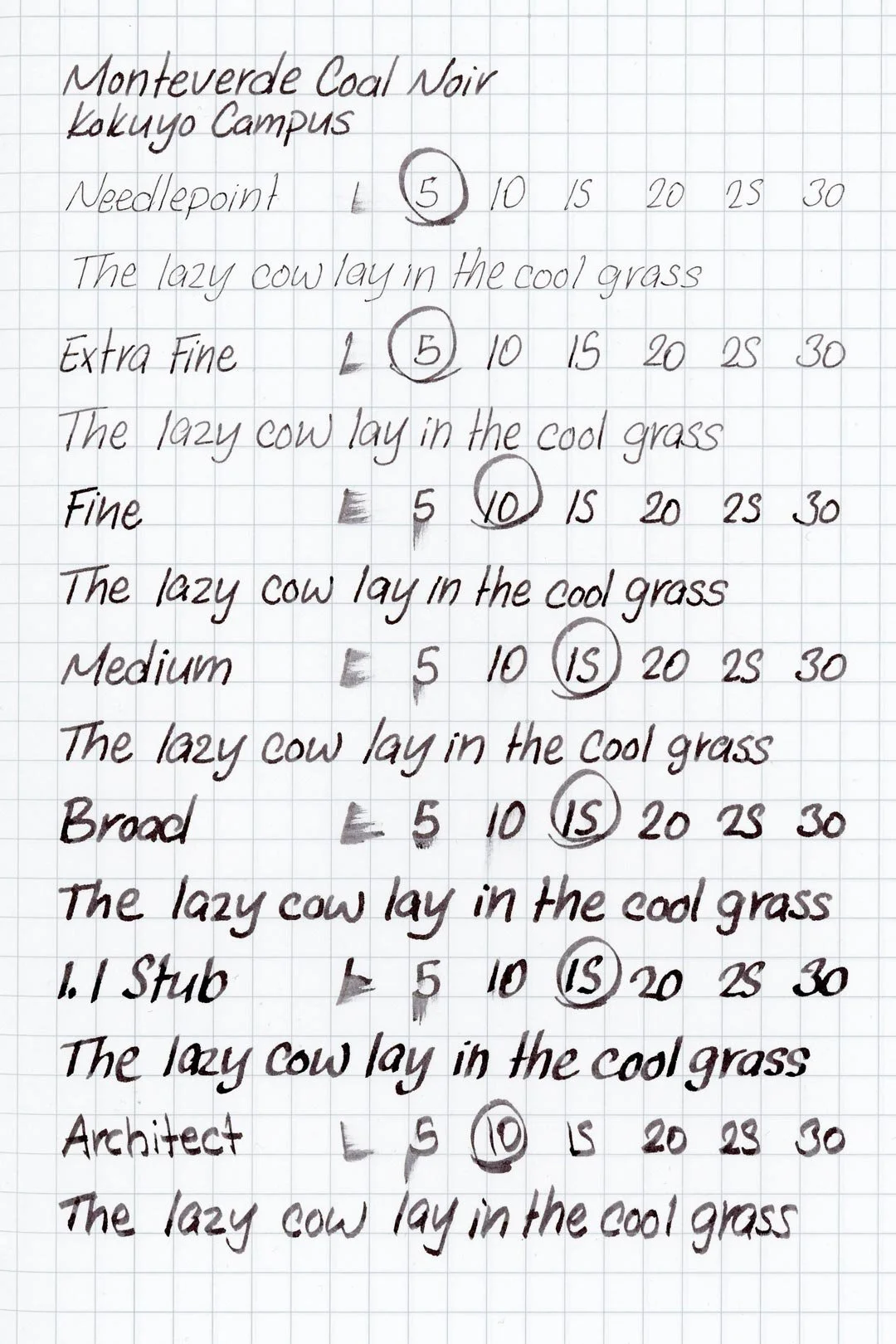
Monteverde Coal Noir is a dark grey ink with mild red/brown undertones. It shades with a soft cut when writing in both cursive. While the shading is still visible, there’s not a lot of tonal variation with this ink. There is, however, a dull black sheen that I noticed. There’s not a lot of contrast, and it can be hard to see, but in the right lighting, it can be visible around the edges of letters.
Ink splat
Ink droplets
Chromatography
Performance on Paper | Dry Times | Water Resistance
Coal Noir behaved well on all of my test pages, with no traces of feathering, and only minor spot bleed-through on the Kokuyo paper. This ink should be fine with most fountain pen-friendly paper options.
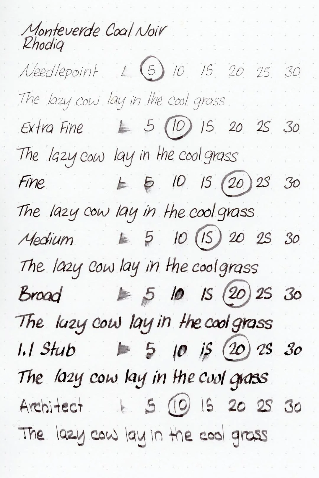

Rhodia
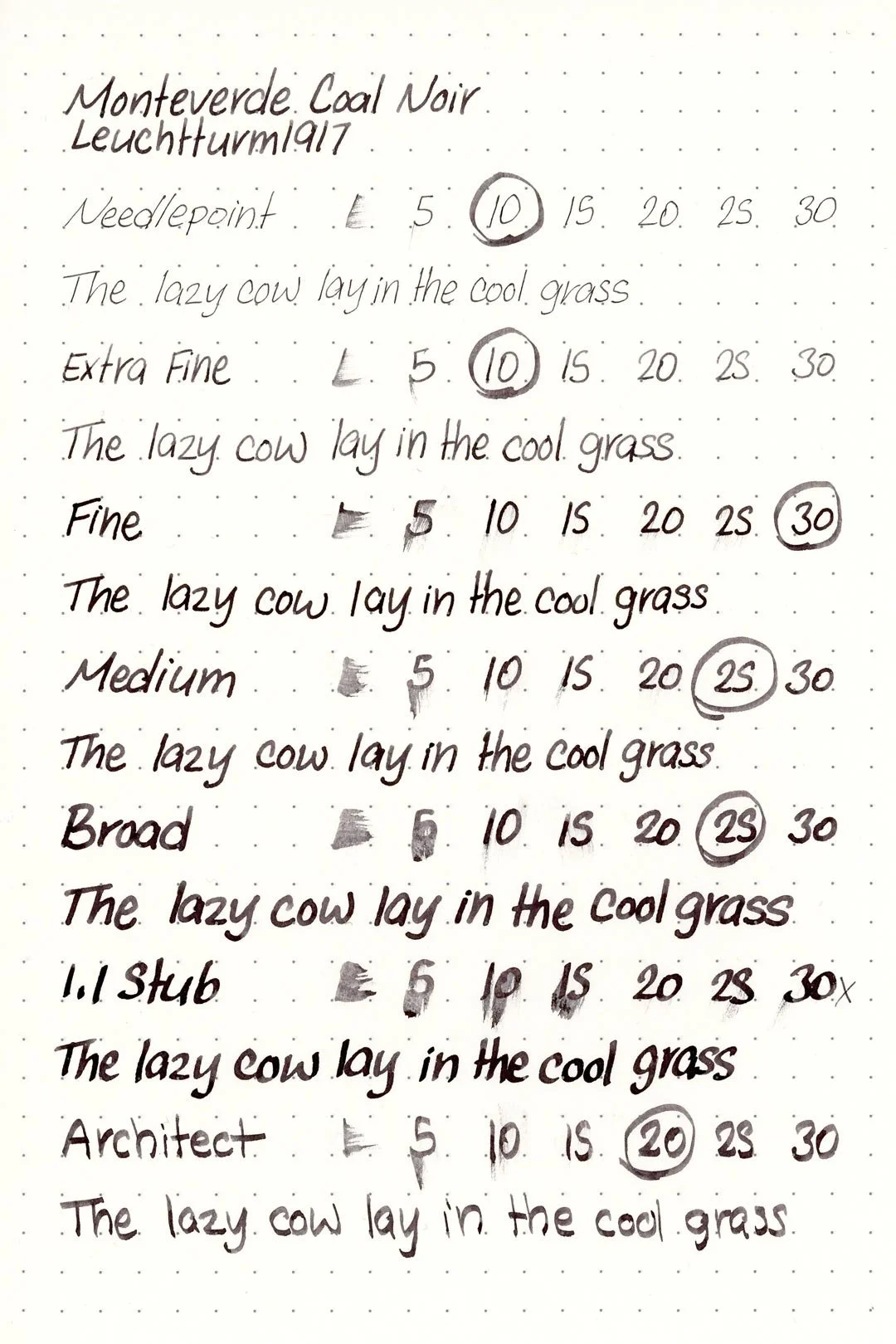

Leuchtturm1917
The dry times were just below average. The needlepoint and extra-fine dried in an average of 5-10 seconds, but the fine-architect took anywhere between 20-30 seconds, and in some cases longer to dry. The light sheen can also leave the ink prone to smudging from hand moisture even after it’s dried.
The water resistance isn’t great, and water exposure quickly causes the color to cloud over, but the remains are still dark and crisp enough to be legible.
More Pages


Performance in the Pen | Cleaning
Coal Noir has a medium-wet flow and is well-lubricated and comfortable to write with. The ink kept up well during extended writing, and I didn’t experience any drops in flow, but I noticed there was a small tendency for the ink to dry in the nib too quickly, causing hard starts when lifting off for too long during writing. This was more common when writing in print, but it didn’t happen often enough to be annoying or feel like an inconvenience.
Cleaning the ink out wasn’t difficult and only required one set of soaks and flushes, but due to the higher saturation of the ink, I heavily recommend soaking the nib if possible, as it will save a lot of time.
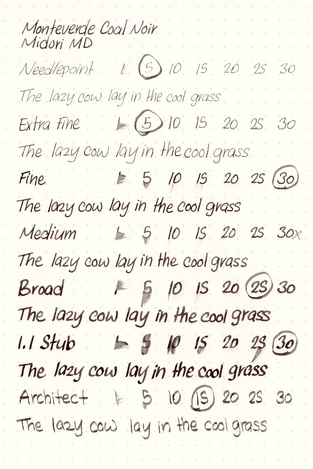
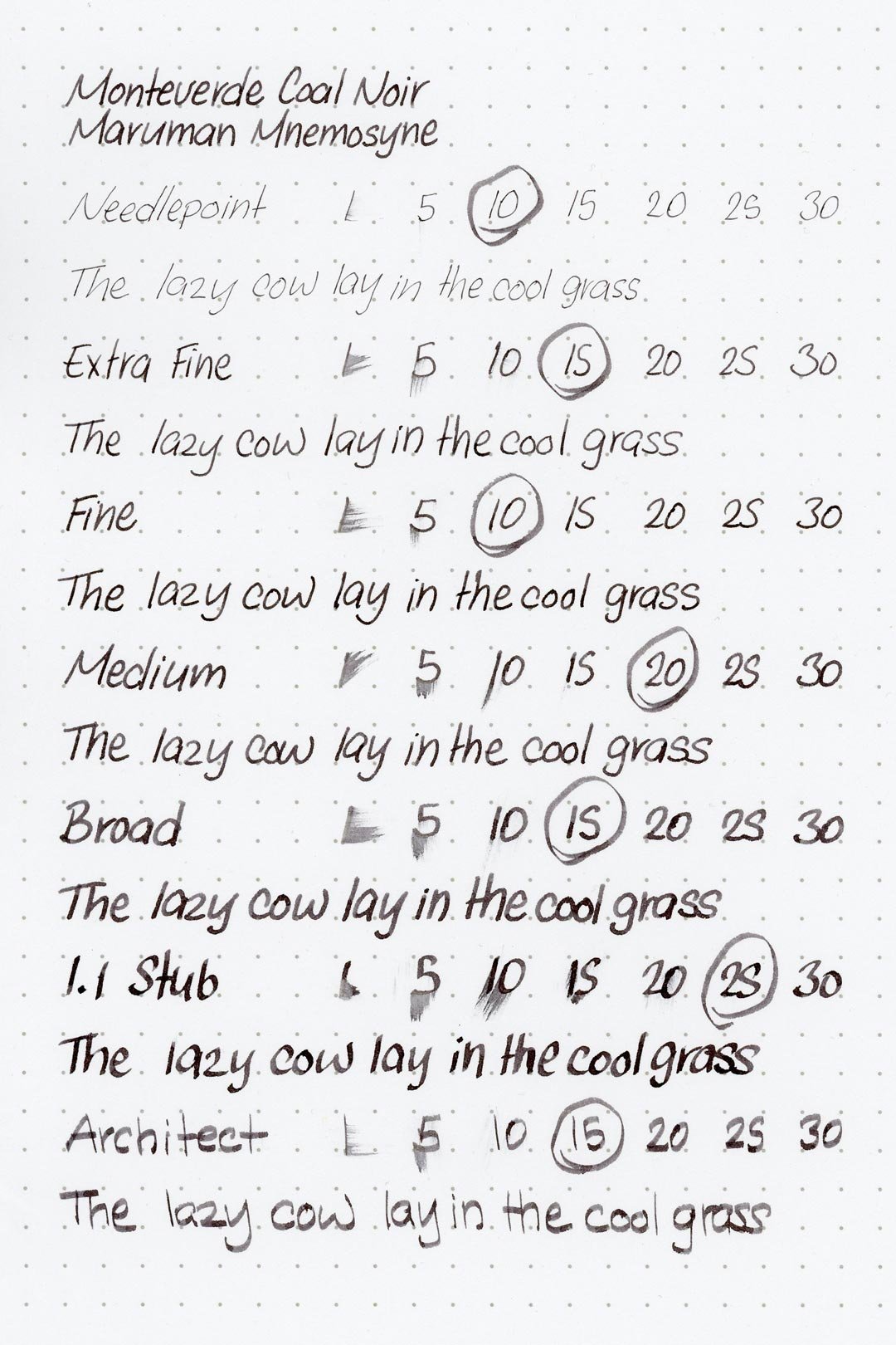
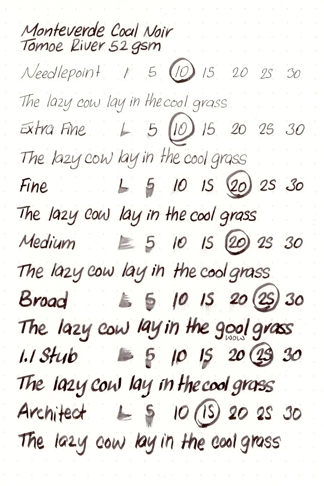
Writing Samples
Written on 52 gsm Tomoe River paper (white, 6mm ruling) with a medium nib.
Written on Midori MD paper (cream, 7mm ruling) with a medium nib.
Performance in a pen: 8.5/10
Performance on paper: 8.5/10
Color saturation: 8/10
Sheening: 3/10
Shading: 3/10
Dry time:6/10
Water resistance: 3/10
Ease of cleaning: 8/10
Shimmer: None
My Personal Thoughts…
The second ink in the Noir collection is described as “A beautiful gray fused with black,” and that makes… a darker grey. Yeah, I was initially underwhelmed by the thought of it, but I quickly warmed up to Coal Noir, because as far as gray ink goes, it’s excellent. I was happily surprised by how pleasant it was to write with! It’s smooth to write with and nicely saturated. There’s not a lot more to say about it. As far as Monteverde’s concept of expanding on blue/black with other colors, it’s okay, and I think other colors in their Noir Collection will be more interesting to look at. But as a gray? It’s an easy ink to recommend, especially if you want a darker one.
Written on 52 gsm Tomoe River paper with a Conklin 1898 “Doodle” (medium nib).
More images/info:
Featured in the photography and writing samples:
Monteverde Coal Noir
Conklin 1898 “Doodle”, medium nib (Atlas Stationers Exclusive)
52 gsm Tomoe River notebook by Sterling Ink
Midori MD A6 lined notebook (Amazon)
Traveler’s Company brass clip (Amazon)
Tim Holtz mini bulldog clips (Amazon)
Zippo 1935 replica lighter (Amazon)
Current text: The Maltese Falcon by Dashiell Hammett (Amazon)
Comparisons:

Tools and materials used in the writing samples:
A TWSBI Diamond 580 AL with 7 nib units, including a Needlepoint grind, EF, F, M, B, 1.1mm stub, and an Architect grind. All nibs are tuned to perform at the same medium wetness.
A Rhodia No16 A5 DotPad
A Leuchtturm1917 A5 Notebook
A Midori MD A5 Notebook
A 52 gsm A5 Tomoe River Notebook
A Maruman Mnemosyne A5 Spiral Notebook
A Kokuyo Campus A5 Notebook