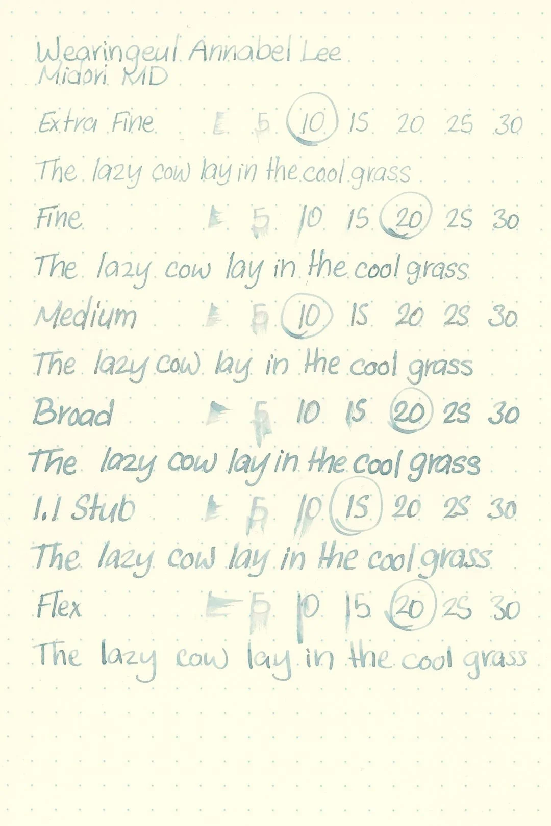
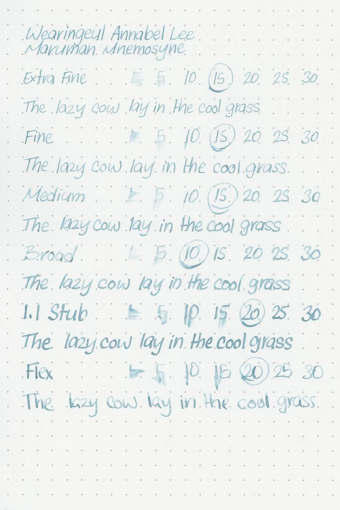
Wearingeul Annabel Lee
Ink Review #156
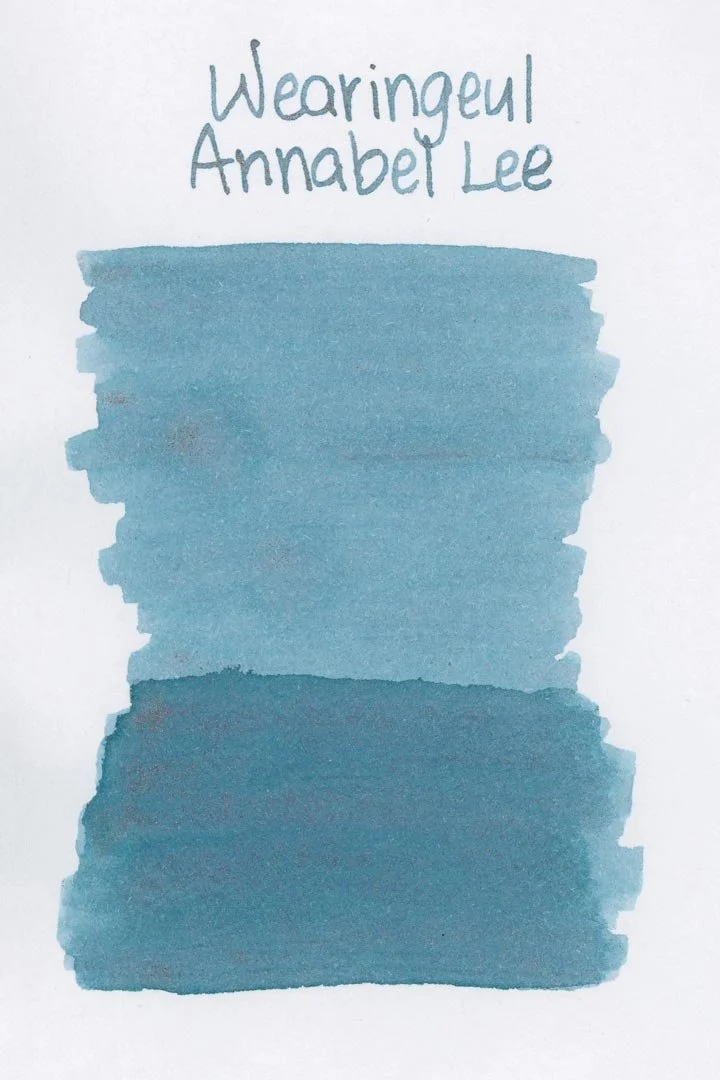
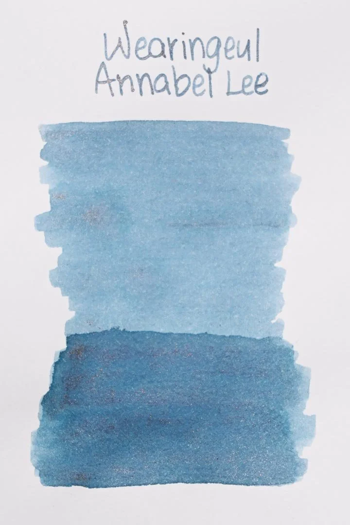
*Please note that the scan is the accurate representation of this color.
Disclosure: This ink was sent to me by Wearingeul for the purpose of review. This in no way impacts my review, and as always, all of my thoughts and opinions are my own. This post also contains affiliate links. If you click and make a purchase, I may earn a small commission.
Overview
The Color and Properties
Wearingeul Annabel Lee is a shimmering ink. The base color is a cool blue with slight green undertones in the right lighting. The ink features a lot of shading in both cursive and print writing, with a crisp cut around areas where the ink pools. The shimmer is rose gold, but there’s not a lot of it distributed in writing. It’s a light shimmer.
Ink Splat
Ink Droplets
Chromatography
Performance on Paper | Dry Times | Water Resistance
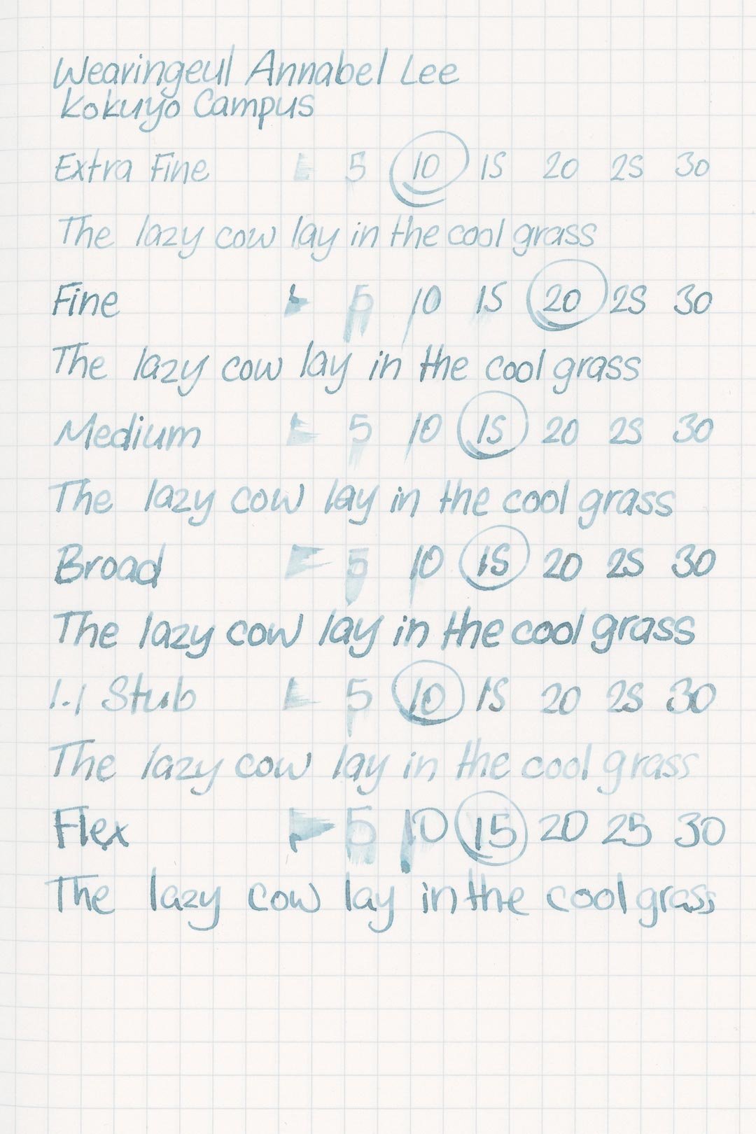
This ink is well-behaved, although there was some occasional light feathering on both the Kokuyo and the 52 gsm Tomoe River test sheets. There’s also some feathering around the edges of the ink splat and droplets. This should be okay with most fountain pen-friendly paper options, but using this ink with wet pens may push some past their limits.
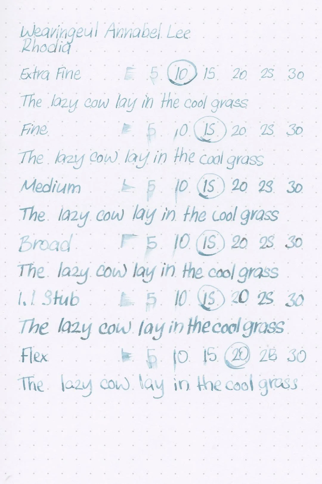

Rhodia
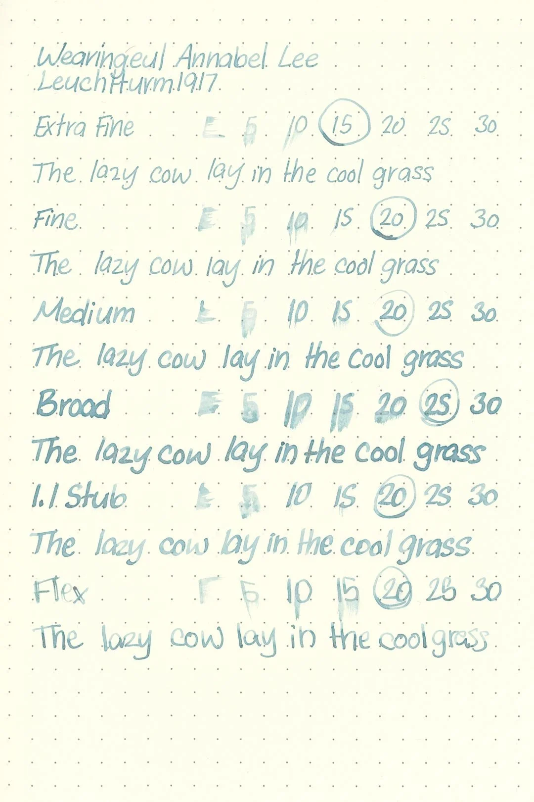
Leuchtturm1917
The dry times are mostly average, with the large nib sizes taking around 20-25 seconds to dry, and the finer nib sizes taking slightly longer than average, but still drying around 10-15 (and sometimes even 20) seconds.
The water resistance is surprisingly good! Water exposure washes some of the color away, but there are still heavy shadows of whatever was left over, and minimal clouding of color. The end results are still very crisp and legible.
More Pages

Performance in the Pen | Cleaning
Annabel Lee has a weird flow. For the first few lines of writing, it seems like a medium-wet flow, and the ink feels well-lubricated and comfortable. Unfortunately, in both my test pen and the pen I used for my writing samples (a TWSBI Diamond 580 and Nahvalur Original, respectively), there’s a sudden and heavy drop-off in flow during extended writing. Once the drop off occurs, there’s a lot of hard starting and an eventual stop, and it takes quite a while to get the pen going again. I want to say it was slightly better with my TWSBI test pen, but there’s a definite issue with the flow keeping up. At first, I thought the shimmer was causing clogs, but there were never any signs of a tine clog. Because the initial flow is so good (especially with dip pens), I have a feeling the shimmer may be causing a blockage in the feed. When I first received the ink, I also noticed that there was a lot of shimmer that I wasn’t able to agitate off the sides of the bottle — there seems to be something about the shimmer that likes to stick to surfaces. I think that has a lot of effect on the distribution of shimmer, too, because there doesn’t seem to be a lot of it when there should be, but no matter how much you agitate the pen, it doesn’t seem to help.
At the very least, this ink is pen-picky. While I don’t base my tests on using inks with flow-enhancing additives, I’ll mention that Wearingeul makes their own flow enhancer (The Swan Elixir), and to give this ink a fair chance, I’ll be testing it with this ink below, and hopefully it can counteract some of the issues I was having.
When it was time to clean the ink out of both the test pen and the pen I used for the writing samples, the results were the same: the color washed out very quickly, and the shimmer didn’t. For my tests, I’ll generally disassemble my pen for cleaning if there’s any shimmer left over, so I don’t contaminate the next one, but this will require disassembly regardless. There’s too much shimmer left over. It was the same thing with the nib units. They were completely caked in shimmer, and in that case, it can be easily loosened by flushing with some light dish soap (Dawn, Blue), but I don’t recommend doing that to the inside of a piston filler, as it can allow water to slip behind the piston assembly. I don’t recommend using this in any pen that can’t be easily cleaned.
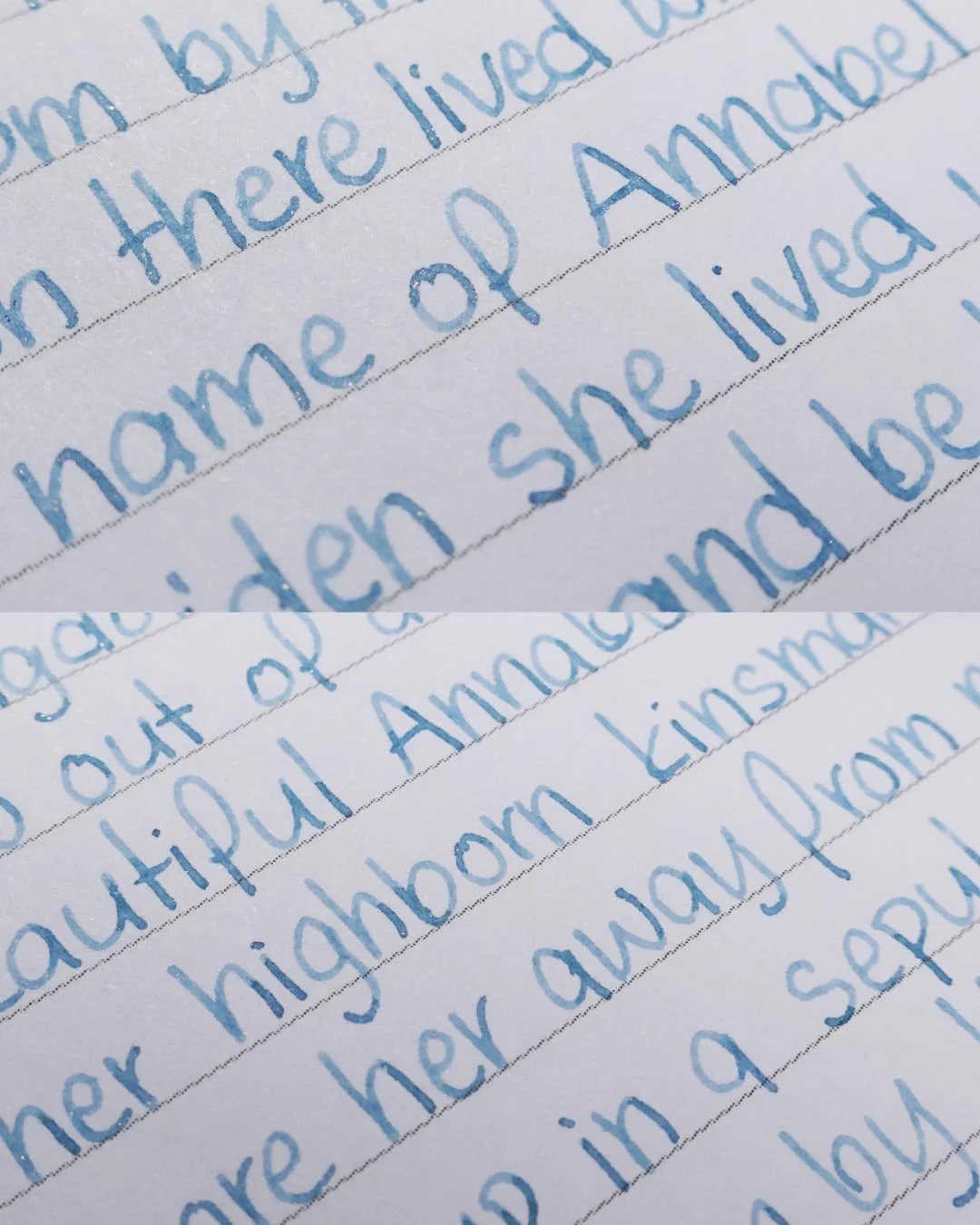
Writing Samples
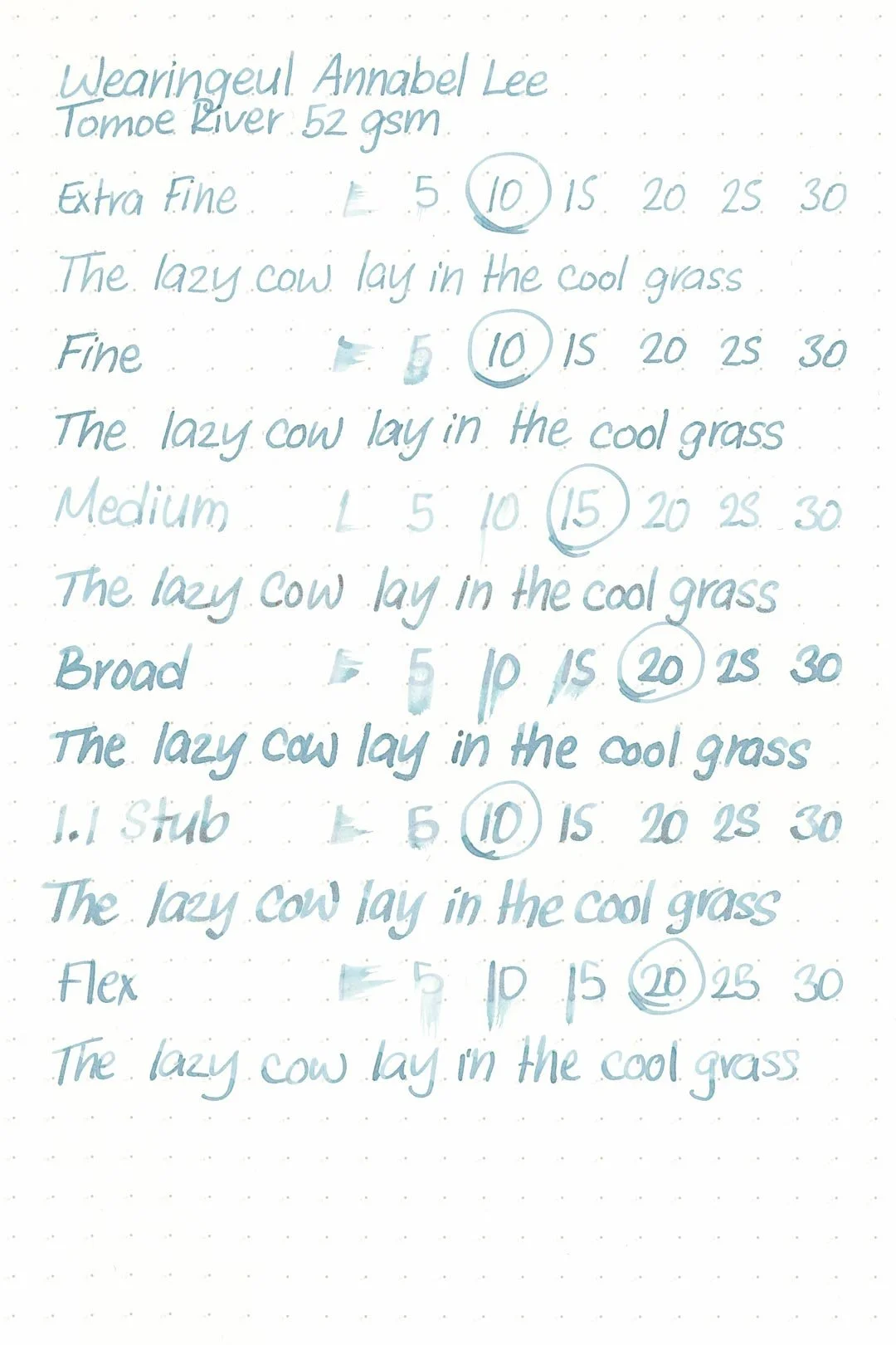
Written on 52 gsm Tomoe River paper (white, 6mm ruling) with a medium nib.
Written on Midori MD paper (cream, 7mm ruling) with a medium nib.
Written in a Retro51 notebook (white, 7mm ruling) with a fine nib.
Flow Enhancer
The above writing sample is using a flow enhancing additive.
At this point, I was really excited to get to use The Swan Elixir flow enhancer because, at the very minimum, I’m at least loving the color. I was ready for it to fix everything. Adding the flow enhancer was a big improvement in the usability of the ink: the hard starts and stops were gone, and while there was still a minor drop off in flow by the time I got to the bottom of the page, it was nowhere close to as bad as before. I started working on some extra writing samples immediately, and it made it through the cursive sample without any issues.
The above writing sample is using a flow enhancing additive.
Sadly, halfway through the second page of the writing sample, it stopped with no visible tine clogs, and I couldn’t get it going again, and that’s where I’ll leave it.
So, the flow enhancer is a hit or miss, and it also makes the color darker (a typical side effect when using ink with flow enhancers). You also lose out on a lot of the shading. That may or may not be something you care for, but in my opinion, it can take away from the concept of the color. In this case, I don’t think it was too bad, and honestly, using the ink without the flow enhancer often required so much extra pressure to get the ink moving that it often darkened up the color anyway.
The shimmer distribution was still an issue as well. Even with the flow enhancer, there simply isn’t enough of the shimmer visible in writing. If anything, it’s worse than without the flow enhancer. And there’s plenty of it swimming around in the pen. The problem? It seems to be too busy sticking to the inside walls of the pen to make it to the page. You can see in the image above how much of the shimmer sticks to the inside of the barrel and bottle, and it can’t be agitated properly.
Dip Pens
The last chance I’m going to give the ink is with a dip pen. The ink felt great when swatching with a Kakimori dip nib, so I thought this would be the silver lining, and it was! I broke out a Dominant Industry Ink Muddler, and as expected, the ink is excellent with it. It’s wet as I remember and enjoyable to use, but with that said, it darkens up the color the most, and there’s still not that much shimmer. Still, dip pens are by far the best way to go with this ink.
Performance in a pen: 4/10
Performance on paper: 7/10
Color saturation: 4/10
Sheening: 0/10
Shading: 5/10
Dry time: 6.5/10
Water resistance: 5/10
Ease of cleaning: 4/10
Shimmer: rose gold, light
My personal thoughts…
I don’t know if I can overstate how excited I was to get this ink. After all, I’m a Poe-loving Marylander, and before I even knew what the color was going to look like, I was sold on the concept. Annabel Lee is a beautiful poem, and I think Wearingeul made a beautiful color. It’s a very melancholy blue. It’s almost bright even, but not quite. It’s cold and muted. It might seem like the inclusion of shimmer would be counterproductive to the overall concept, but the choice of rose gold serves to darken the color even further — it reminds me a lot of what Diamine did with Baltic Breeze in 2024, although lighter and less dramatic. There’s a lot to love about the color, and I wanted to give Wearingeul’s Interpretation of Annabel Lee the best chance I could because I personally wanted to love it. That’s why I’m sad to say I can’t recommend it. It’s just too temperamental, even as far as shimmering inks go. A lot of shimmering inks might require some degree of experimentation to get the result you’re looking for, and they’re generally the kind of inks to be avoided if practicality is what you’re looking for, but the final product is often worth the effort. Annabel Lee never got that happy ending. Is that oddly appropriate? Maybe, but that’s all I can give it. You might be able to find the magical pair of ink and pen that this will work with. If you want to enjoy this ink, my suggestion is stick with a dip pen (also oddly appropriate).
Written on 52 gsm Tomoe River paper with a Conklin Endura Deco Crest (broad nib).
More images/info:
Featured in the photography and writing samples:
Wearingeul Annabel Lee
Nahvalur Original Winter, medium nib (Amazon)
52 gsm B6 Tomoe River notebook by Sterling Ink
68 gsm a5 Tomoe River notebook by Odyssey Notebooks
Midori A6 lined notebook (Amazon)
Retro51 x PenBoutique Annabel Lee lined notebook
Traveler’s Company Brass Clip (Amazon)
Dominant Industry Ink Muddler
MVLXLX 3 Pen Case, blue (Amazon)
Current text: Anne of Green Gables by LM Montgomery (Amazon)
Tools and materials used in the writing samples:
A TWSBI Diamond 580 with 5 nib units, including an EF, F, M, B, and 1.1mm stub. All nibs are tuned to perform at the same wetness.
A Rhodia No16 A5 DotPad
A Leuchtturm1917 A5 Notebook
A Midori MD A5 Notebook
A 52 gsm A5 Tomoe River Notebook
A Maruman Mnemosyne A5 Spiral Notebook
A Kokuyo Campus A5 Notebook