Wearingeul Peter Pan
Ink Review #64

*Please note that the scan is the accurate representation of this color.
Overview
The Color and Properties
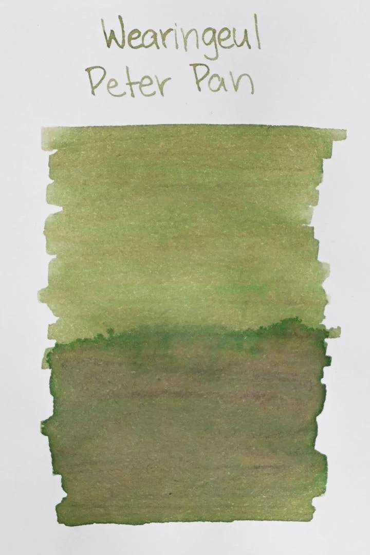
Wearingeul Peter Pan is a light olive green with high shading characteristics. It shades easily with a hard cut between light and dark tones in areas where the ink pools, but also exhibits some heavy red/brown tones within the olive base color. I noticed this the most on the Midori paper, where it even appeared more brown than green in some areas. The best characteristics of this ink are easily observable in basic writing circumstances too — the red tones were easily visible with most of the nib sizes fine and larger, and in some cases, I even noticed traces of blue around the edges of areas the ink pools in. Still, wetter and broader nibs will yield the best results.
Ink Splat
Ink Droplets
Chromatography
Performance on Paper | Dry Times | Water Resistance
Peter Pan is well-behaved. There wasn’t a lot of bleed-through on the Kokuyo sheet; there was some light spot bleeding with the larger nib sizes, but not a lot else. None of the other test sheets exhibited any bleeding or feathering, and Peter Pan should be fine on most fountain pen-friendly papers.


Rhodia


Leuchtturm1917
The dry times were slightly above average. There were a few cases of larger nib sizes drying by the 20-second mark, but for the most part, they were dry within 15.
There was some light water resistance too. While water exposure washed most of the color away, there wasn’t any clouding of color left behind, and there were easily legible red/grey shadows of anything that was written.
More Pages


Performance in the Pen | Cleaning
When I first swatched this color, I had a feeling it was going to have an overly dry flow, but I was surprised to find out that wasn’t the case. Peter Pan still has a dry-medium flow, but it works well and consistently. I didn’t run into any hard starts, skips, or decreases in flow during extended writing. There was an adequate amount of lubrication to provide a comfortable writing experience as well.
Cleaning was also easy, only needing a single flush and soak for the nibs and pen to run clean.
Writing Samples
A closer look at the brown tones that come through easily on Midori MD paper.
Performance in a pen: 10/10
Performance on paper: 9/10
Color saturation: 5/10
Sheening: 0/10
Shading: 9/10
Dry time: 8/10
Water resistance: 4/10
Ease of cleaning: 10/10
Shimmer: None
My personal thoughts...
I already knew I was going to like this ink, but I didn’t think I was going to like it this much. I’ve inked a handful of pens with it already and it hasn’t missed the mark once. It makes for a unique and pleasant writing experience in its own right, but I think
Wearingeul did a great job representing the character with this color. The inspiration is clear, but the earthy and rustic characteristics brought by the reddish-brown tones of this ink bring it to life even further. Without question, it’s a great and fun ink, and I would recommend it.
Written in a 52 gsm Tomoe River notebook (print) and a Midori MD Traveler’s Company notebook insert (cursive) with a DarailPenz Naomi (Broad)
Other inks in this set:
More images/info:
Tools and materials used in the writing samples:
A TWSBI Diamond 580 AL with 7 nib units, including a Needlepoint grind, EF, F, M, B, 1.1mm stub, and an Architect grind. All nibs are tuned to perform at the same medium wetness.
A Rhodia No16 A5 DotPad
A Leuchtturm1917 A5 Notebook
A Midori MD A5 Notebook
A 68 gsm A5 Tomoe River Notebook
A Maruman Mnemosyne A5 Spiral Notebook
A Kokuyo Campus A5 Notebook