Wearingeul Tinker Bell
Ink Review #65


*Please note that the scan is the accurate representation of this color.
Overview
The Color and Properties
Wearingeul Tinker Bell is a Shimmering ink. The base color is a pale grey-green with moderate shading. There’s not a lot of tonal variation, but there’s a crisp cut between light and dark shades where the ink pools. The particulates are golden yellow, but they don’t contrast the base color well: I found the shimmer very difficult to see while writing to the point that it looked like it wasn’t a shimmering ink at all without closer inspection. After drying for an extended duration, the shimmer is still subtle but becomes far more visible, and when you look at the page from different angles, the shimmer shines brightly.
The color is pale, but I didn’t find it to be difficult to read on most papers. It may be harder to see if darker ink is used on a following or subsequent page, but even on graph paper, I didn’t think it was that bad. The bigger issue is how pale it is before it dries. It can be really hard to see what you’re writing while the ink is still drying, and that can be annoying in less-than-ideal lighting.
Ink Splat
Ink Droplets
Chromatography
Performance on Paper | Dry Times | Water Resistance
Tinker Bell should be well-behaved on most fountain pen-friendly papers. There was minimal spot-bleeding on the Kokuyo sheet, and no observable bleeding or feathering on the other test pages.


Rhodia


Leuchtturm1917
The dry times were a touch above average: the large nibs mostly dried within 15 seconds, but in turn the finer nibs took slightly longer to dry than usual.
The water resistance was surprisingly good! There’s light color loss after water exposure, but there’s a heavy grey shadow left behind of anything written on the paper that’s crisp and easily legible.
More Pages


Performance in the Pen | Cleaning
Tinker Bell’s performance is okay. It has a dry flow, and initially, the ink seems well-lubricated and comfortable to write with. However, I found that the flow would quickly slow down after a few lines of writing, forcing me to pause regularly to allow the flow to catch up again. To test the flow further, I tried this ink with a semi-flex nib, and unfortunately, it’s not wet enough to maintain capillary action when flexed, causing railroading immediately (this can be easily seen in the water resistance test). With that said, I didn’t run into any clogs or hard starts during regular writing, and the shimmer distribution was consistent and even, with minimal need for agitation of the pen (though a little agitation still helps).
Cleaning the pen doesn’t require more than a quick flush and soak to wash away the color completely, but there were still some light particulates stuck to the inside of the barrel and the crown of the piston. No amount of soaking will get that out without some scrubbing, and while it’s easy to get out, my pen needed to be disassembled for cleaning.
Writing Samples
Written on 52 gsm Tomoe River paper (white, 6mm ruling) with a medium nib.
Written on Midori MD paper (cream, 7mm ruling) with a medium nib.
Written on Leuchtturm1917 paper (cream, 5mm ruling) with a medium nib.
Taken in low indirect lighting to better showwcase the shimmer.
Performance in a pen: 7/10
Performance on paper: 9.5/10
Color saturation: 3/10
Sheening: 0/10
Shading: 5/10
Dry time: 8/10
Water resistance: 4/10
Ease of cleaning: 5/10
Shimmer: Golden, Medium
My personal thoughts...
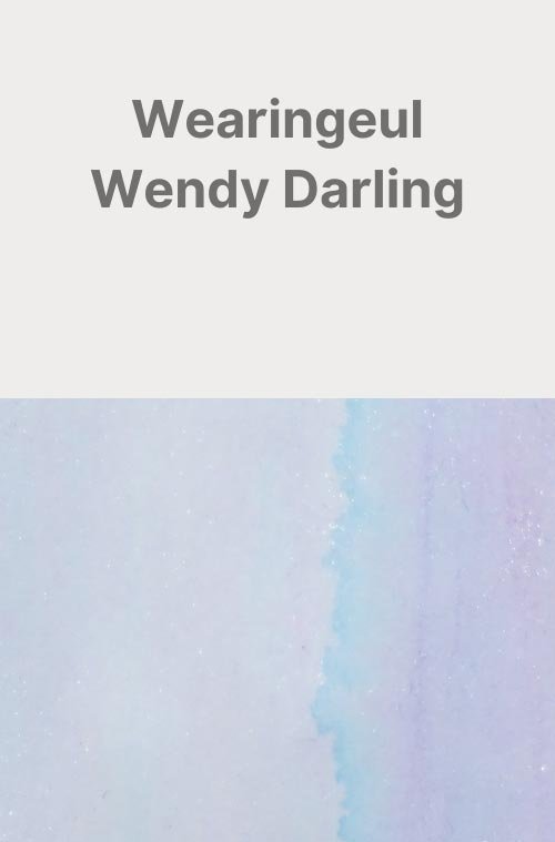
After my experience with Wendy Darling from the same set, I had fears that this ink would be similarly pale and unusable. Thankfully, it’s not quite as bad. Still, it can be very pale, and I think that will turn a lot of people away, but for whatever reason, I kind of like it. I think it’s another great translation of a character into a color by Wearingeul. The pale color might be a slight departure from the vibrant green that many are familiar with, but like many inks in the set, I think it fosters a sense of realism over stylization. Of course, the writing experience wasn’t perfect by any means, but this was never a conventional ink in the first place, so what does it really matter? I certainly wouldn’t recommend this as an everyday ink, but it doesn’t have to be an everyday ink to be fun.
Written on 52 gsm Tomoe River paper with a Darailpenz Naomi (medium nib).
More images/info:
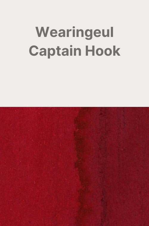
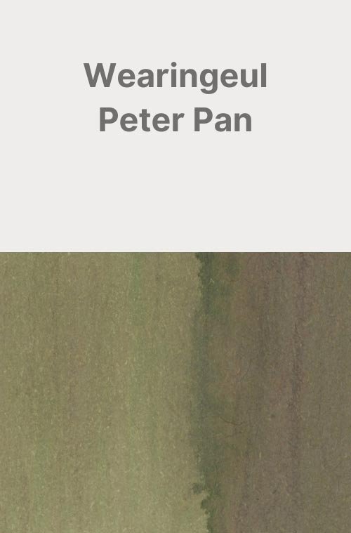
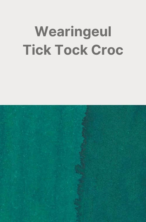
Other inks in this set:
Tools and materials used in the writing samples:
A TWSBI Diamond 580 with 5 nib units, including an EF, F, M, B, and 1.1mm stub. All nibs are tuned to perform at the same wetness.
A Rhodia No16 A5 DotPad
A Leuchtturm1917 A5 Notebook
A Midori MD A5 Notebook
A 68gsm A5 Tomoe River Notebook
A Maruman Mnemosyne A5 Spiral Notebook
A Kokuyo Campus A5 Notebook