Wearingeul Robinson Crusoe
Ink Review #139
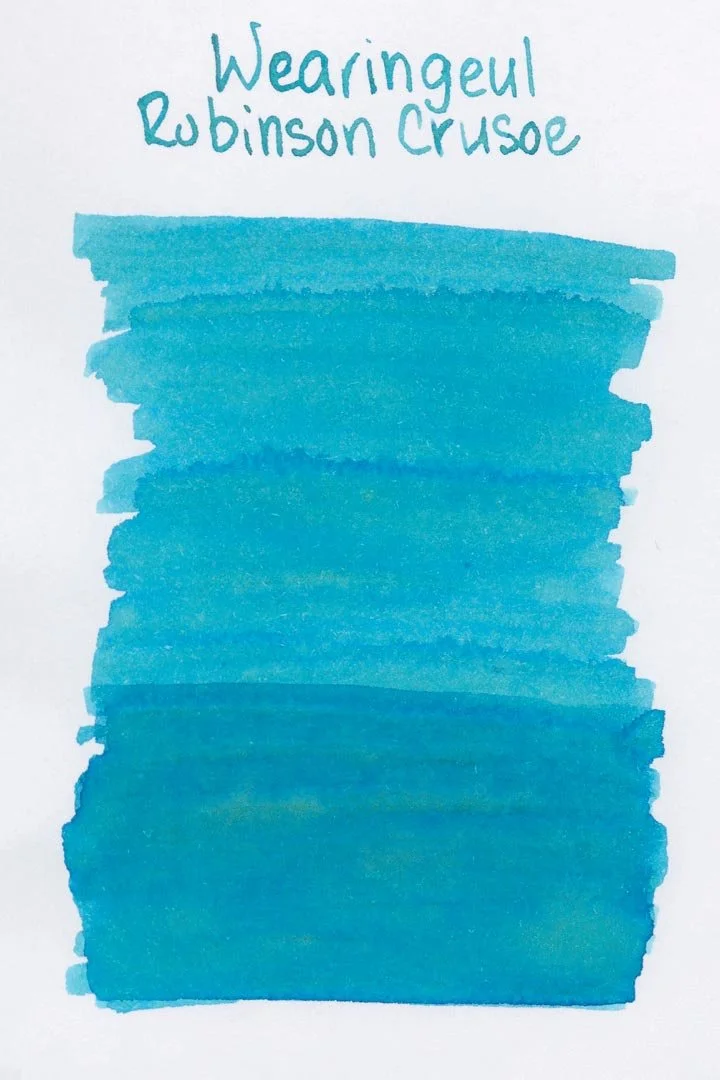

*Please note that the scan is the accurate representation of this color.
Disclosure: This ink was sent to me by Wearingeul for the purpose of review. This in no way impacts my review, and as always, all of my thoughts and opinions are my own. This post also contains affiliate links. If you click and make a purchase, I may earn a small commission.
Overview
The Color and Properties
Wearingeul Robinson Crusoe is a light blue with heavy green undertones. It shades with a crisp cut in both print and cursive writing, as well as dark edges around the shaded areas. There’s also a lot of tonal variation in the shading: the lighter blue quickly becomes darker and bolder, but more notably has the possibility of showing a heavy green where the ink pools heavily enough. Larger nib sizes might make the shading easier to see, but I was surprised that you could still see it (though less) with finer nibs. In this case, I think the overall wetness of the nib is more important than size if you want to bring out the green shading (more on that below).
Ink Splat
Ink Droplets
Chromatography
Performance on Paper | Dry Times | Water Resistance
Robinson Crusoe is very well-behaved. I didn’t see any traces of bleeding or feathering on any of my test pages, and it should perform well on most fountain pen-friendly papers.
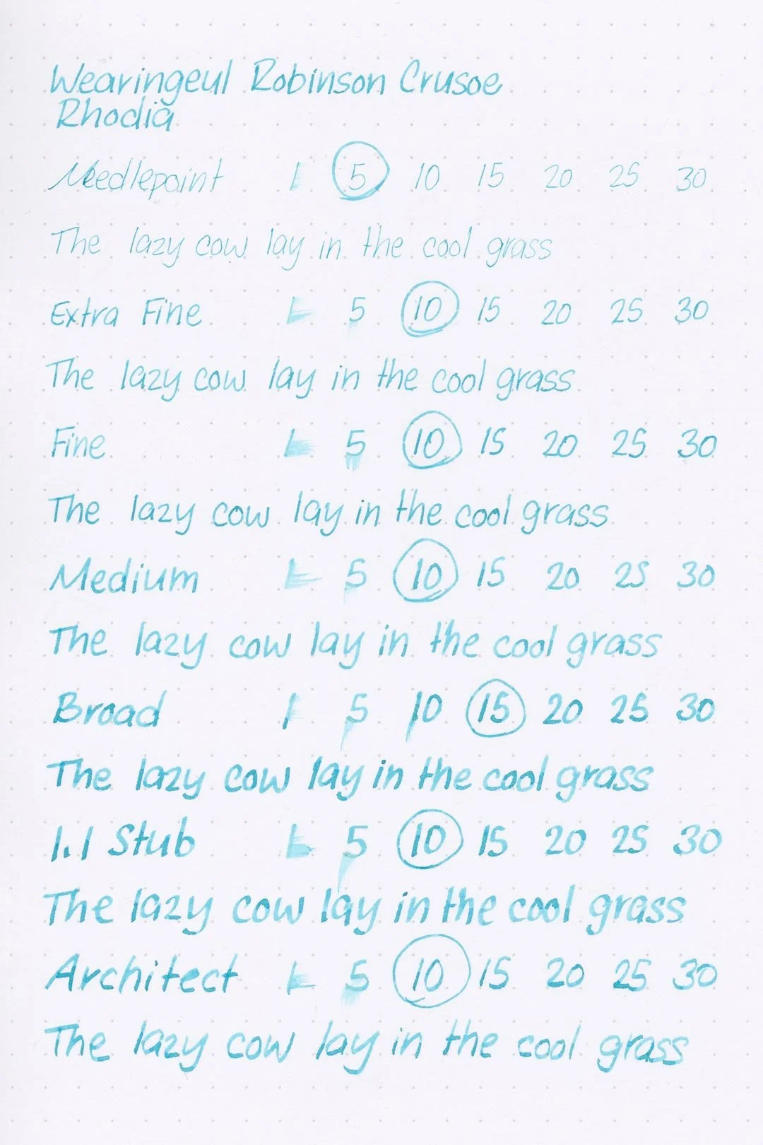

Rhodia

Leuchtturm1917
The dry times are great, with the largest nib sizes almost always drying in 10-15 seconds. The finer nib sizes, surprisingly, didn’t dry much faster than the large nib sizes, but still dried within an average 10-second range.
The water resistance wasn’t great. Water exposure quickly washes most of the color away, and while there are some very light green shadows left behind, they’re a bit too hard to read in normal writing. I would avoid this ink if you have any plans of being shipwrecked on an island.
More Pages


Performance in the Pen | Cleaning
Robinson Crusoe has a medium flow that is well-lubricated enough for a comfortable writing experience. I didn’t experience any hard starts, skips, or stops during my tests, and it even kept up well with not only long writing sessions without any drop-offs in flow, it also kept up shockingly well with the double-stacked nib I tested the ink with in this review. That’s surprisingly good performance for an ink with heavier shading properties.
Cleaning the ink out of the pen was also easy, only needing a single soak and flush, without any visible color or residue left over inside the barrel of the pen.
Writing Samples
I don’t usually do this, but I wanted to see what the ink would look like if you put it through a massive nib, so I inked this broad double-stacked nib. It shows off the green shading well enough, but not to the degree I expected. It’s still mostly visible in heavily pooled areas (such as where letters cross each other). On the other hand, just look at it — it’s gorgeous.
Here’s a close up of the green shading.

The double stacked nib in question.
Written on 52 gsm Tomoe River paper (white, 7mm ruling) with a medium nib.
Written on Midori MD paper (cream, 7mm ruling) with a medium nib.
Written on 52 gsm Tomoe River paper (white, 7mm ruling) with a broad double-stacked nib.
Performance in a pen: 10/10
Performance on paper: 10/10
Color saturation: 4/10
Sheening: 0/10
Shading: 7.5/10
Dry time: 8/10
Water resistance: 1/10
Ease of cleaning: 10/10
Shimmer: None
My personal thoughts...
If I had to describe this ink in one word, it would be refreshing. Its bright greenish blue color immediately brings beautiful and clear tropical waters to mind. And that makes sense — Robinson Crusoe might have plenty of elements and themes to take inspiration from, but how do you put that into color without it feeling like an arbitrary decision? The ink is clearly inspired by the book’s tropical setting, and Wearingeul captured that incredibly well.
Of the handful of inks Wearingeul let me choose for review, I have to say, this is by far the one that left the biggest impression on me, not because the others were any worse, but because this one is simply so unique. A bright and vibrant blue like this is already well up my alley, but that hint of green is the icing on the cake, and it simply works so well, I can’t do anything other than give it my highest recommendation.
Written on 52 gsm Tomoe River paper with an Asvine P20 (medium nib).
More images/info:
Featured in the photography and writing samples:
Wearingeul Robinson Crusoe
Custom pen by Relic Pens with double-stacked JoWo nib
Galen Leather B6 52 gsm Tomoe River notebook
Galen Leather A5 52 gsm Tomoe River Notebook
Midori B6 slim lined notebook (Amazon)
Endless Explorer notebook cover
Wearingeul Reservoir A5 grid notebook
Rohrer & Klinger glass dip pen
Dominant Industry Ink Muddler
Current text: Robinson Crusoe by Daniel Defoe (Amazon)
Tools and materials used in the writing samples:
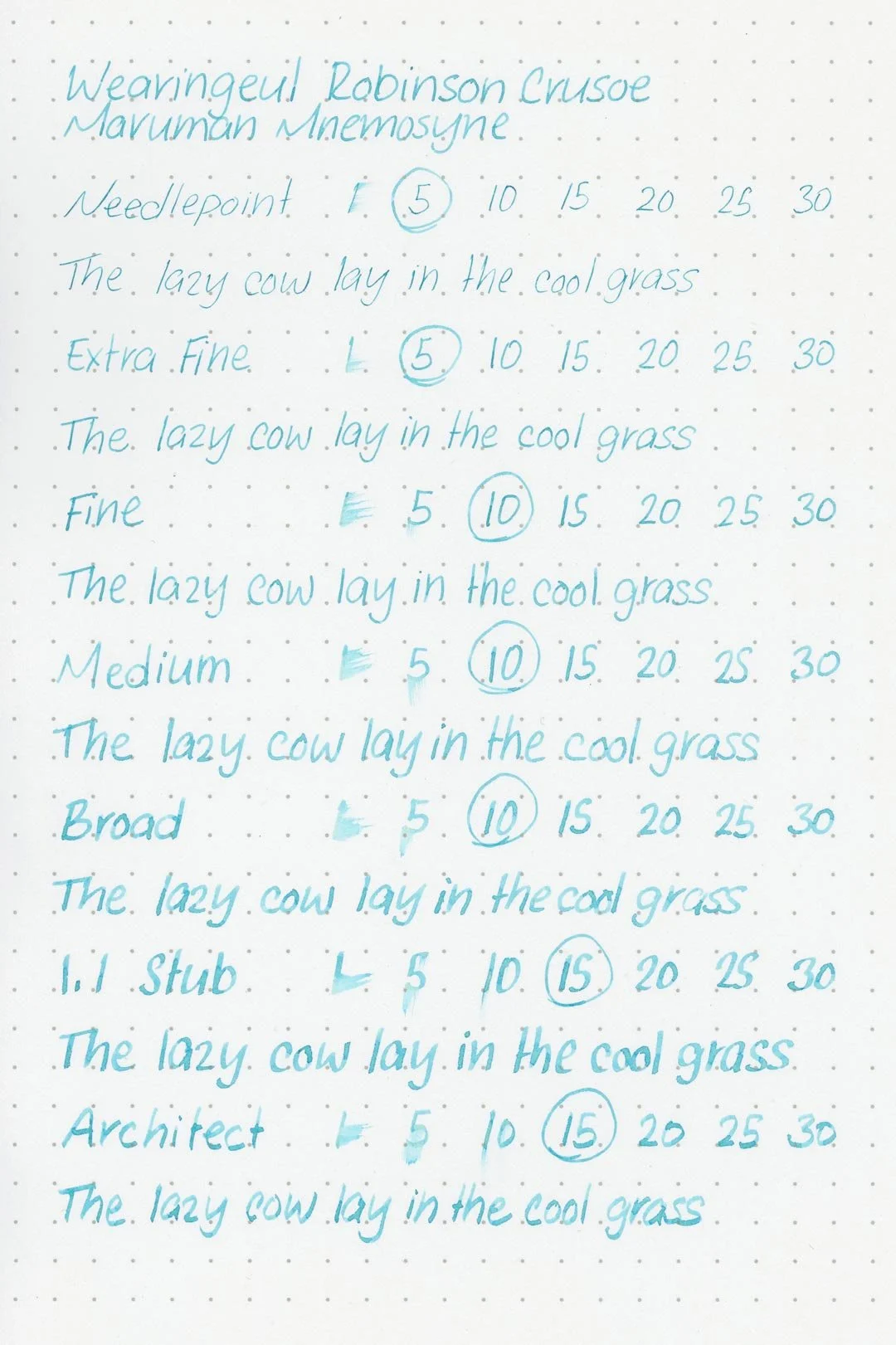
A TWSBI Diamond 580 AL with 7 nib units, including a Needlepoint grind, EF, F, M, B, 1.1mm stub, and an Architect grind. All nibs are tuned to perform at the same medium wetness.
A Rhodia No16 A5 DotPad
A Leuchtturm1917 A5 Notebook
A Midori MD A5 Notebook
A 52 gsm A5 Tomoe River Notebook
A Maruman Mnemosyne A5 Spiral Notebook
A Kokuyo Campus A5 Notebook